|
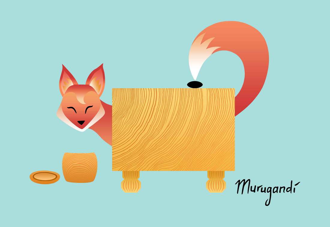
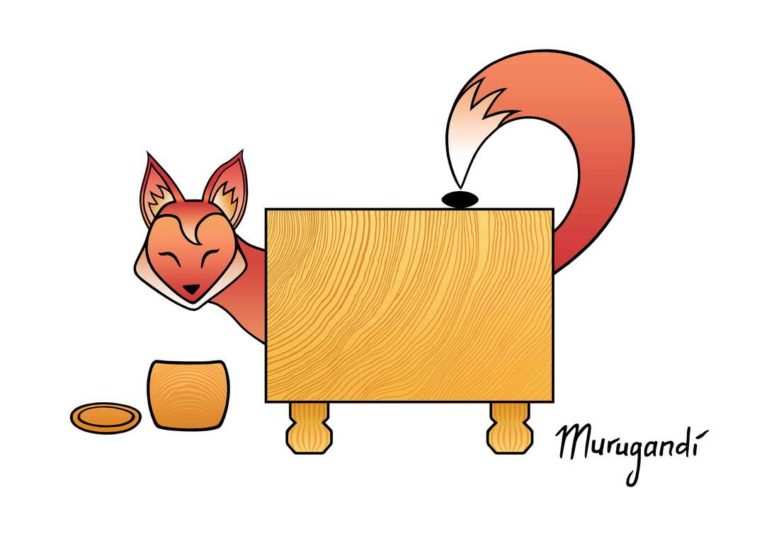
In winter 2021, the Chinese Weiqi Association organized an art competition on their social media platform Little Fox Weiqi. For the competition, artists were encouraged to create designs based around the fox in the logo of Little Fox Weiqi, incorporating references to the game of go. "Little Fox Weiqi" stems from China's nickname for go: 木野狐 (wooden wild fox). In the announcement of the competition, the fox was described as "very clever, cute, lively but also naughty." The organization further wrote: "We hope to use the image of 'little fox' to show the elegance, kindness and wisdom of Chinese weiqi, and its powerful vitality and infinite charm." Inspired by the logo of Little Fox Weiqi (above), I made an illustration in the same cute and child-friendly style, using gradients for the red-orange-white fur similar to the original. I played into the classic qualities of naughtiness and shrewdness of the fox: my fox peeks at us from behind a beautiful wooden go board, smiling happily while simultaneously placing a go stone on the board with its tail. I titled my design "Cheeky Little Fox". I ended up making two versions of my design which I both entered into the competition: one with my usual black outlines (above) and one without (at the beginning of this blog post).
On social media, opinions were divided on which version was better. Personally, I probably prefer the version without the black outlines: it is more in line with the logo of Little Fox Weiqi, and this change from my usual drawing style positively surprised me. All participants of the competition will receive prizes or certificates of honour. The winners should be announced in the coming weeks.
0 Comments
This December my go mugs are flying off the shelves!
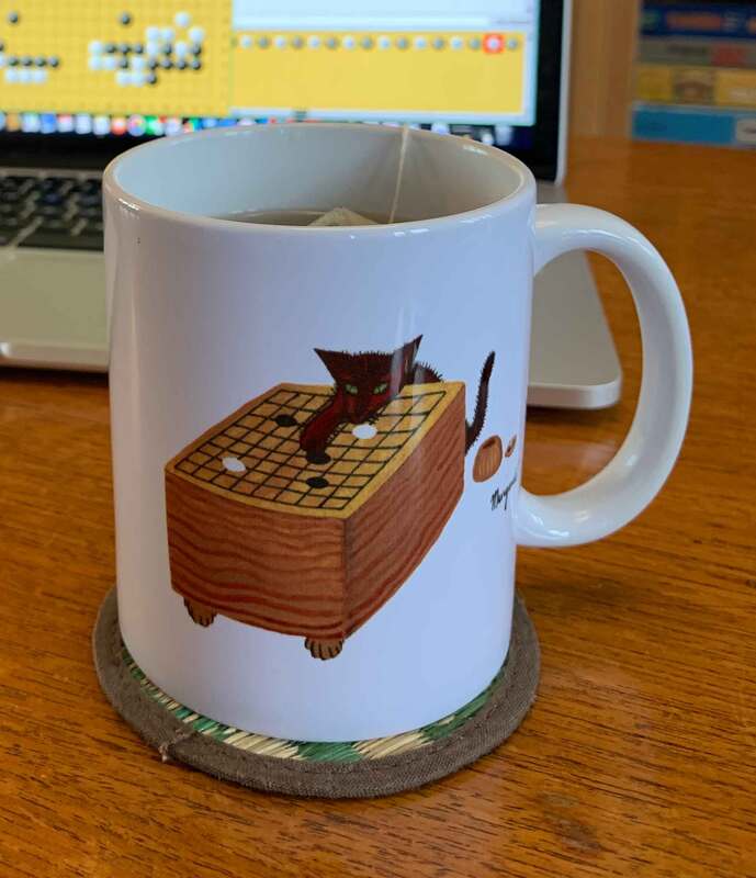
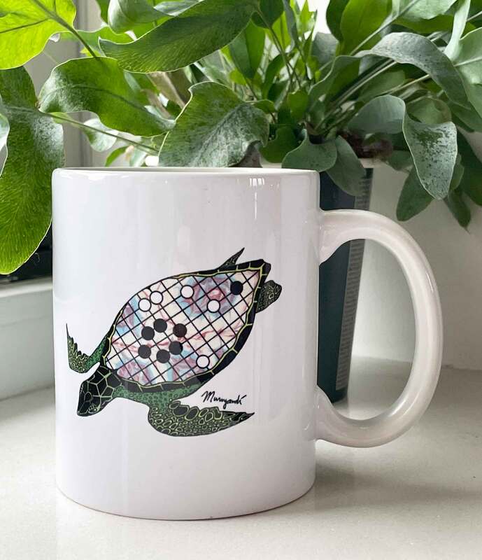
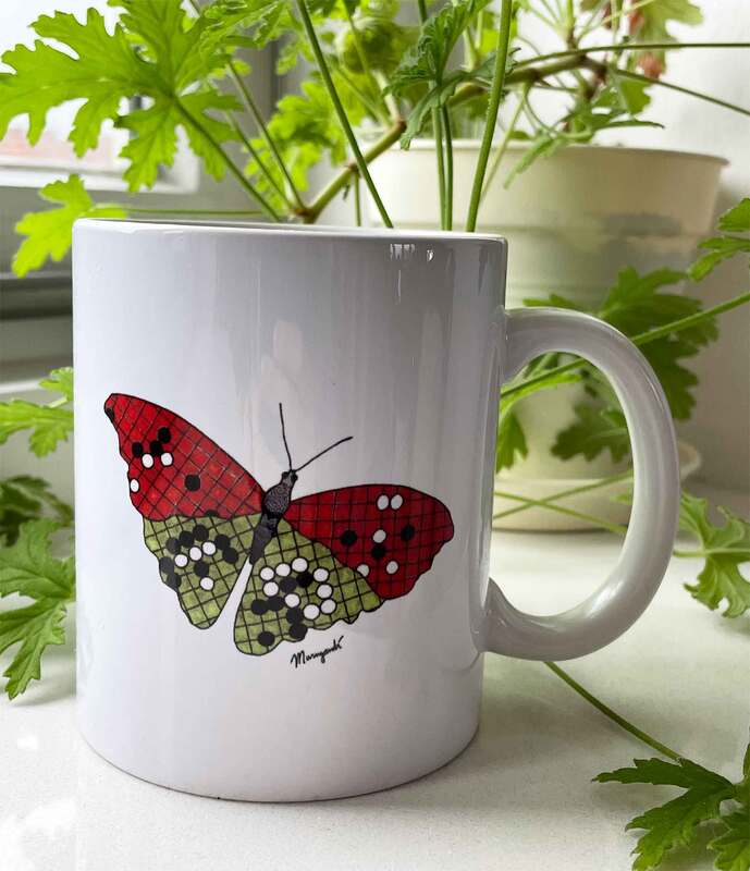
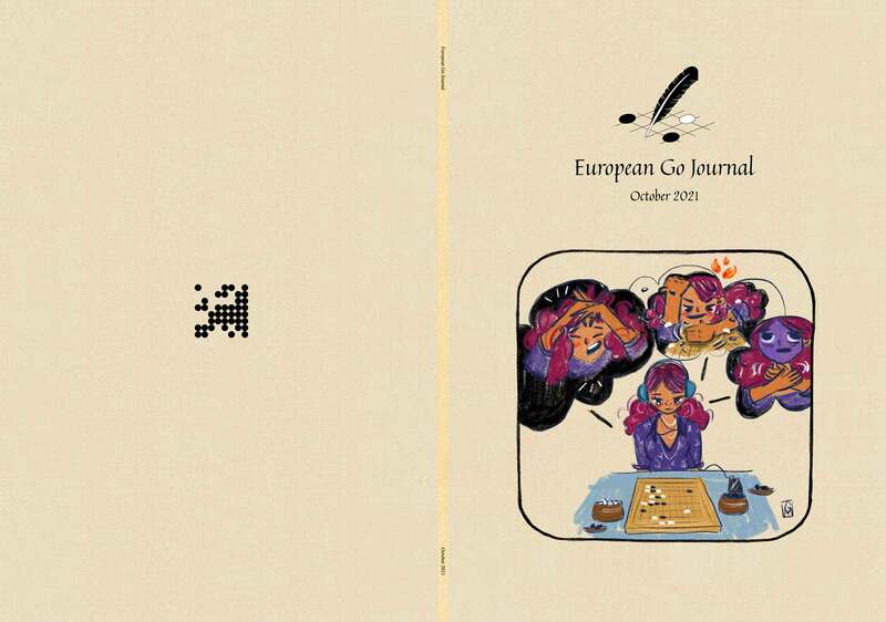
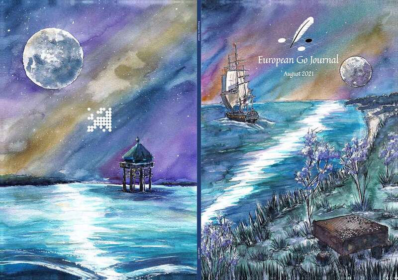
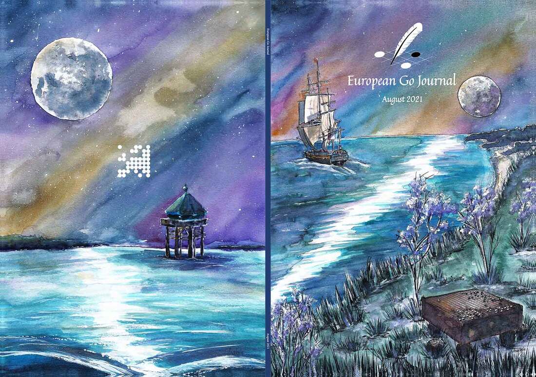
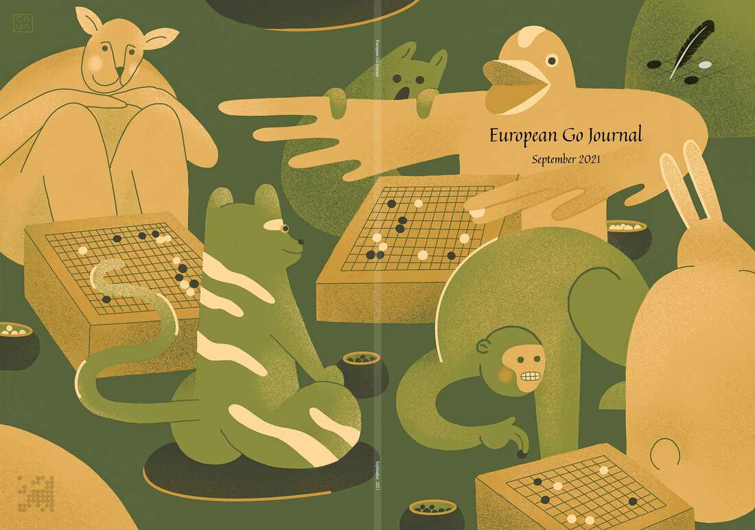
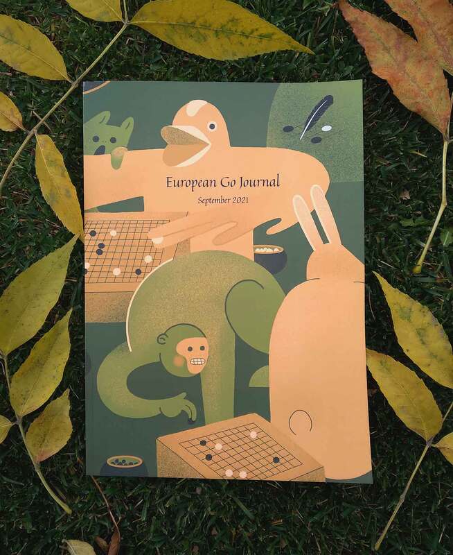
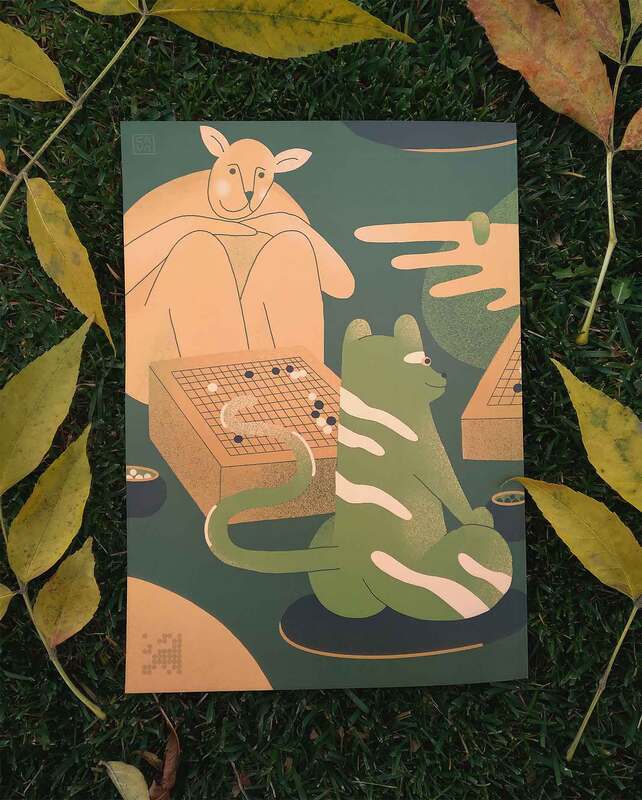
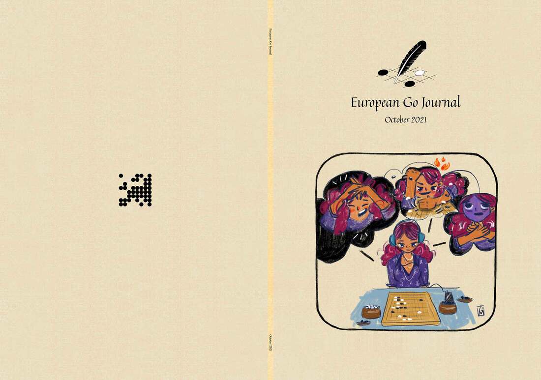
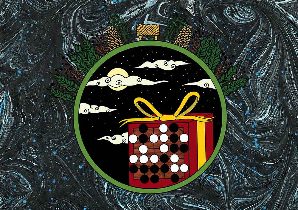
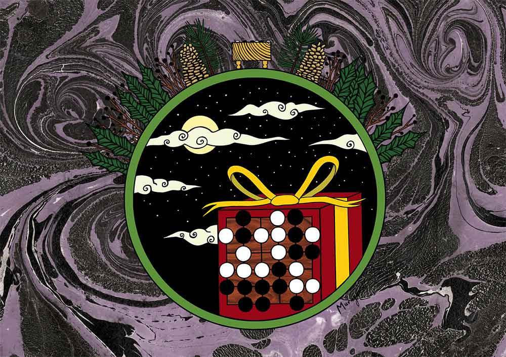
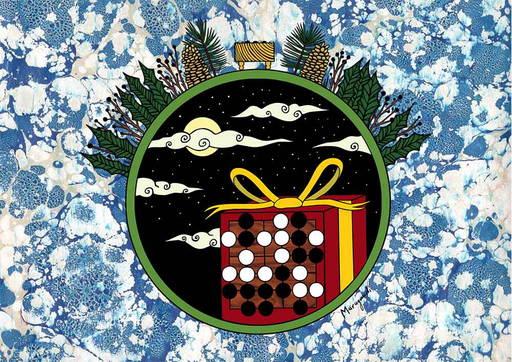
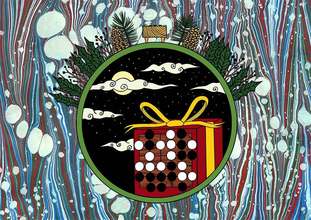
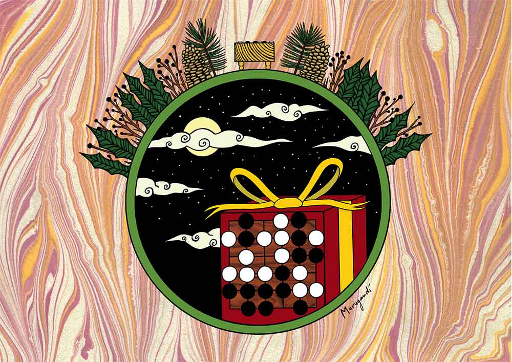
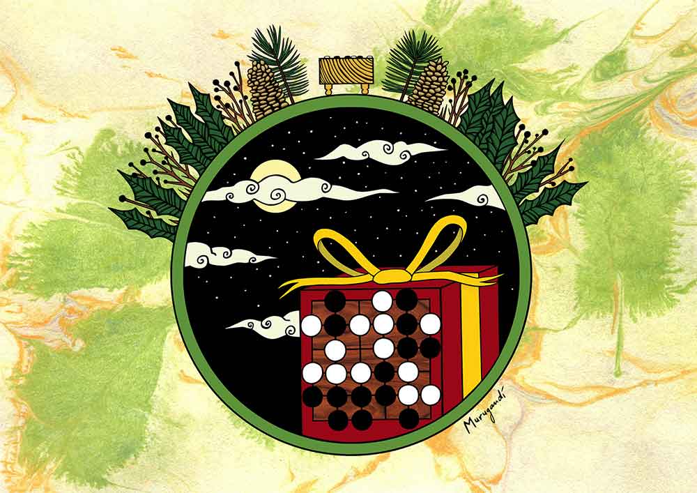
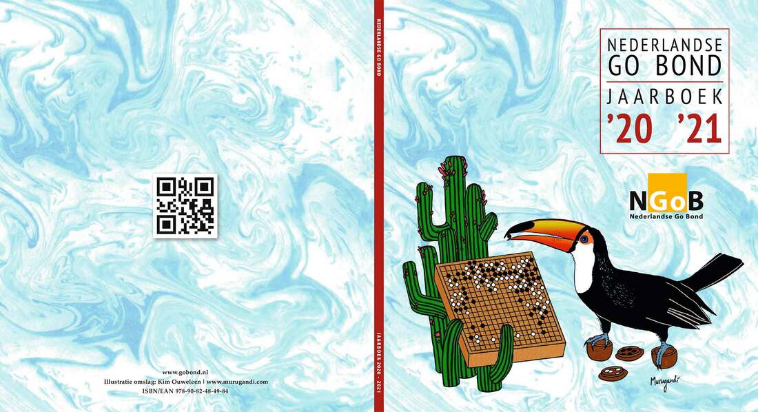
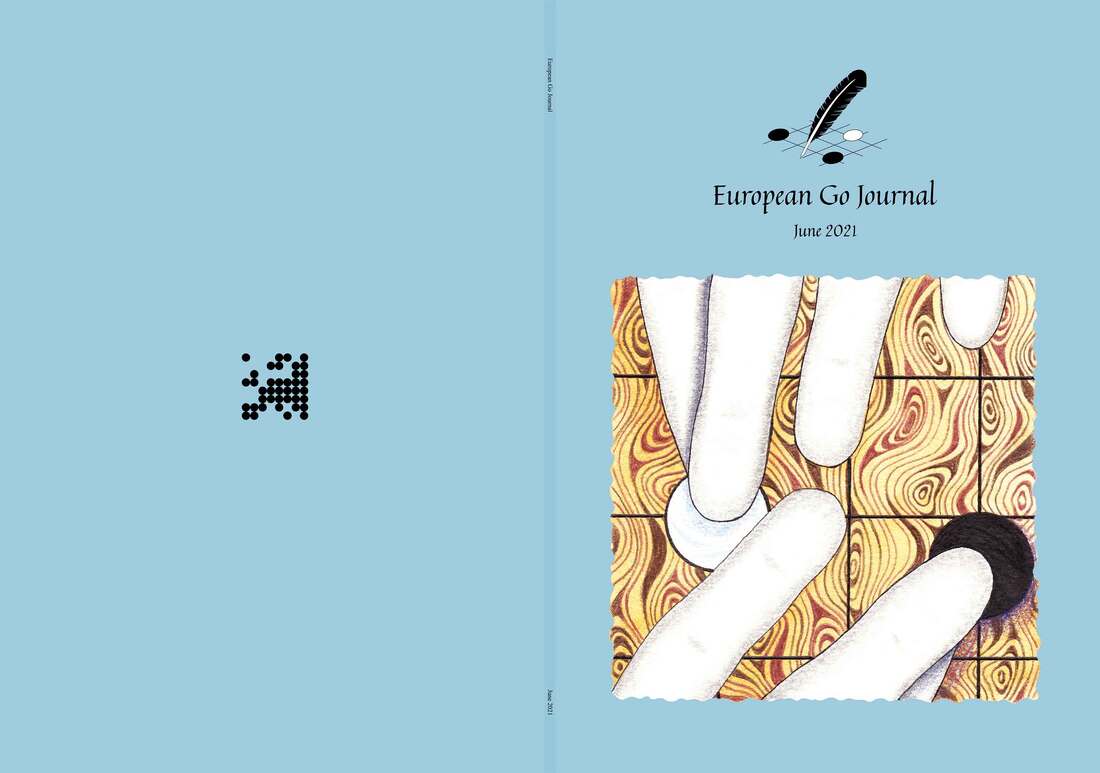
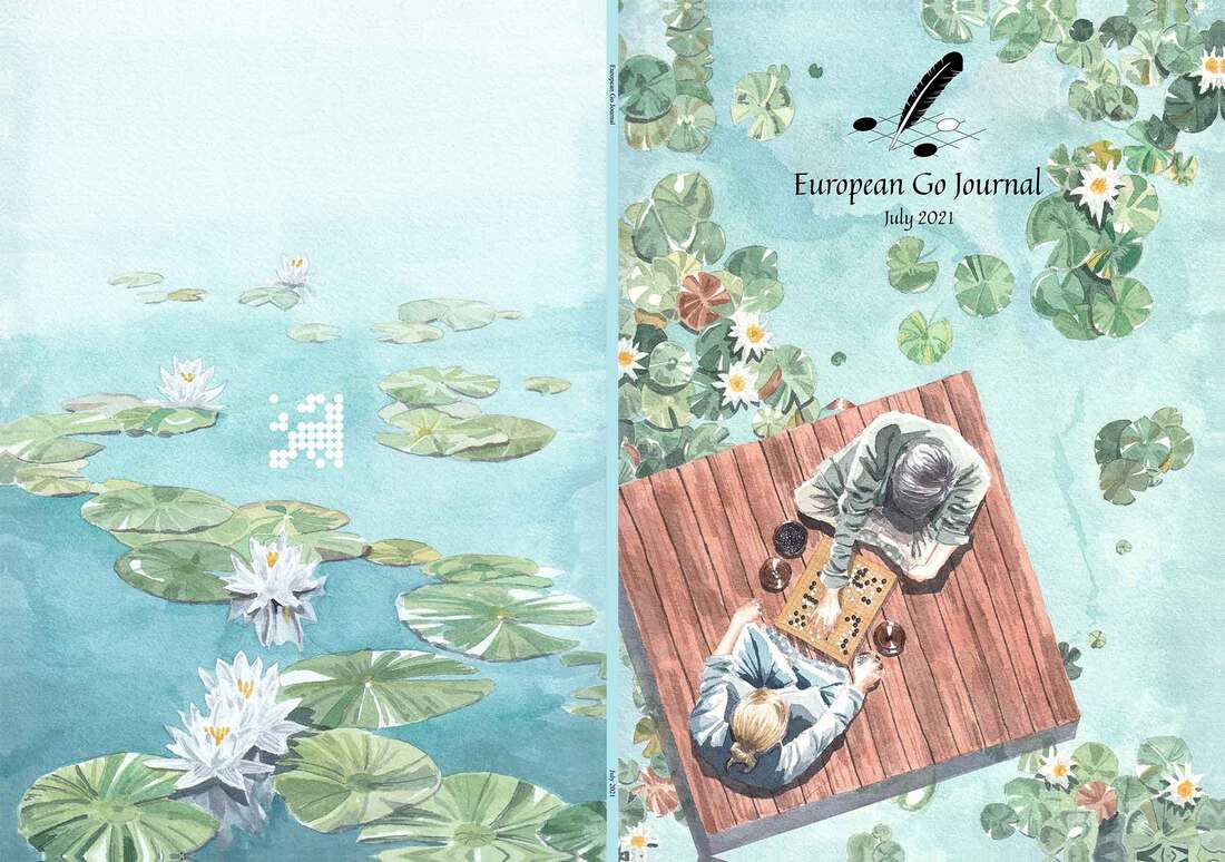
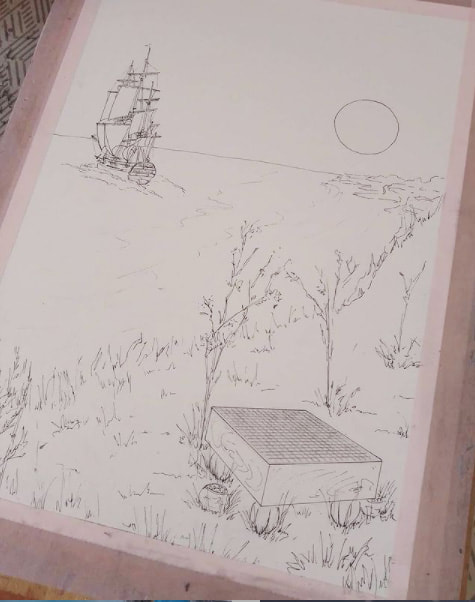
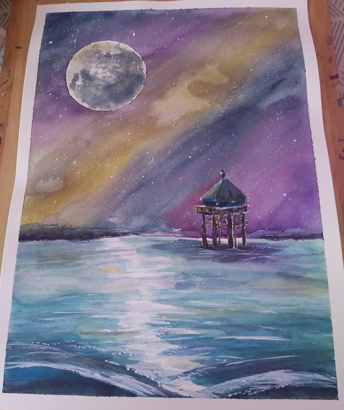
Earlier this year I had my first batch of go mugs made, featuring my go-playing cat. A month and a half ago or so, they sold out and I decided to order more with the upcoming holidays in mind. I then also added two new mugs to the store, sporting my go turtle and butterfly. Recently, that batch also ran out! The cat was the most popular, but the turtle also did really well. Only 3 of the butterfly mugs remained. Today the third run arrived: 15 cats and 10 turtles are now back in business. I chose a fourth design to print on mugs as well: the raccoon-dog that drums its belly. Unfortunately those turned out too dark and too unsharp, so I won't put them in the shop. I am currently getting that misprint rectified and I hope to have a proper version of the raccoon-dog mug up online soon. If you are interested in my go mugs, have a look in my Etsy shop by clicking here. They say that all good things must come to an end. Unfortunately, not long after finishing the October issue of the European Go Journal, my work for the magazine abruptly came to a close after nine successful editions. If it were up to me, my designing and proofreading work for the Journal would have continued on for a long time, but it is what it is. The last three covers I created can be viewed above, and in more detail below, for which I used artworks of three different artists: Alizée Chabin (France), Aleksandra Khokhlova (Russia), and Gonca Mine Çelik (Turkey). Alizée Chabin (Kalyptane) made two illustrations especially for the occasion, adorning the Journal's front and back. In the Art & Photography chapter of the August edition, she writes: "The painting that I made for the front cover is titled “Feeling Cosmic”. We see a go board, standing on top of the cliffs of Saint-Georges-de-Didonne. The position on the board shows the final game of the Transatlantic Professional Go League between Ilya Shikshin 4p and Ryan Li 3p, reviewed in this issue. In the distance, the historic warship “L'Hermione” from the 17th century, whose home port is Rochefort, sails off. I took some liberties in the drawing: the landscape is missing the wooden fishing platforms on the seashore and the plants in the foreground don't actually bloom that way. The painting for the back cover is titled “Le Phare du Bout du Monde”, which translates to “The Lighthouse at the End of the World”. It shows the lighthouse off the coast of La Rochelle, which is a replica of the one in Patagonia (Argentina)." The September cover was special in the sense that it is the only one to date that has a front and back that blend into each other, since they are part of one and the same artwork. I stumbled upon this drawing on Aleksandra Khokhlova's Instagram, and she was kind enough to let the Journal use it. In the magazine, Aleksandra explains where the inspiration for this artwork came from: "This illustration depicts my impressions of a go tournament. Before making it, I took part in the championship of Siberia that brought together around 50 go players with all kinds of personalities: loud and silent, brave and careful, self-confident and modest. I wanted to capture all of this, and so in the breaks between my games I drew sketches in my notebook. After the tournament I colored them at home, and a new artwork was born. To engage with this artwork, you can self-reflect with the question of “What kind of go player am I?” Are you a brooding kangaroo, a happy ferret, a cocky bird, a doubting monkey, a beast that watches, or a hare that sits with its back towards everyone?" For the front cover of October, I used a drawing by professional illustrator Gonca Mine Çelik that I'd first spotted in a Turkish go magazine called Taslı Yol ("Stony Road") a few years ago. In the Journal, Gonca describes her artwork, titled "Emotions of Go": "I struggle a lot during a game of go, and this drawing illustrates how much of a struggle the game can be. Go is a real challenge to one’s character. It provides so many ups-and-downs, and pushes you to your limits. One moment you can feel very happy, then very sad the next. To handle that, you need to be strong mentally. I think every go player will recognize this sentiment and might even be able to identify with my illustration." For the November edition, I had already asked Ofer Zivony (Israel) to create a portrait of Stanislaw Frejlak 1p, the freshly promoted professional go player of the EGF. I also contacted Zoé Constans (France) for the December edition, and I had plans to use a wonderful illustration by Clémence Bécaud (France), sent in by her husband Hugo Maussion (who created the cover of the July edition). My hope is that you'll be able to see their artworks on the covers of future editions. My art lives on inside the Journal for just a little longer. In the November edition, all subscribers that receive a physical copy will also receive a Christmas card with it, designed by yours truly. There are six variations of the card, making each one a limited edition collector's item (see below). So long, EGJ, and thanks for all the fish! The cover of the 2020-2021 Dutch Go Yearbook is the sixth consecutive one in a series I have made for the Nederlandse Go Bond. The covers feature animals, go positions and paper marbling.
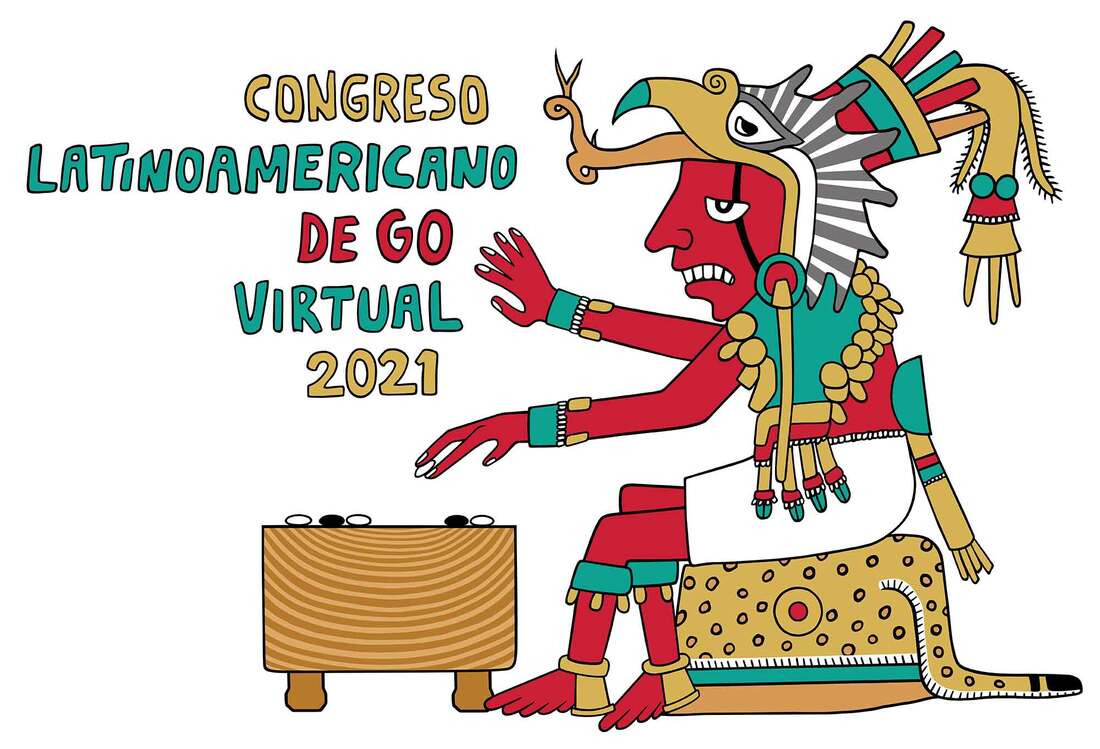
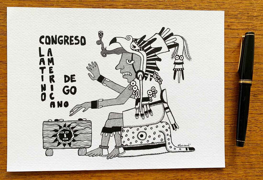
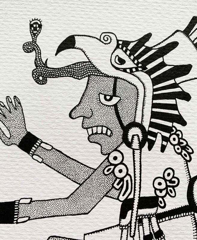
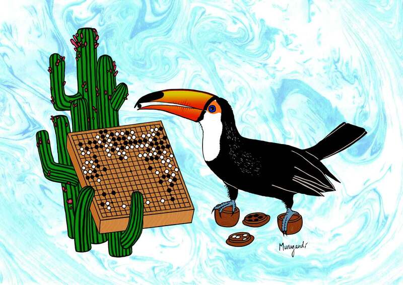
The toucan artwork is a creation from 2019. The organization of the Latin American Go Congress commissioned me to make a drawing for its edition that year, and to print 1000 postcards for the event that took place in the Nihon Ki-in da América do Sul in São Paulo, Brazil. The toucan is a bird species indigenous to large parts of South America, and is taking the place of legendary go player Honinbo Shusaku in this design. The go match in the artwork is one of the most famous ones ever played, known as "The Ear Reddening Game". The match is at its most vital stage and the toucan is about to play a move that went down in history. Reportedly, when Shusaku played move 127, it mentally shook his opponent, Gennan Inseki, so much so that his ears turned red. If you look carefully at the cacti in the drawing, you can see that their fruit are starting to blush. I'm grateful to the NGoB; this series of yearbooks is becoming quite something and I hope future Dutch go players will enjoy my covers as much as I do. The 2020-2021 edition will be printed and distributed among the members of the Dutch Go Association in early 2022. I have created a new go-related artwork! The occasion is a logo competition for the 2021 edition of the Congreso Latinoamericano de Go, a go tournament for Latin American players that will take place online in October this year. Requirements for the logo competition were to include a visual reference to the game of go and a representation of Latin American culture. I immediately thought of the ancient Mesoamerican civilizations, such as the Incas, Mayans, Aztecs, Olmecs and Mixtecs, and started looking into their art. Particularly some of the Mixtec drawings resonated with me, and I used them as inspiration. In the logo we see a richly dressed figure with eagle headgear similar to that of Aztec eagle warriors, placing a stone on the go board. The color palette is also taken from old iconography, with the skin being red, and the clothing and jewelry being white, turquoise and golden. The figure is seated on a stool covered with a jaguar hide; both the eagle and the jaguar were symbols of power and divinity in ancient Mesoamerica. For logos and trademarks I often first draw a rough sketch with pen on paper. I scan that line-drawing, then trace it on the computer and refine it. In this case, after I finished the color version on the computer, I still had inspiration left and came back to my original line-art on paper. You can see the final result of the black and white original above, after I added detail to it. Lately I make most of my design work in Photoshop, but when I draw by hand on paper I feel more free and creative. Drawing by hand can be almost meditative for me: I lose myself in the flow of creation and the details of the artwork. The deadline for the logo competition was 5th of September, and its winner will be announced on the 8th. Fingers crossed! (EDIT on 20th of September 2021: Unfortunately I did not win, but my design did get an honorable mention)
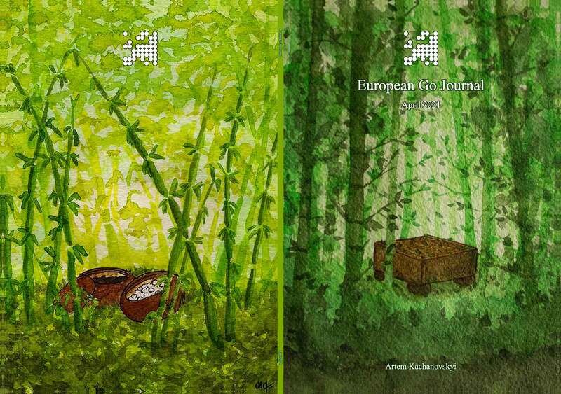
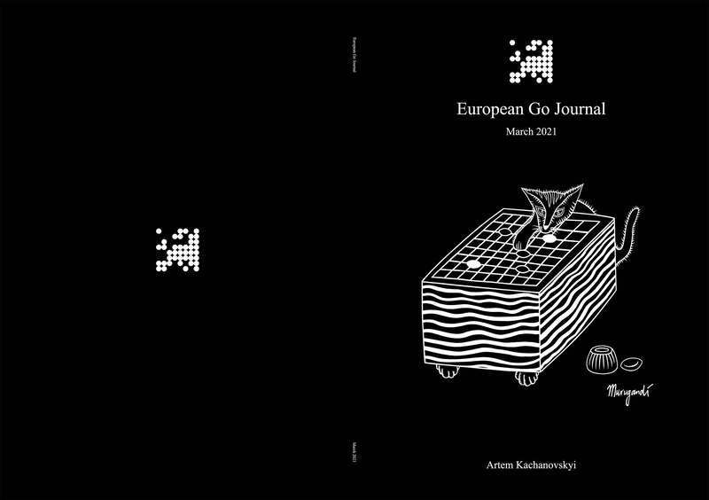
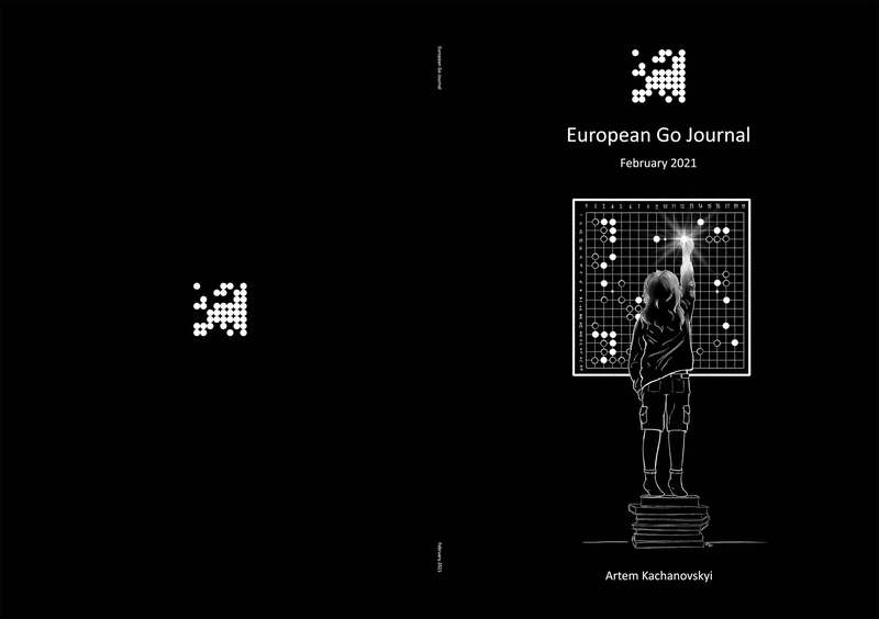
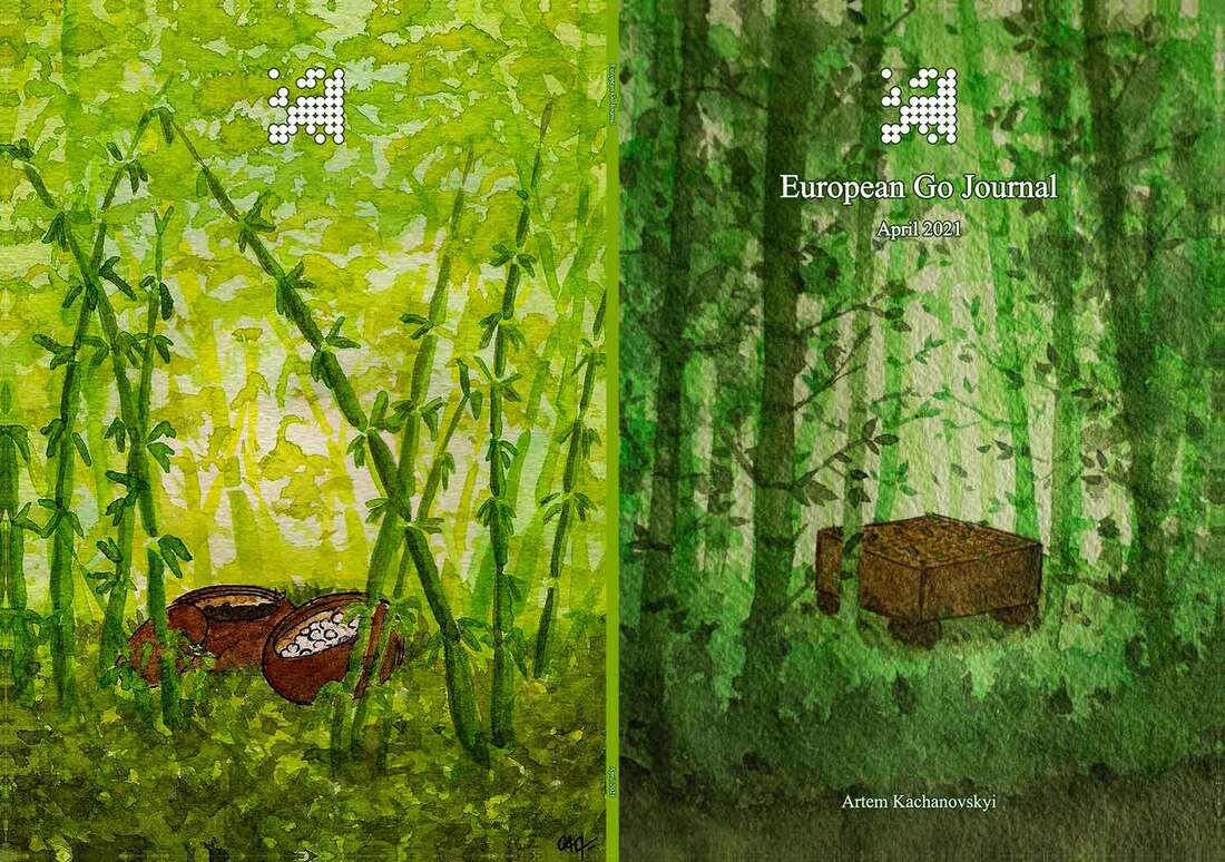
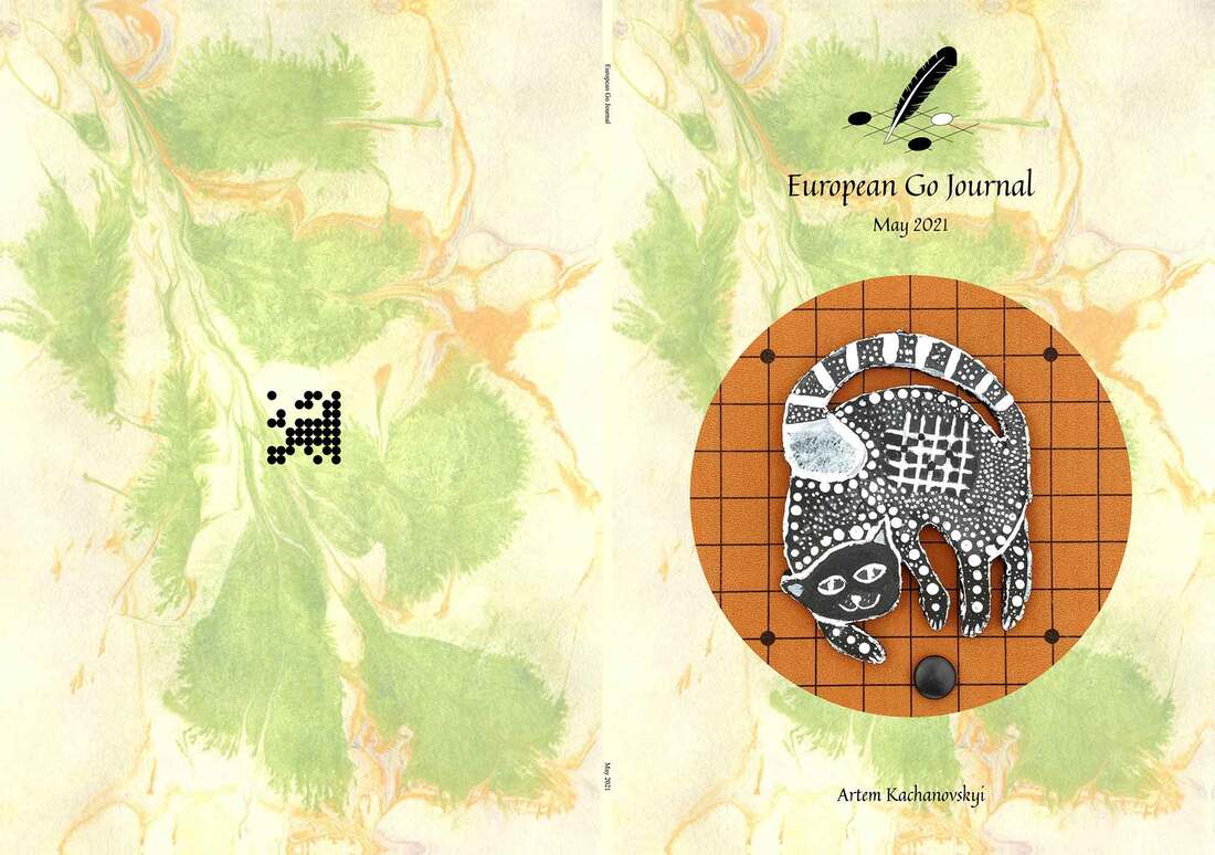
This is not the first time that I made artwork for the Latin American Go Congress. In 2019 the organizers of the congress commissioned me to make a drawing, and to print 1000 postcards for the event that took place in the Nihon Ki-in da América do Sul in São Paulo, Brazil. I drew a toucan (see images above), a bird species indigenous to large parts of South America, taking the place of legendary go player Honinbo Shusaku. The go match in the artwork is one of the most famous ones ever played, known as "The Ear Reddening Game". The match is at its critical stage and the toucan is about to play a move that went down in history. Reportedly, when Shusaku played move 127, it mentally shook his opponent, Gennan Inseki, so much so that his ears turned red. If you look carefully at the cacti in the drawing, you can see that their fruit are starting to blush. Since February 2021 I've been working together with Artem Kachanovskyi 2p to create the European Go Journal, a monthly magazine about the game of go. The magazine includes news from recent European go events, notable news from the Asian continent where pro tournaments are more frequent, game commentaries, interviews, and recurring chapters like "Art & Photography", "World of Tesuji" by Alexandre Dinerchtein 3p and "Thirty-Six Stratagems" by Dai Junfu 8d. My tasks for the journal are varied. I am the lead proofreader/editor, I adjust details of the layouting to improve looks, and I design the cover of each edition. The creation of the covers is a lot of fun. I try to use different go-related artwork from as many different people as possible to showcase the diversity of the go community. This blog post looks back on the covers that I've made so far and gives a sneak peek into covers that are yet to come. Covers so far: February - July 2021So far six editions have been published, with artworks by the following people:
Covers yet to comeBelow a sneak peek of what is yet to come.
Currently Alizée Chabin (from France), who is also known online as Kalyptane, is working on a custom cover with a nautical theme - front and back - for the August 2021 edition. For the September and October issues, I found candidates in two amazing artists from Russia and Turkey. September will most likely have a cover made by Aleksandra Khokhlova, whose art I spotted on her Instagram account. The October issue will suitingly be adorned with autumn colors - I saw this illustration of a girl fighting off her mental demons in a Turkish go magazine called Tasli Yol (translates as "Stony Road"). That was a few years ago, and it was printed as a small picture. It is made by professional illustrator Gonca Mine Çelik and deserves to be in the spotlight. Peter Brouwer and I have been working on a go-book this year which will be published in a couple of months by the Kiseido Publishing Company. The book will be called Weird and Wonderful - Vol. 1. Extraordinary Moves by Professional Players. This will be the first volume in a series of three, with the second volume focusing on unusual joseki and techniques, and the third volume being a collection of spectacular go problems.
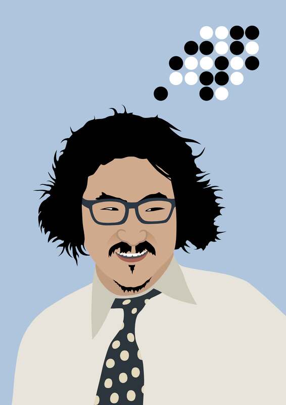
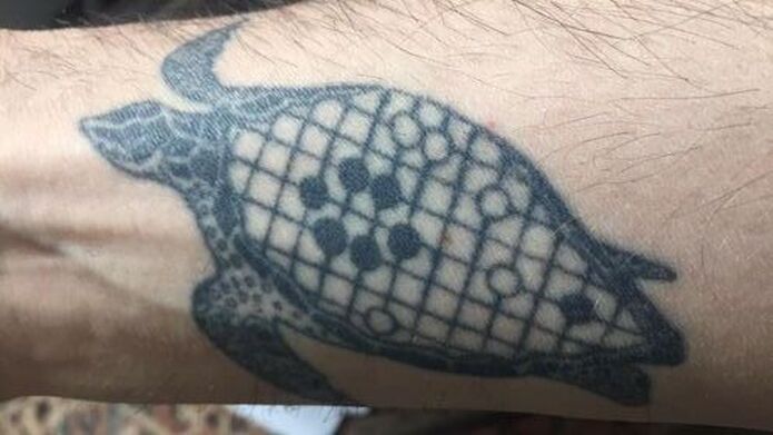
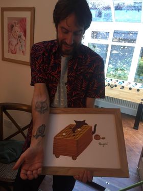
I've been thinking about the cover for volume 1 and recently came up with the concept that you see above. What are we looking at? An eccentric man, without a doubt. But not just any man. It is Cho Chikun 9-dan, legendary go player of the Nihon Ki-in, who came to Japan from South Korea as a young boy and grew to become one of the best and most exciting players of the country. Cho is well-known for his cheekiness and sharp play on the go board, and especially for his ability to make life in confined spaces. The go position above him refers to one of the chapters of the book titled "Double Ladder Breakers that Calmed the Gods". A double ladder breaker cancels out two ladders of the opponent simultaneously and rarely occurs. It is known in Japanese as 鎮神頭 (Chinshinto), stemming from the Chinese 镇神头 (Zhèn shén tóu). Its Korean name is translated from Japanese to 진신두 (Jin shin-doo). Three professional games that include this rare move are analyzed in the chapter, of which one was played by Cho Chikun 9-dan against Kobayashi Satoru 9-dan for the 20th Kisei title match in January 1996. It is not yet clear if this design will make the cover, but I am happy with the new artwork. I am contemplating doing more go-portraits in this style. Is there a player that you'd like me to portray? Let me know. My mind is blown. I never thought that someday my art would be tattooed on someone's body. But it happened. Jamie Coulthard from the United Kingdom had one of my go-related artworks tattooed on his arm. It's a surreal and humbling feeling. Thank you, Jamie, you're rocking it.
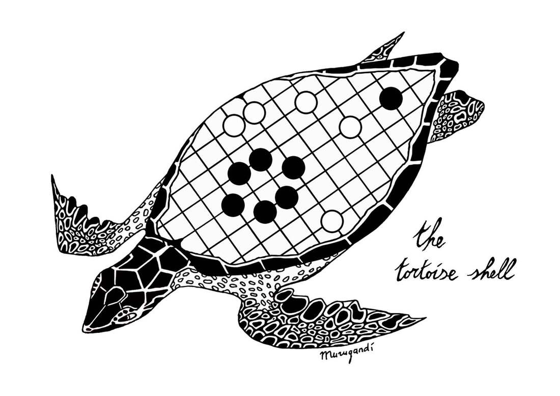
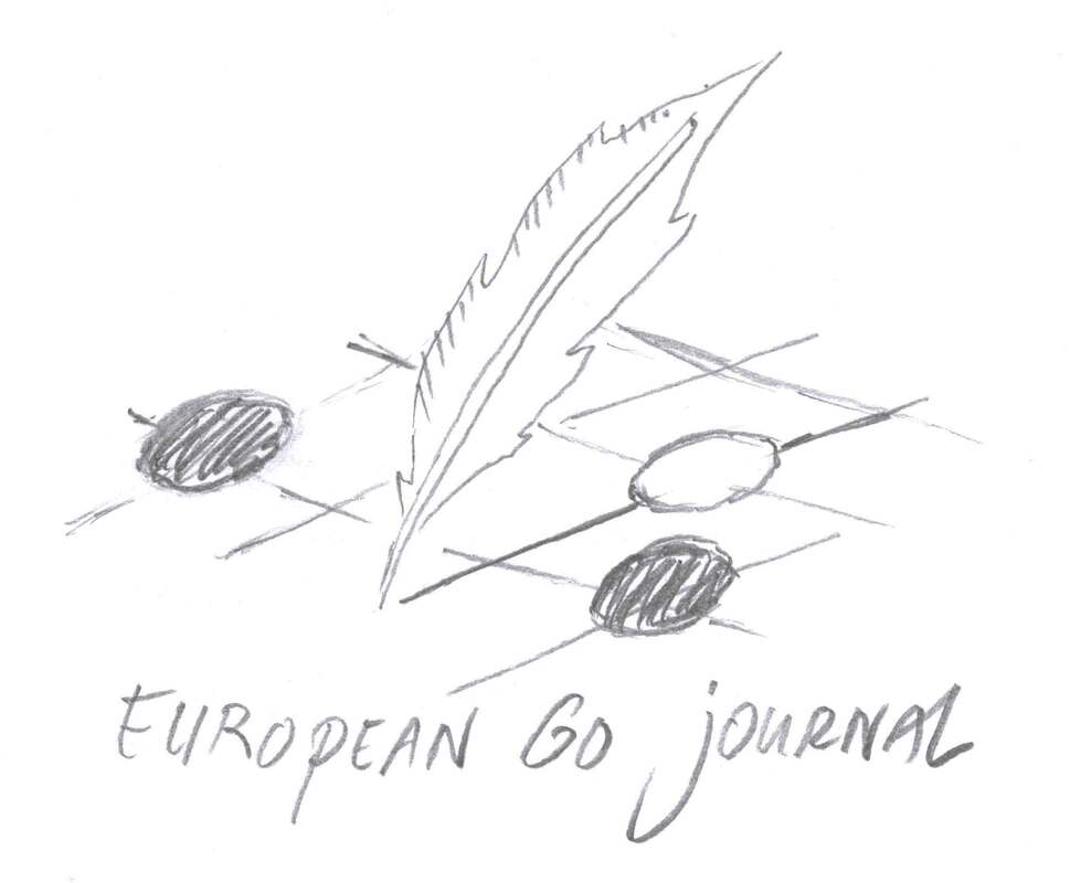
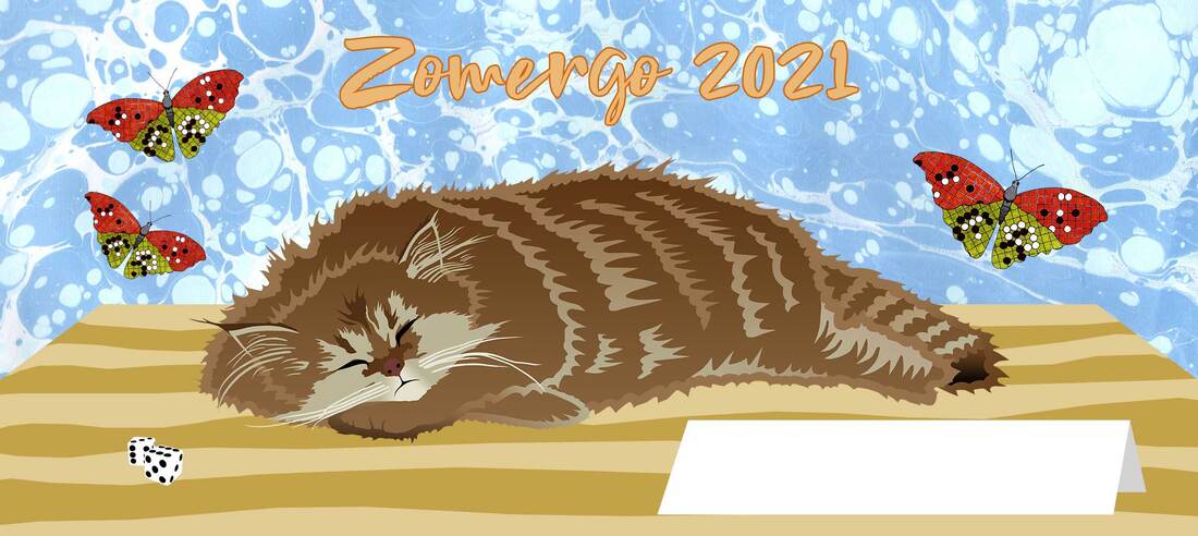
This go shape - the black stones - is called "kame no kou" in Japanese (亀の甲), translating to "the tortoise shell". Its Chinese and Korean names mean the same (龟甲 and 거북등 respectively). My drawing is a pun, showing "the tortoise shell" on the shell of a tortoise. I made the original black and white drawing with pen on paper in 2014. It is owned by Dutch go-collector Theo van Ees. I was commissioned to make a logo for the European Go Journal. The quill represents the written word. It draws a line on the go board, symbolizing the creativity and inspiration we take away from the journal, ready to be used in our own games of go. Artem Kachanovskyi and I brainstormed about the design: it was to be simple but easily recognizable in different sizes, since it will be used on the new website for the journal as well as on the cover of each edition. We sent sketches back and forth. My initial idea was to have a fountain pen draw a go stone on a board. My second idea was for the pen to shoot or drip drops of ink that would shape into go stones. Artem preferred a classic quill over a fountain pen and showed me a picture of a quill drawing a line. This gave me the idea of the quill drawing one of the lines of the go board, which form the intersections on which stones are placed. This felt like a better metaphor for the journal, with the quill "preparing" the setting for us to play on. I wanted the font of the text to represent the classy, old-fashioned atmosphere of the drawing and after confirming with Artem, we chose "Quintessential" for the job. I made a color version and a black and white version for the logo. In the end I think I prefer the b&w one, as its go board feels less defined, which makes the movement of the quill more apparent. Artem also asked if I could design a favicon for the website, which ended up as a cross-cut shape of four go stones. This was a shape that he had suggested during the creation of the logo as well, and it is very characteristic for the complexity of the game of go, because it usually indicates a difficult fight. Artem and I are currently working on the fourth edition of the magazine, the May 2021 print, which will be published in the beginning of June. If you are interested to get a copy of the European Go Journal, have a look at its Patreon page. I made a design for Zomergo, a camp for go / weiqi / baduk players in the Netherlands that takes place in August every year. Although the game of go is the common denominator of the participants, lots of other board games are played during this event.
My design is for the "mug competition" of Zomergo: each year people can send in their designs. The winning design will be printed on mugs. Each participant will receive a mug with that design and their name on it. The white paper sign in my drawing is meant to write those names on. If you are interested in the event, check it out at https://zomergo.nl/ |
AuthorWelcome to my website! My name is Kim Ouweleen, my artist pseudonym is Murugandi. I am an illustrator, author, proofreader and go teacher from Amsterdam. Do you want to support my art? I take on private commissions.
On Etsy I sell prints, postcards and mugs.
On Spreadshirt I sell clothing, mouse pads, stickers & more.
Want to stay updated on my latest art? Click below to subscribe to my newsletter.
You can view my previous newsletters here.
Archives
December 2023
Categories
All
|
