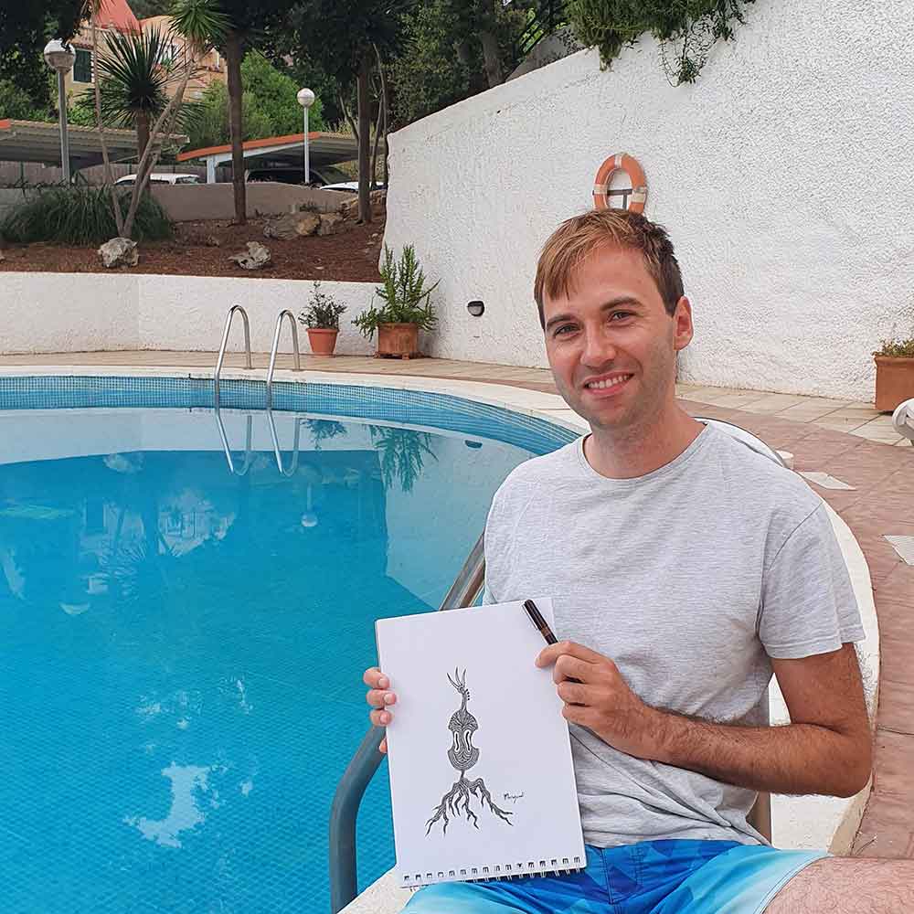
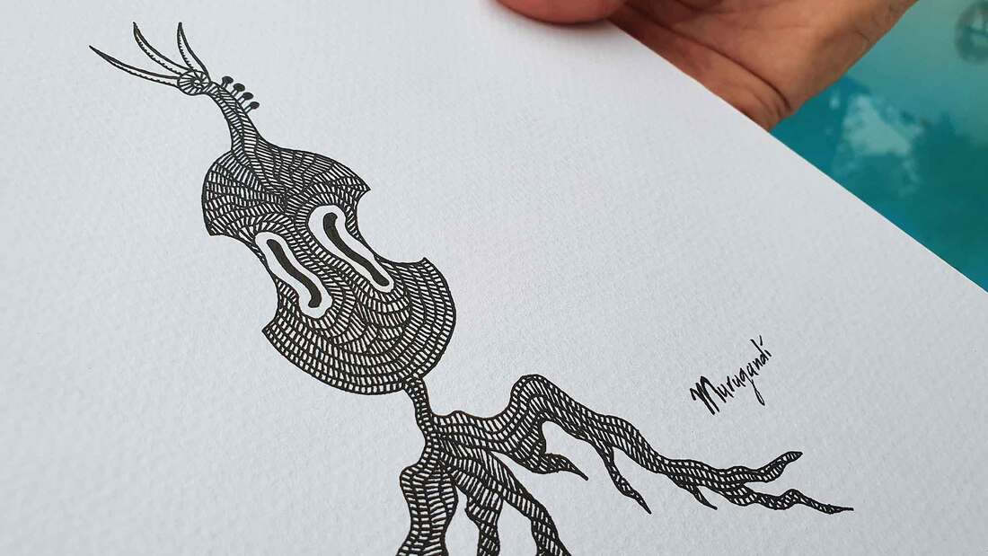
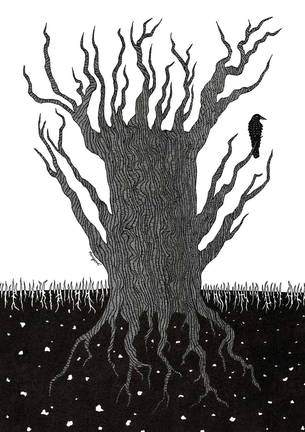
 Yesterday I published Murugandi Newsletter #2. You can view it here, and subscribe if you are interested. If you do subscribe, expect to receive a newsletter in your inbox once a month or so. What's in it the latest newsletter? - A new drawing I made on vacation in Menorca, titled "Roots in Music" (see above). It is done with ink on watercolor paper, size 18.2 x 25.2 cm, and is for sale for €25! Inspired by my sister Philo Ouweleen, I plan to do Weekly Drawings, which will be small in size and will be sold for €25 each. The money I gain from the sales will be spent to buy art from others in order to support the cultural sector. - Background info about the September issue of the European Go Journal. - A tattoo of my artwork "The Tortoise Shell". - The rare Meijin screen-prints by German artist Harald Germer, for sale in my Etsy shop. - Update on the logo competition of the Latinamerican Go Congress. - News about my participation in the Dutch Foosball Championship (NK Tafelvoetbal 2021).
0 Comments
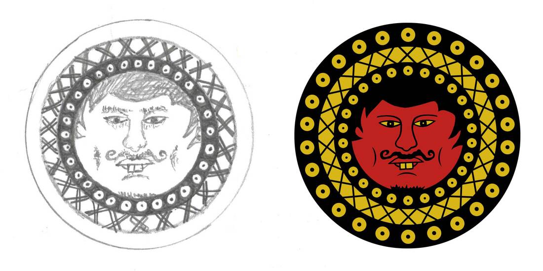
I have created a new go-related artwork! The occasion is a logo competition for the 2021 edition of the Congreso Latinoamericano de Go, a go tournament for Latin American players that will take place online in October this year. Requirements for the logo competition were to include a visual reference to the game of go and a representation of Latin American culture. I immediately thought of the ancient Mesoamerican civilizations, such as the Incas, Mayans, Aztecs, Olmecs and Mixtecs, and started looking into their art. Particularly some of the Mixtec drawings resonated with me, and I used them as inspiration. In the logo we see a richly dressed figure with eagle headgear similar to that of Aztec eagle warriors, placing a stone on the go board. The color palette is also taken from old iconography, with the skin being red, and the clothing and jewelry being white, turquoise and golden. The figure is seated on a stool covered with a jaguar hide; both the eagle and the jaguar were symbols of power and divinity in ancient Mesoamerica. For logos and trademarks I often first draw a rough sketch with pen on paper. I scan that line-drawing, then trace it on the computer and refine it. In this case, after I finished the color version on the computer, I still had inspiration left and came back to my original line-art on paper. You can see the final result of the black and white original above, after I added detail to it. Lately I make most of my design work in Photoshop, but when I draw by hand on paper I feel more free and creative. Drawing by hand can be almost meditative for me: I lose myself in the flow of creation and the details of the artwork. The deadline for the logo competition was 5th of September, and its winner will be announced on the 8th. Fingers crossed! (EDIT on 20th of September 2021: Unfortunately I did not win, but my design did get an honorable mention)
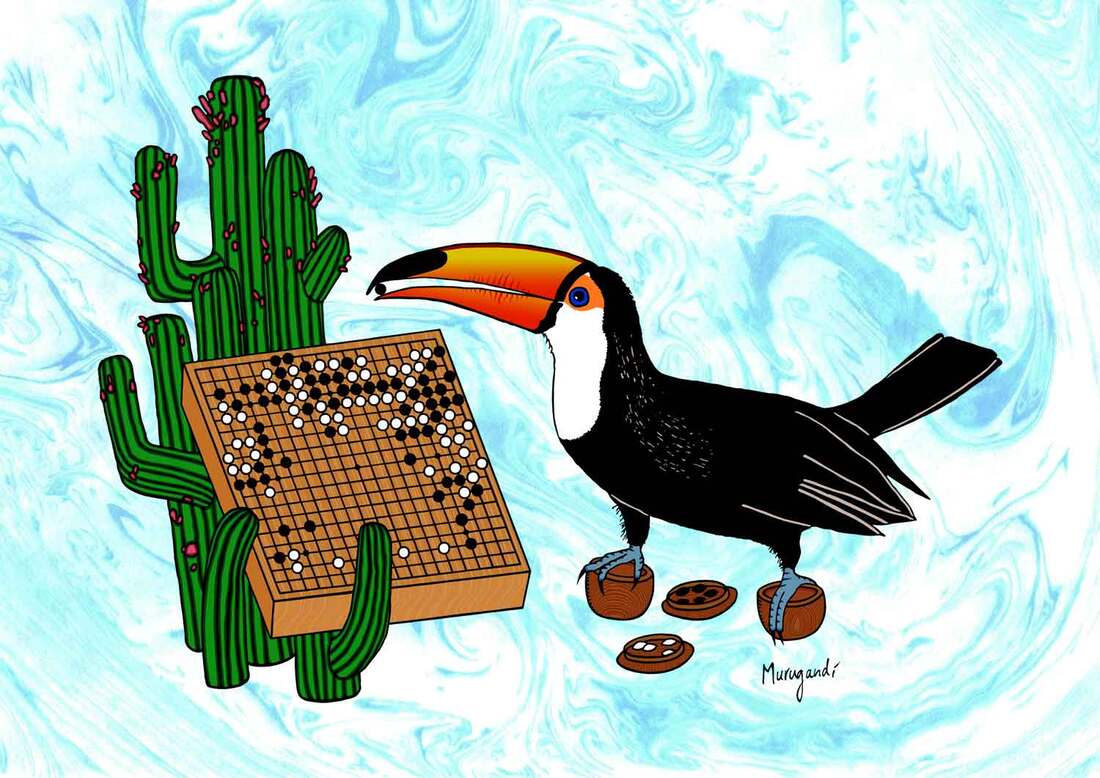
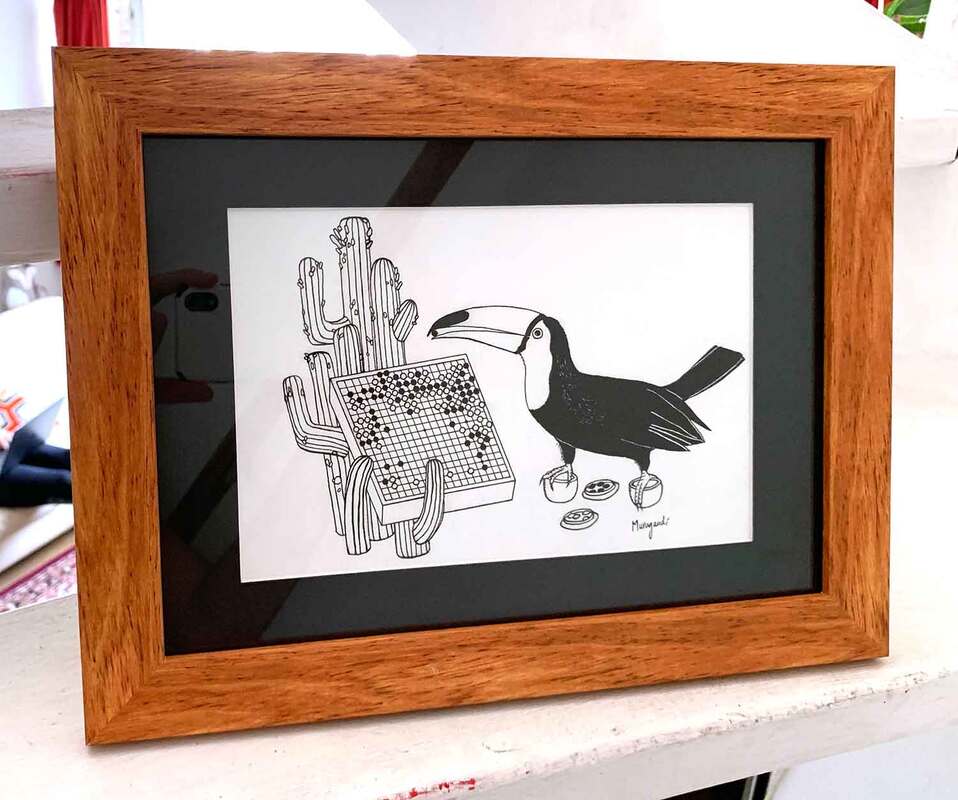
This is not the first time that I made artwork for the Latin American Go Congress. In 2019 the organizers of the congress commissioned me to make a drawing, and to print 1000 postcards for the event that took place in the Nihon Ki-in da América do Sul in São Paulo, Brazil. I drew a toucan (see images above), a bird species indigenous to large parts of South America, taking the place of legendary go player Honinbo Shusaku. The go match in the artwork is one of the most famous ones ever played, known as "The Ear Reddening Game". The match is at its critical stage and the toucan is about to play a move that went down in history. Reportedly, when Shusaku played move 127, it mentally shook his opponent, Gennan Inseki, so much so that his ears turned red. If you look carefully at the cacti in the drawing, you can see that their fruit are starting to blush. 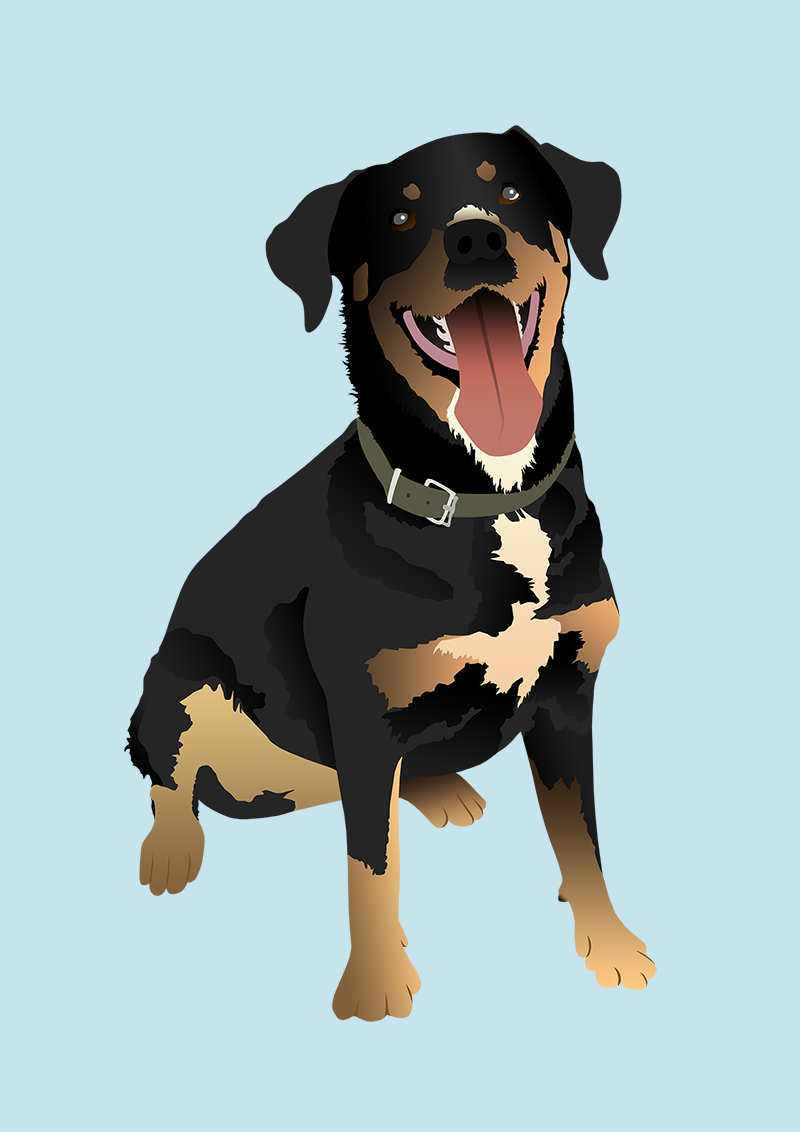 Recently Harmen, a foosball buddy of mine, was in the hospital for surgery. My friend Bart had the great idea to send him one of my cards with a "get better soon" from us. Then I thought: why not make art specifically for him? Recently Harmen's dog and best friend Jillian passed away, and after posing the idea to some people close to Harmen and getting the green signal, I decided to go for it. I had just one photo from Whatsapp to work with and I took me two days to finish the artwork. This was the result.
A few days after we posted the card to the hospital we got a message from Harmen. He loved it! 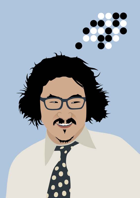 Peter Brouwer and I have been working on a go-book this year which will be published in a couple of months by the Kiseido Publishing Company. The book will be called Weird and Wonderful - Vol. 1. Extraordinary Moves by Professional Players. This will be the first volume in a series of three, with the second volume focusing on unusual joseki and techniques, and the third volume being a collection of spectacular go problems.
I've been thinking about the cover for volume 1 and recently came up with the concept that you see above. What are we looking at? An eccentric man, without a doubt. But not just any man. It is Cho Chikun 9-dan, legendary go player of the Nihon Ki-in, who came to Japan from South Korea as a young boy and grew to become one of the best and most exciting players of the country. Cho is well-known for his cheekiness and sharp play on the go board, and especially for his ability to make life in confined spaces. The go position above him refers to one of the chapters of the book titled "Double Ladder Breakers that Calmed the Gods". A double ladder breaker cancels out two ladders of the opponent simultaneously and rarely occurs. It is known in Japanese as 鎮神頭 (Chinshinto), stemming from the Chinese 镇神头 (Zhèn shén tóu). Its Korean name is translated from Japanese to 진신두 (Jin shin-doo). Three professional games that include this rare move are analyzed in the chapter, of which one was played by Cho Chikun 9-dan against Kobayashi Satoru 9-dan for the 20th Kisei title match in January 1996. It is not yet clear if this design will make the cover, but I am happy with the new artwork. I am contemplating doing more go-portraits in this style. Is there a player that you'd like me to portray? Let me know.
I was commissioned to make a logo for the European Go Journal. The quill represents the written word. It draws a line on the go board, symbolizing the creativity and inspiration we take away from the journal, ready to be used in our own games of go. Artem Kachanovskyi and I brainstormed about the design: it was to be simple but easily recognizable in different sizes, since it will be used on the new website for the journal as well as on the cover of each edition. We sent sketches back and forth. My initial idea was to have a fountain pen draw a go stone on a board. My second idea was for the pen to shoot or drip drops of ink that would shape into go stones. Artem preferred a classic quill over a fountain pen and showed me a picture of a quill drawing a line. This gave me the idea of the quill drawing one of the lines of the go board, which form the intersections on which stones are placed. This felt like a better metaphor for the journal, with the quill "preparing" the setting for us to play on. I wanted the font of the text to represent the classy, old-fashioned atmosphere of the drawing and after confirming with Artem, we chose "Quintessential" for the job. I made a color version and a black and white version for the logo. In the end I think I prefer the b&w one, as its go board feels less defined, which makes the movement of the quill more apparent. Artem also asked if I could design a favicon for the website, which ended up as a cross-cut shape of four go stones. This was a shape that he had suggested during the creation of the logo as well, and it is very characteristic for the complexity of the game of go, because it usually indicates a difficult fight. Artem and I are currently working on the fourth edition of the magazine, the May 2021 print, which will be published in the beginning of June. If you are interested to get a copy of the European Go Journal, have a look at its Patreon page.
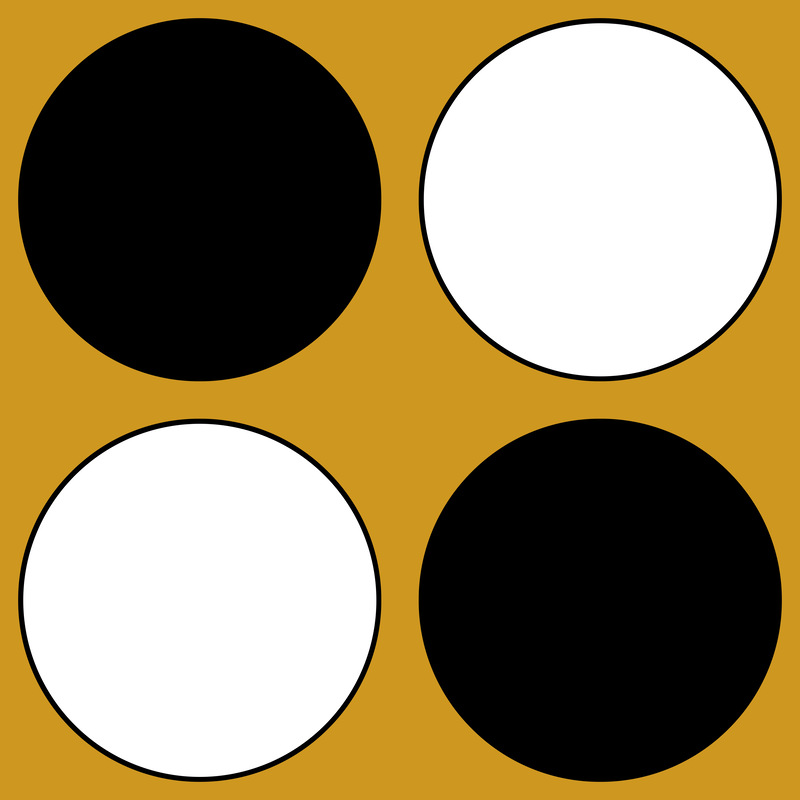
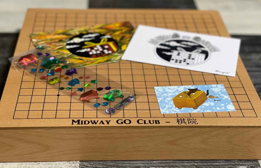
One of my customers on Etsy, William Sheehan, was happy with his order and asked me if I'd consider doing a private commission for him. William is 54 years old and has 20+ years of experience in chess under his belt. Only recently, about two months ago, he got into go and has already reached the level of 14-kyu. Previously William ran a chess club and as he is now fully submerged into go, and plans to start a go club. He showed me the logo of his chess club that he made himself (see picture below), in which he incorporated the blue and red colors of the flag of Chicago. The stars in the top left corner are taken from the same flag and the buildings in the background form the skyline of the city. We exchanged some ideas and soon I understood that the go logo was to be quite similar, but that I was free to give it my personal twist. William told me that he lives close to the Midway International Airport, and that's where the name of his club comes from. Soon after, I got the idea to include an airplane in the design and have it take off from the go board. William had also mentioned the tarmac of the airport and this gave me an idea for the go-position: the go stones shown in the logo form a ladder that resembles a tarmac and emphasizes the movement of the plane. The ladder is good for White: White is in atari, but can move out with the next move, connecting up to his corner stones and breaking free, just like the plane. Interestingly, although the blue of the plane looks darker than the blue of the sky, they are in fact the same color. It is an optical illusion caused by the black skyline. Another optical illusion is at play in the go stones: did you know that when go stones are produced, the white stones are made slightly smaller than the black ones? This is done because white objects seem larger to our eyes. I experienced that first hand during the design process: when using same-sized stones for black and white, the white stones appeared much larger, and I had to reduce them for a balanced composition. For the font of the letters we ended up chosing a mechanical-style font called 'Noise Machine'. If I'm ever in Chicago, I look forward to dropping by at the Midway Go Club.
 During high school one of my classmates introduced me to Italian playing cards and in specifically to the glorious game of scopa. I immediately liked the artwork of the cards, with its denari (coins), coppe (cups), bastoni (clubs) and spade (swords). I've been playing the game ever since with my girlfriend and close friends. Whenever I go on a trip or a holiday, the deck of Italian cards always travels along. I've long had the idea of creating my own scopa deck, and talked about it many times with my friend Jan Hootsmans. We used to draw and write together during high school and we decided we're finally going to take this project seriously. Jan lives in Canada, so it's logistically a bit challenging, but we'll make it work.
Above is the first step: a design for the coins, perfected in Photoshop from a sketch I did many years ago, when Jan was still living in Amsterdam. I made a logo for IGLO - Internetowa Go Liga O!
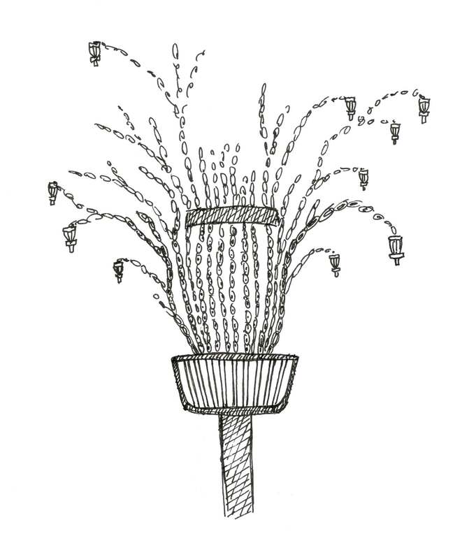
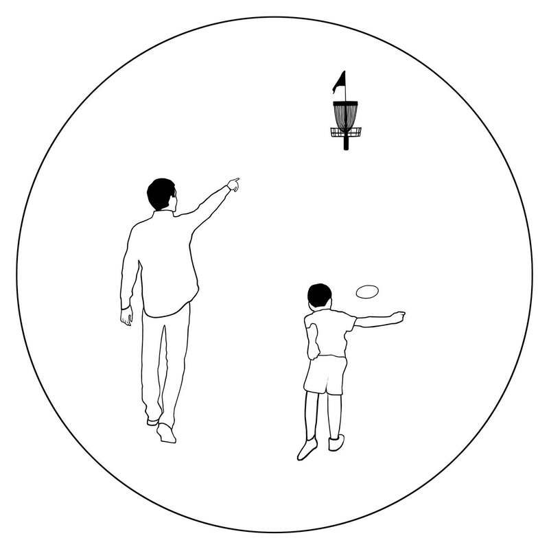
IGLO is an online go league that was started around the time the covid-19 pandemic began. The league was created by Cezary Czernecki, supported by the Polish Go Association, and is now running its 9th season with 57 players competing. Participation is free of charge and most participants are from Poland and Ukraine, but anybody is welcome to take part. Each group consists of 8 players, in which each player plays against seven others, one game per week, The players compete to promote to the higher rated groups and, when results are suboptimal, can also fall down to the groups below. When a new player joins, he/she will be placed in a suitable group relative to their playing strength. IGLO includes regular lessons and game commentaries by top European players Stanislaw Frejlak 7 dan and Lukas Podpera 7 dan. You can find out more about IGLO on its website here. 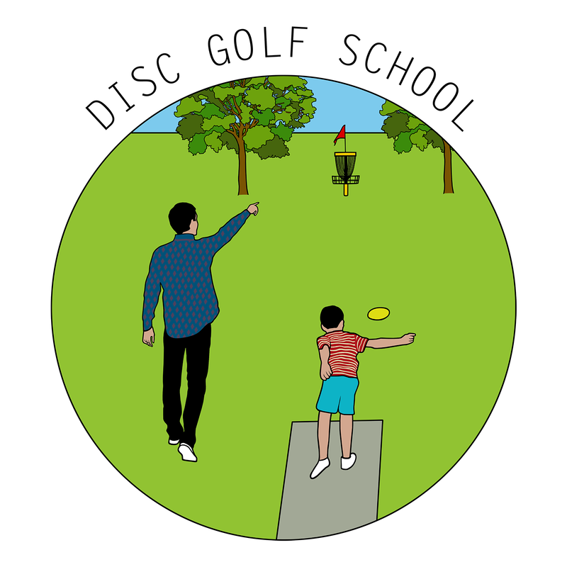 Previously, I designed a disc golf winter logo for the guys from Next Move in Groningen. This time around, they asked me to make a logo for Disc Golf School, a new initiative to teach disc golf to kids and grow the sport throughout the Netherlands. I had two concept sketches that I pitched to Next Move: - A basket with chains that grow out like the branches of a tree, forming new baskets as fruits of labor. Trees are often used as a symbol of wisdom and physical and spiritual nourishment. The multiplication of the baskets is a metaphor of the passing on of knowledge and the creation of new disc golf players. - A teacher and a pupil in a disc golf environment. The teacher shows the student where to throw and the pupil executes the shot. This was my literal translation of the idea of a school.
Although Next Move liked the idea of multiplication, they chose the second design because of its more professional feel. I added trees, a teepad, some details, colour and of course the text. Next Move also requested a black and white version. No problemo guys, roger that. 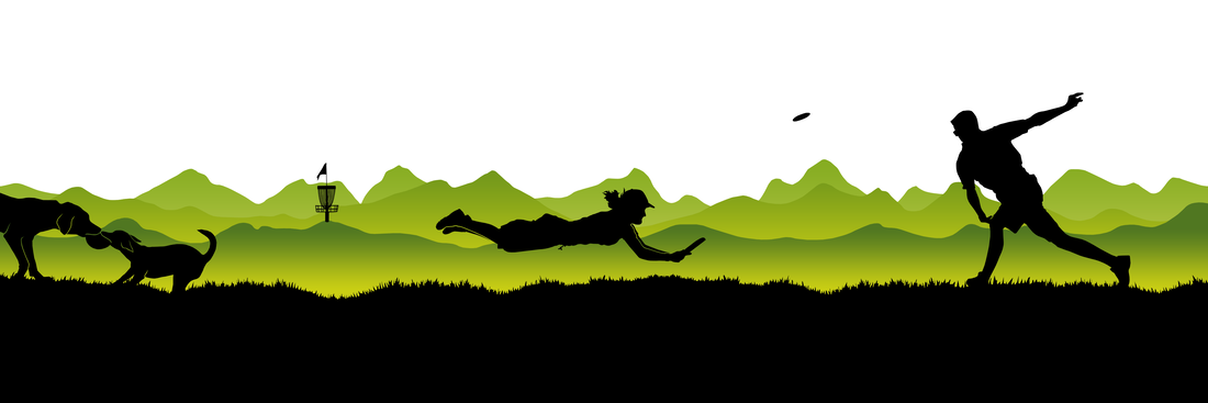 I made a footer for the website of Frisbeewinkel. On request, the footer incorporates designs I previously made for the category buttons on the site of Disc Golf, Ultimate Frisbee and Dog Frisbee. This represents the range of frisbee sports the company stands for and the articles the website sells. The green mountains in the background have a similar colour to the thumbnails I made and are in line with the colours of Frisbeewinkel's logo.
|

AuthorWelcome to my website! My name is Kim Ouweleen, my artist pseudonym is Murugandi. I am an illustrator, author, proofreader and go teacher from Amsterdam. Do you want to support my art? I take on private commissions.
On Etsy I sell prints, postcards and mugs.
On Spreadshirt I sell clothing, mouse pads, stickers & more.
Want to stay updated on my latest art? Click below to subscribe to my newsletter.
You can view my previous newsletters here.
Archives
December 2023
Categories
All
|