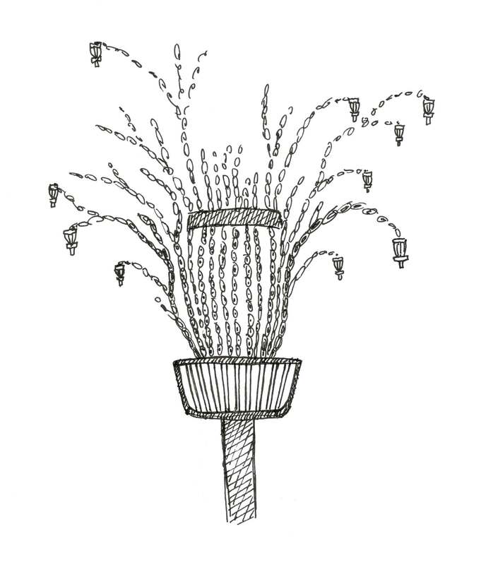
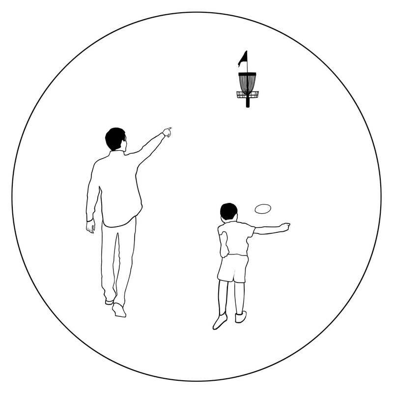
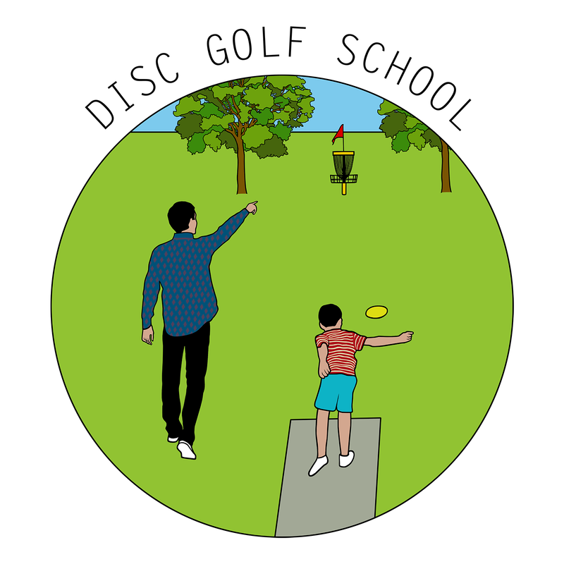
 Previously, I designed a disc golf winter logo for the guys from Next Move in Groningen. This time around, they asked me to make a logo for Disc Golf School, a new initiative to teach disc golf to kids and grow the sport throughout the Netherlands. I had two concept sketches that I pitched to Next Move: - A basket with chains that grow out like the branches of a tree, forming new baskets as fruits of labor. Trees are often used as a symbol of wisdom and physical and spiritual nourishment. The multiplication of the baskets is a metaphor of the passing on of knowledge and the creation of new disc golf players. - A teacher and a pupil in a disc golf environment. The teacher shows the student where to throw and the pupil executes the shot. This was my literal translation of the idea of a school.
Although Next Move liked the idea of multiplication, they chose the second design because of its more professional feel. I added trees, a teepad, some details, colour and of course the text. Next Move also requested a black and white version. No problemo guys, roger that.
0 Comments
|

AuthorWelcome to my website! My name is Kim Ouweleen, my artist pseudonym is Murugandi. I am an illustrator, author, proofreader and go teacher from Amsterdam. Do you want to support my art? I take on private commissions.
On Etsy I sell prints, postcards and mugs.
On Spreadshirt I sell clothing, mouse pads, stickers & more.
Want to stay updated on my latest art? Click below to subscribe to my newsletter.
You can view my previous newsletters here.
Archives
June 2024
Categories
All
|