|
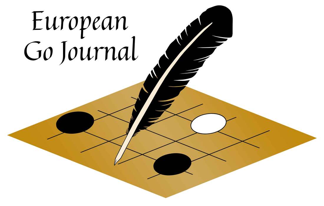
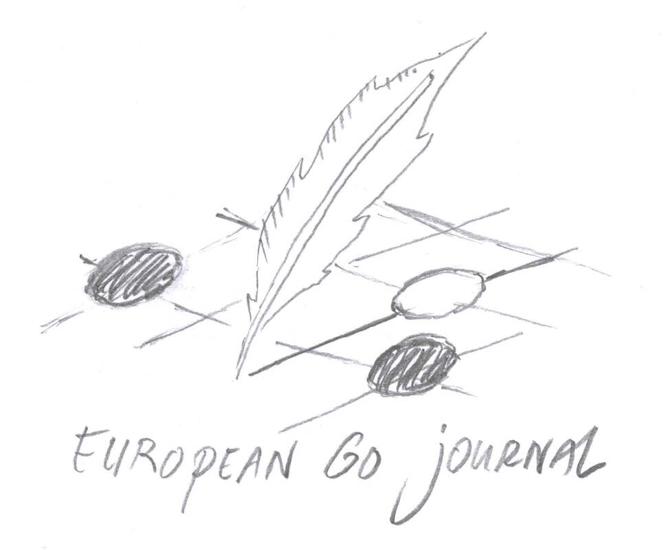
I was commissioned to make a logo for the European Go Journal. The quill represents the written word. It draws a line on the go board, symbolizing the creativity and inspiration we take away from the journal, ready to be used in our own games of go. Artem Kachanovskyi and I brainstormed about the design: it was to be simple but easily recognizable in different sizes, since it will be used on the new website for the journal as well as on the cover of each edition. We sent sketches back and forth. My initial idea was to have a fountain pen draw a go stone on a board. My second idea was for the pen to shoot or drip drops of ink that would shape into go stones. Artem preferred a classic quill over a fountain pen and showed me a picture of a quill drawing a line. This gave me the idea of the quill drawing one of the lines of the go board, which form the intersections on which stones are placed. This felt like a better metaphor for the journal, with the quill "preparing" the setting for us to play on. I wanted the font of the text to represent the classy, old-fashioned atmosphere of the drawing and after confirming with Artem, we chose "Quintessential" for the job. I made a color version and a black and white version for the logo. In the end I think I prefer the b&w one, as its go board feels less defined, which makes the movement of the quill more apparent. Artem also asked if I could design a favicon for the website, which ended up as a cross-cut shape of four go stones. This was a shape that he had suggested during the creation of the logo as well, and it is very characteristic for the complexity of the game of go, because it usually indicates a difficult fight. Artem and I are currently working on the fourth edition of the magazine, the May 2021 print, which will be published in the beginning of June. If you are interested to get a copy of the European Go Journal, have a look at its Patreon page.
1 Comment
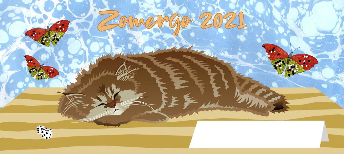
I made a design for Zomergo, a camp for go / weiqi / baduk players in the Netherlands that takes place in August every year. Although the game of go is the common denominator of the participants, lots of other board games are played during this event.
My design is for the "mug competition" of Zomergo: each year people can send in their designs. The winning design will be printed on mugs. Each participant will receive a mug with that design and their name on it. The white paper sign in my drawing is meant to write those names on. If you are interested in the event, check it out at https://zomergo.nl/ |
AuthorWelcome to my website! My name is Kim Ouweleen, my artist pseudonym is Murugandi. I am an illustrator, author, proofreader and go teacher from Amsterdam. Do you want to support my art? I take on private commissions.
On Etsy I sell prints, postcards and mugs.
On Spreadshirt I sell clothing, mouse pads, stickers & more.
Want to stay updated on my latest art? Click below to subscribe to my newsletter.
You can view my previous newsletters here.
Archives
June 2024
Categories
All
|


