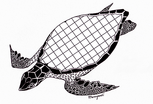
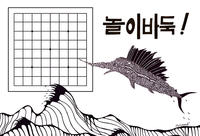
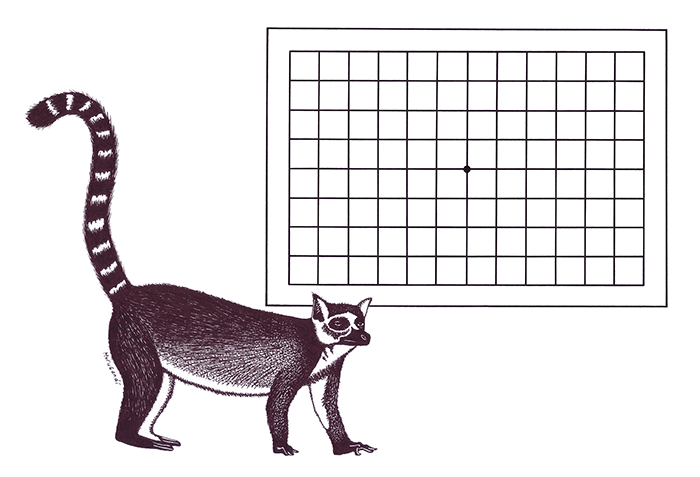
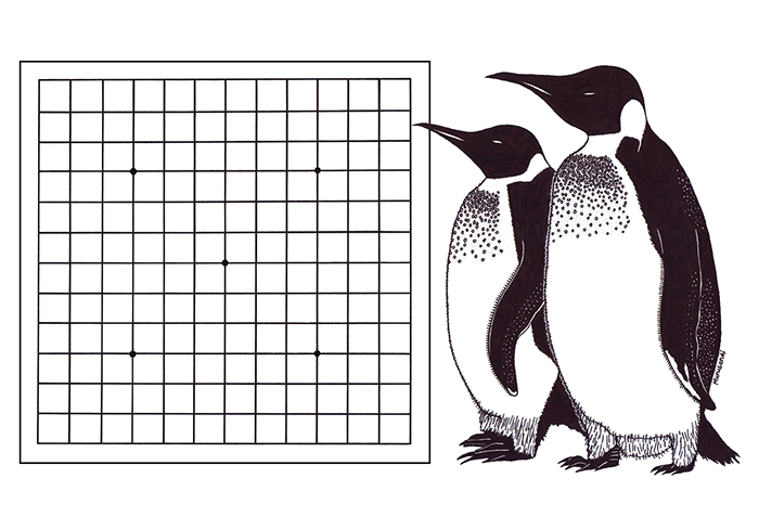
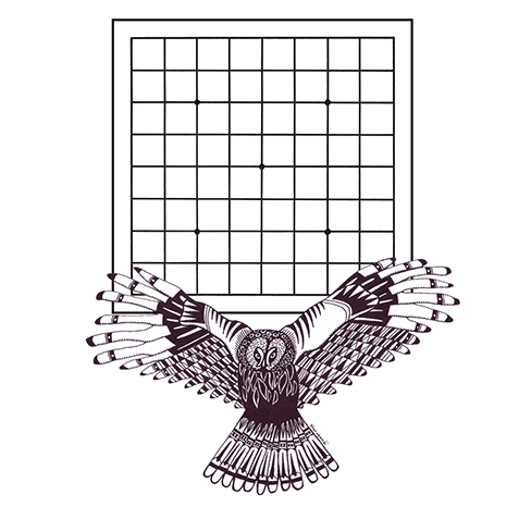
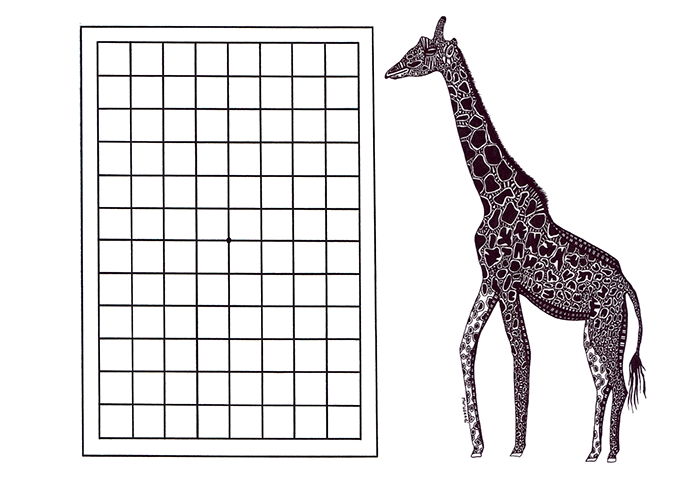
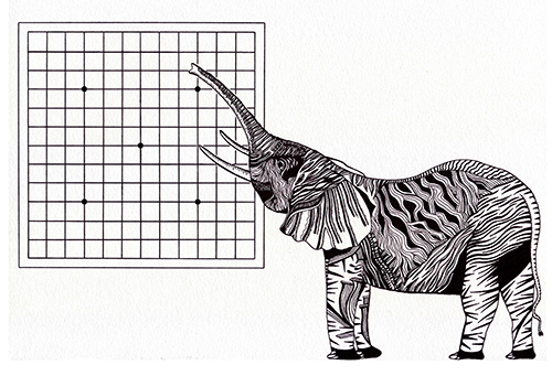
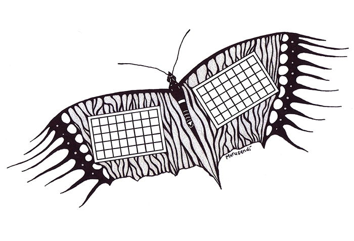
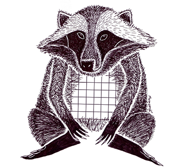
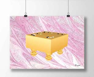
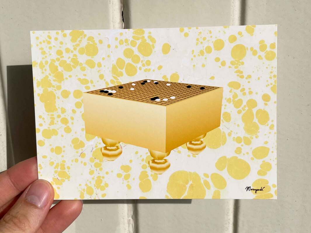
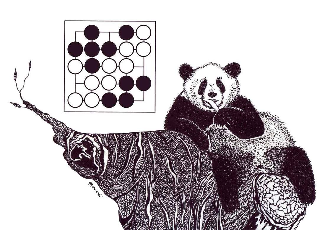
 In 2015 I created a series of 10 animal illustrations in black and white for BadukTV, a Korean television channel that broadcasts the game of go 24/7. The go boards depicted in the drawings were to have specific dimensions: 9x6, 13x13, 9x13, 9x9, 5x5, 13x13, 13x9 and 9x5. The plan for these drawings was to use them on promotional material for kids in Korea. BadukTV requested empty go boards, as they planned on adding go shapes themselves. I drew a turtle, a swordfish, a ring-tailed lemur, emperor penguins, a panda, an owl, a giraffe, an elephant, a butterfly and a raccoon-dog. Three of those were alterations of artworks I had already made in the past: the turtle, the swordfish and the raccoon-dog. The other seven drawings I made specifically for this project. See all 10 of them below. Sadly, for reasons still unclear to me, BadukTV shelved the project and my drawings were never used in Korea. The good thing about the situation was that the rights for the drawings came back to me and I was free to use them any way I wanted. In the years that followed, I created many colour versions of the artworks, incorporating puns for names of go shapes, historic go matches and swirly backgrounds made with marbled paper: click here to see the results. Some of these colour versions made it to the covers of the Dutch Go Yearbook (see here) and over the years I sold many of them in the form of art prints, postcards and mugs in my Etsy shop. A few of the black and white animals never made a reappearance: the owl, the giraffe and the panda were left and forgotten. Recently I rediscovered the panda and re-designed it (first picture of this post) when I was working on a 2024 go calendar (now 20 for sale: click here). 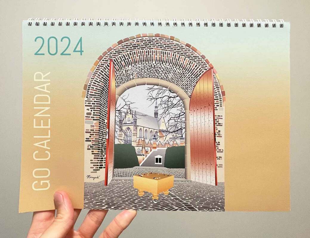 2024 Go Calendar, available in my Etsy store The panda drawing incorporates a 5 by 5 go board that is filled with a go position I thought up: a double ko that can never be resolved by either player sets up a seki on the entire board. Seki (セキ) is the Japanese term for a local stalemate position of 'shared life': neither black nor white can take away liberties of the other's group(s), resulting in a truce. The panda artwork is now for sale as cards and posters. Click here for the postcard. Click here for the poster. 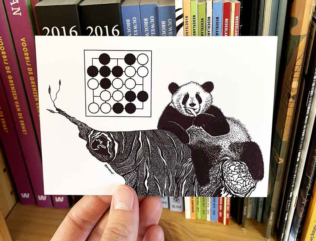
1 Comment
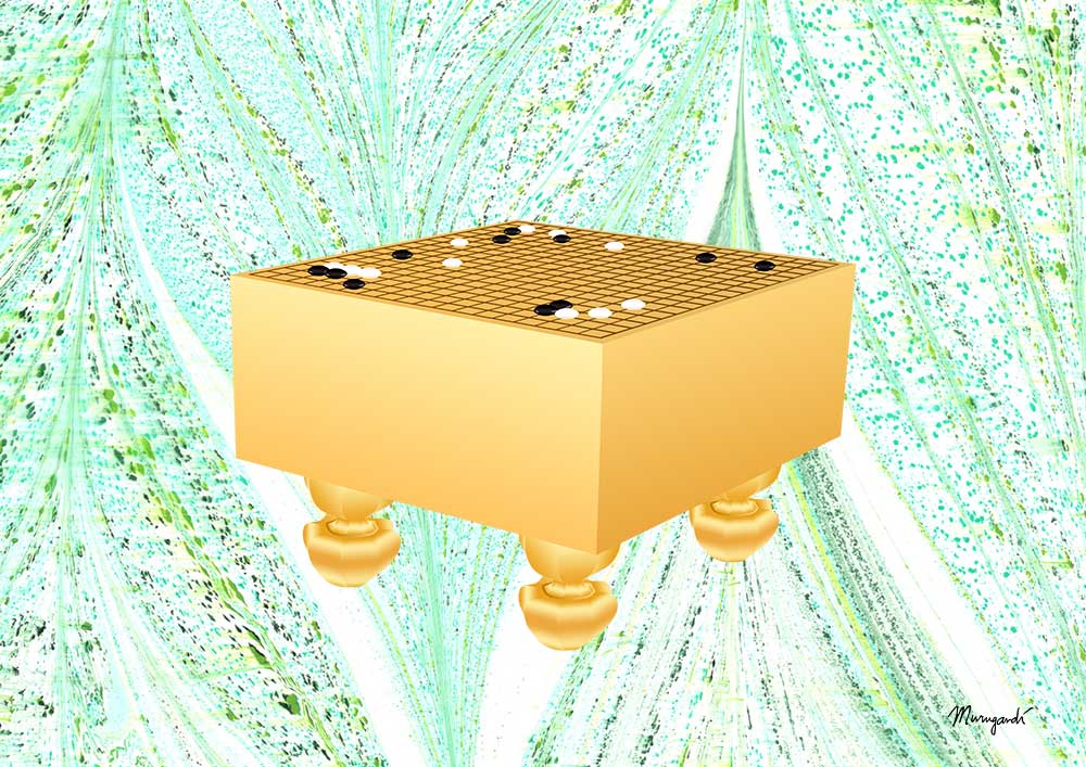
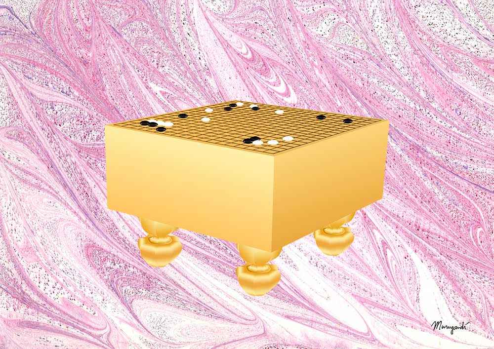
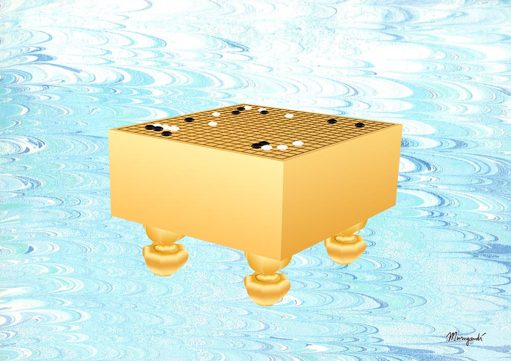
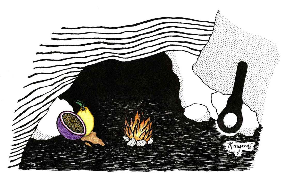 Martien van Agtmaal, one of the editors of digital cultural magazine De Optimist, asked me around the beginning of October if I'd like to make an illustration for the poem 'so this is my wilderness' by Lilian van Ooijen. The poem evokes several surreal images, among which are the union of a passion fruit and a dripping quince, a licorice key and sedimentary rock formations. It can now be read (in Dutch) on the website of De Optimist, by clicking here. 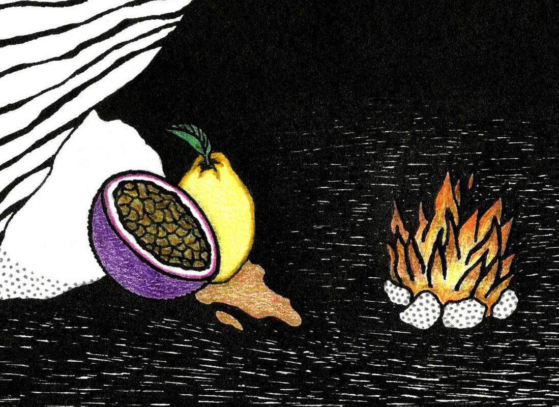 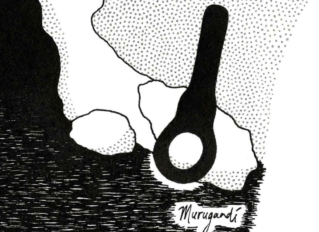 I recently created a logo for the Ambassadors Group of NBD Biblion. NBD Biblion is a foundation that supports libraries throughout the Netherlands and parts of Flanders and provides them with a wide array of services. The foundation stimulates the sharing of information through books and other media. Among other things, NBD Biblion prepares all the books for Dutch libraries so that they have the right coding, are durable and ready for long-term use, offers logistic services to libraries and schools for the management of collections, collects metadata and writes summaries on new publications in the Dutch language, creates specialist machinery for the sorting, printing and plastification of books, stimulates reading through educational programs and provides book recommendation software for librarians and individual readers. The Ambassadors Group of NBD Biblion was created for the employees. It gives them a place to feel proud of what they do, voice their opinions within the company and share their expertise with the rest of the world. The design I made is largely based on NBD Biblion's colourful logo and its corporate identity, inspired by innovation, paper and traditional printing techniques. The crowns represent the value of the employees: they are essential to the organisation and should be celebrated. An ambassador is a true representative of a company, someone that can convey what they stand for.  Logo of NBD Biblion by Studio Enkelvoud  I used my latest marbled papers to create a new go-related artwork. It features the go board from my poster design for the Dutch Open: depicting a match that was played between top Chinese professionals Mi Yuting 9-dan (芈昱廷) and Ke Jie 9-dan (柯洁) on the 15th of February 2023. This artwork comes in a variety of four different background colors of yellow, green, purple and blue. All versions are available as posters and as postcards in my Etsy shop. You can reach the products by clicking the images below. This design is also available on T-shirts and other clothing and household items in my Spreadshirt shop: click here.
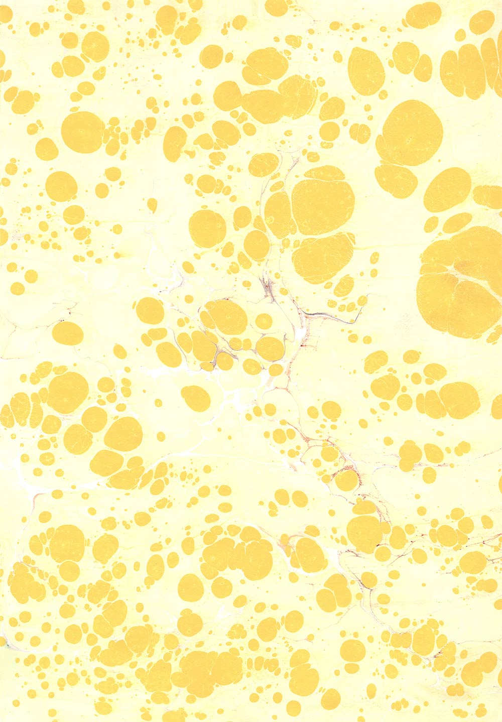
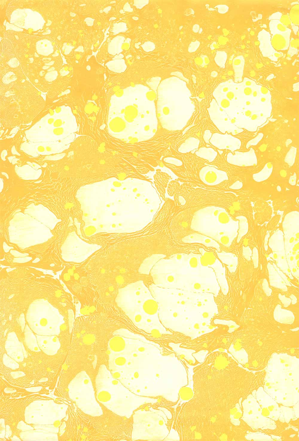
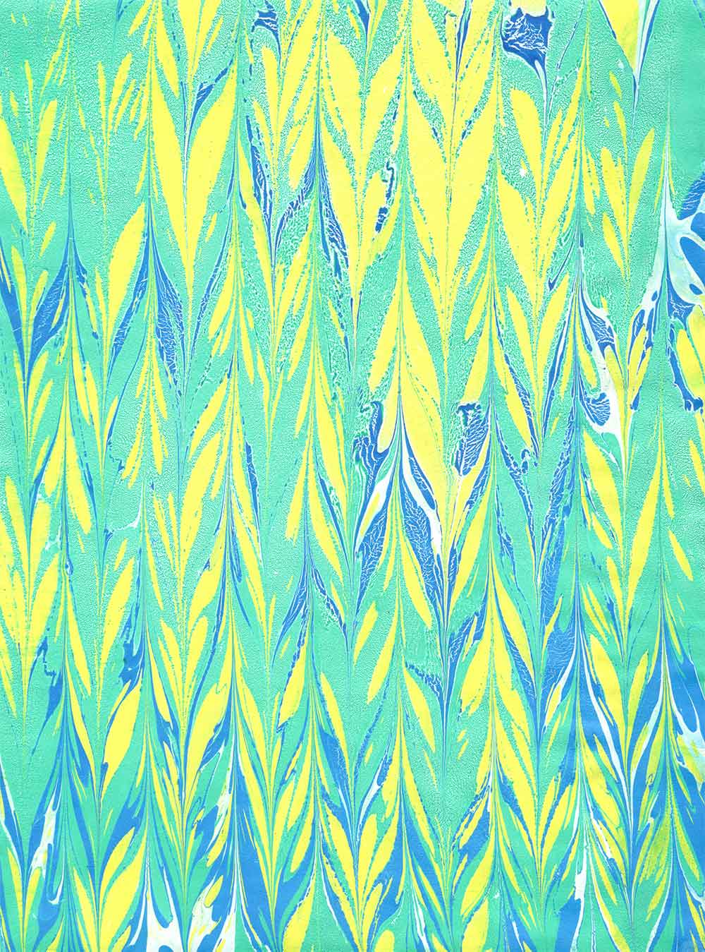
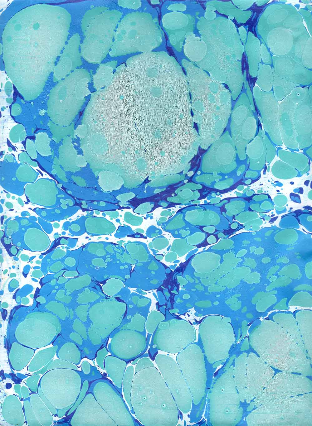
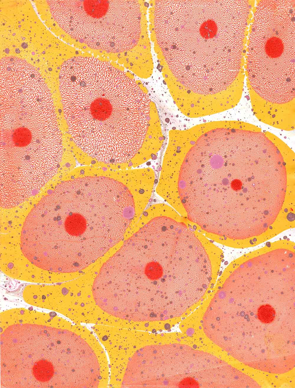
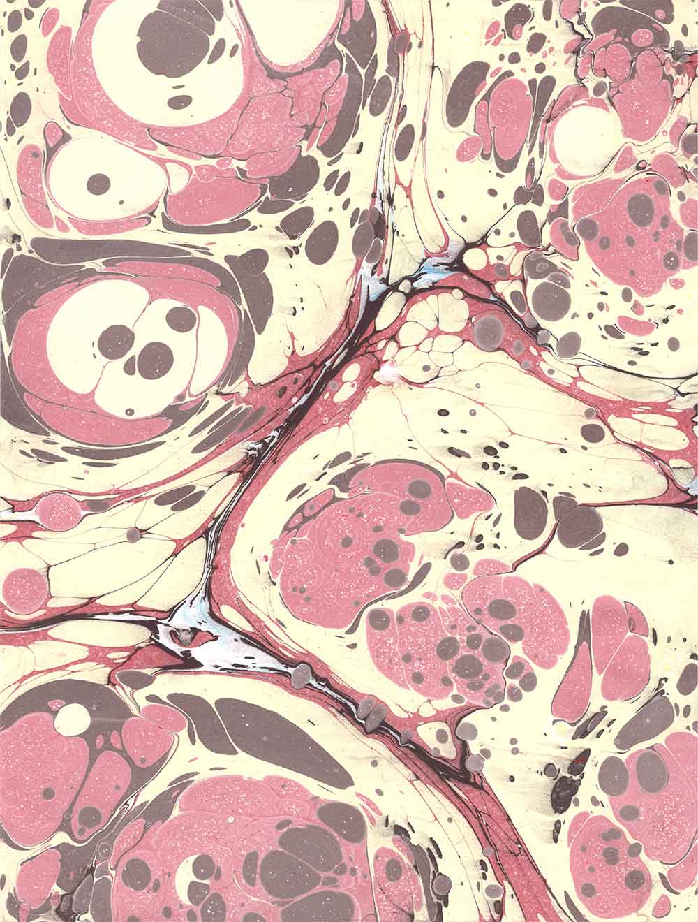
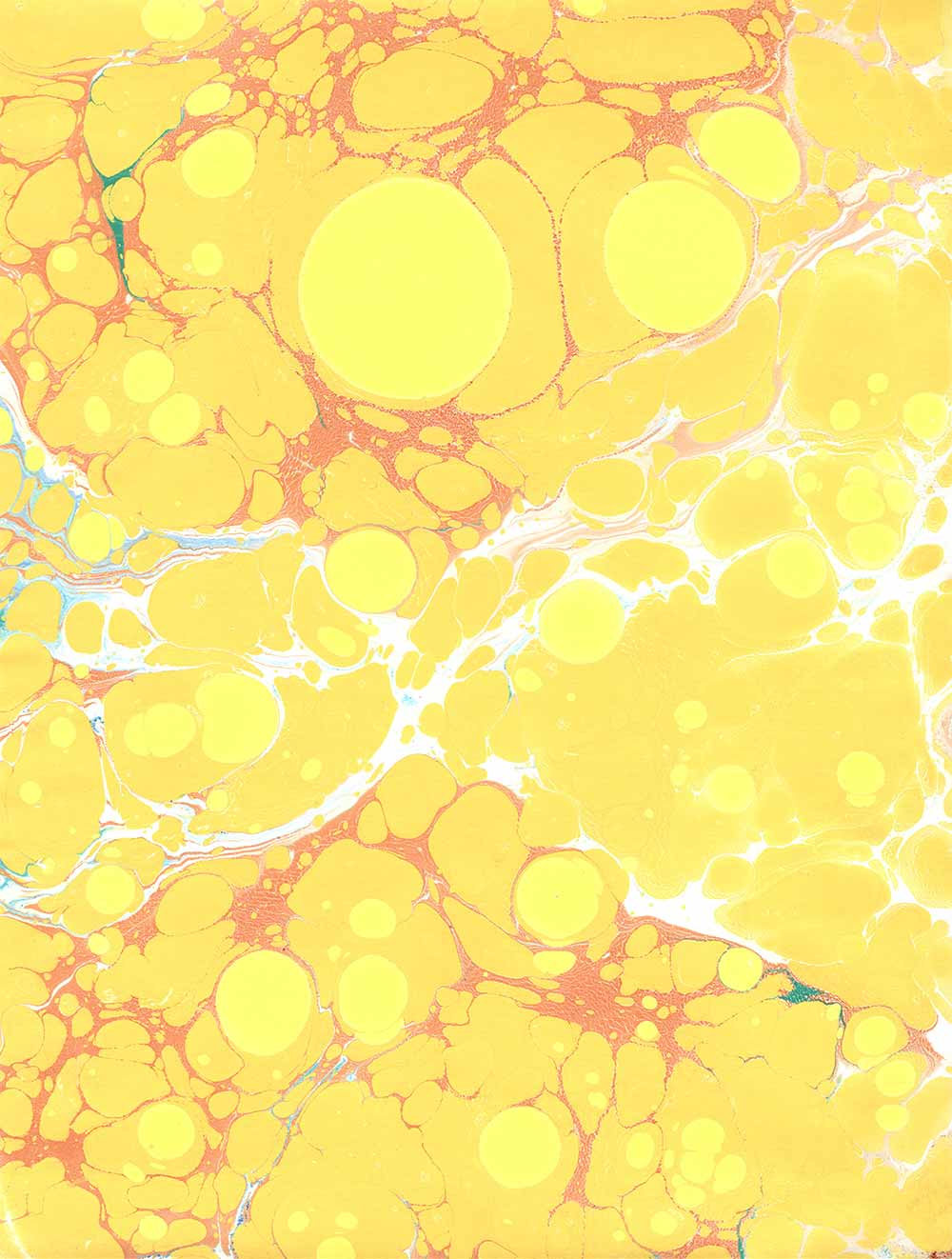
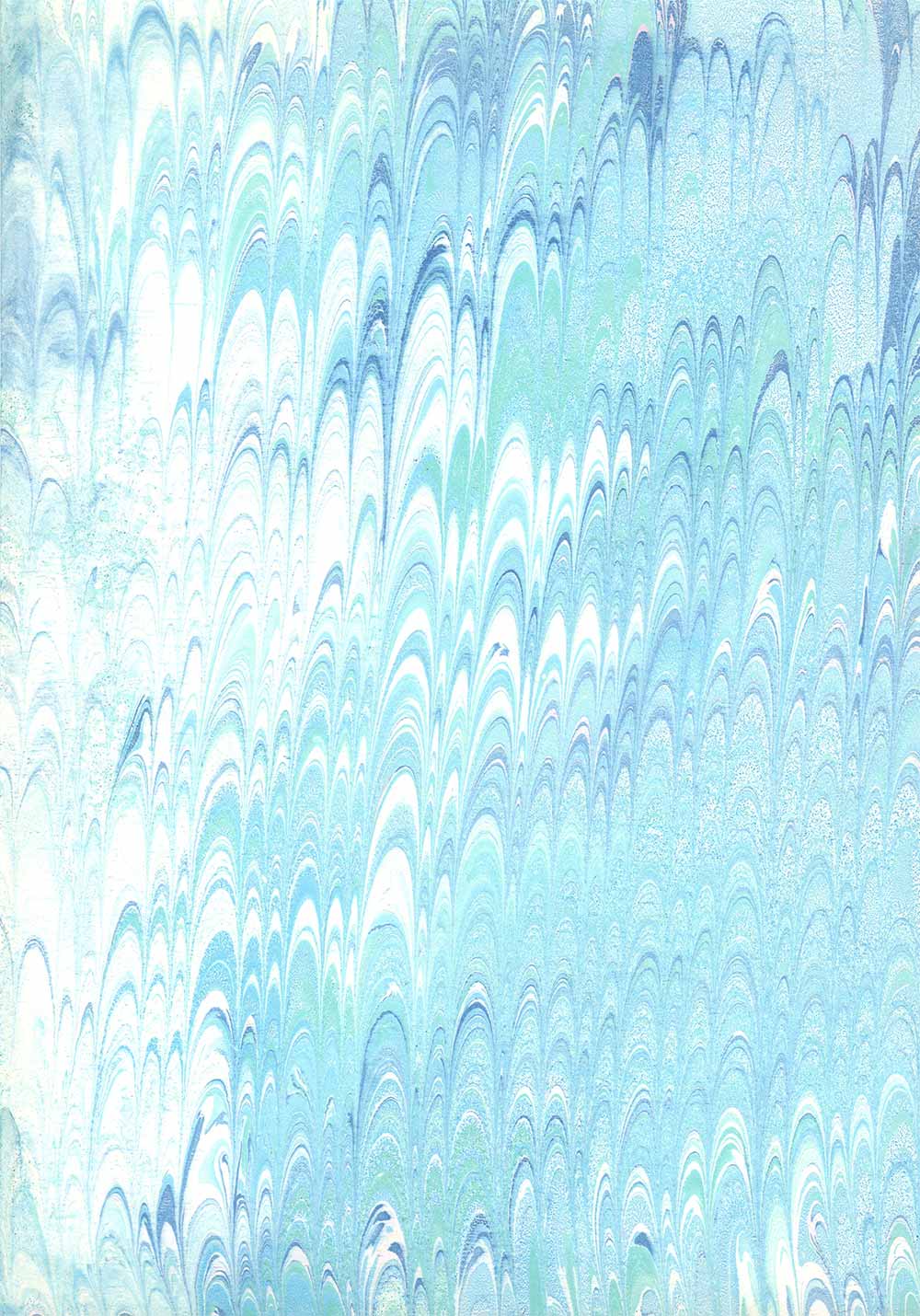
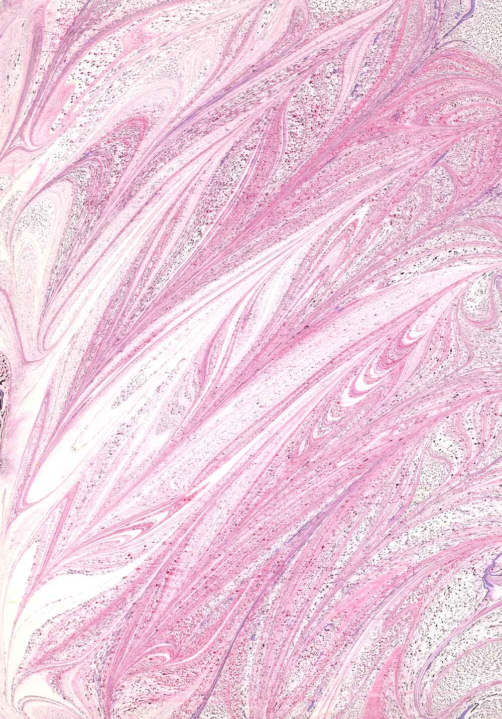
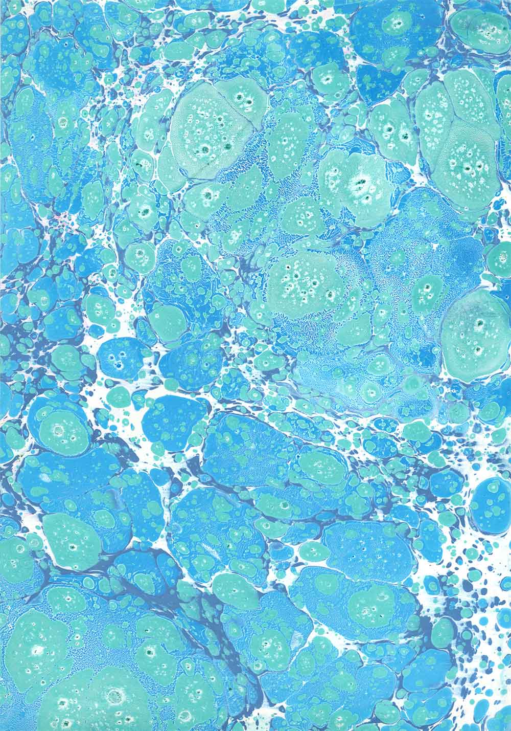
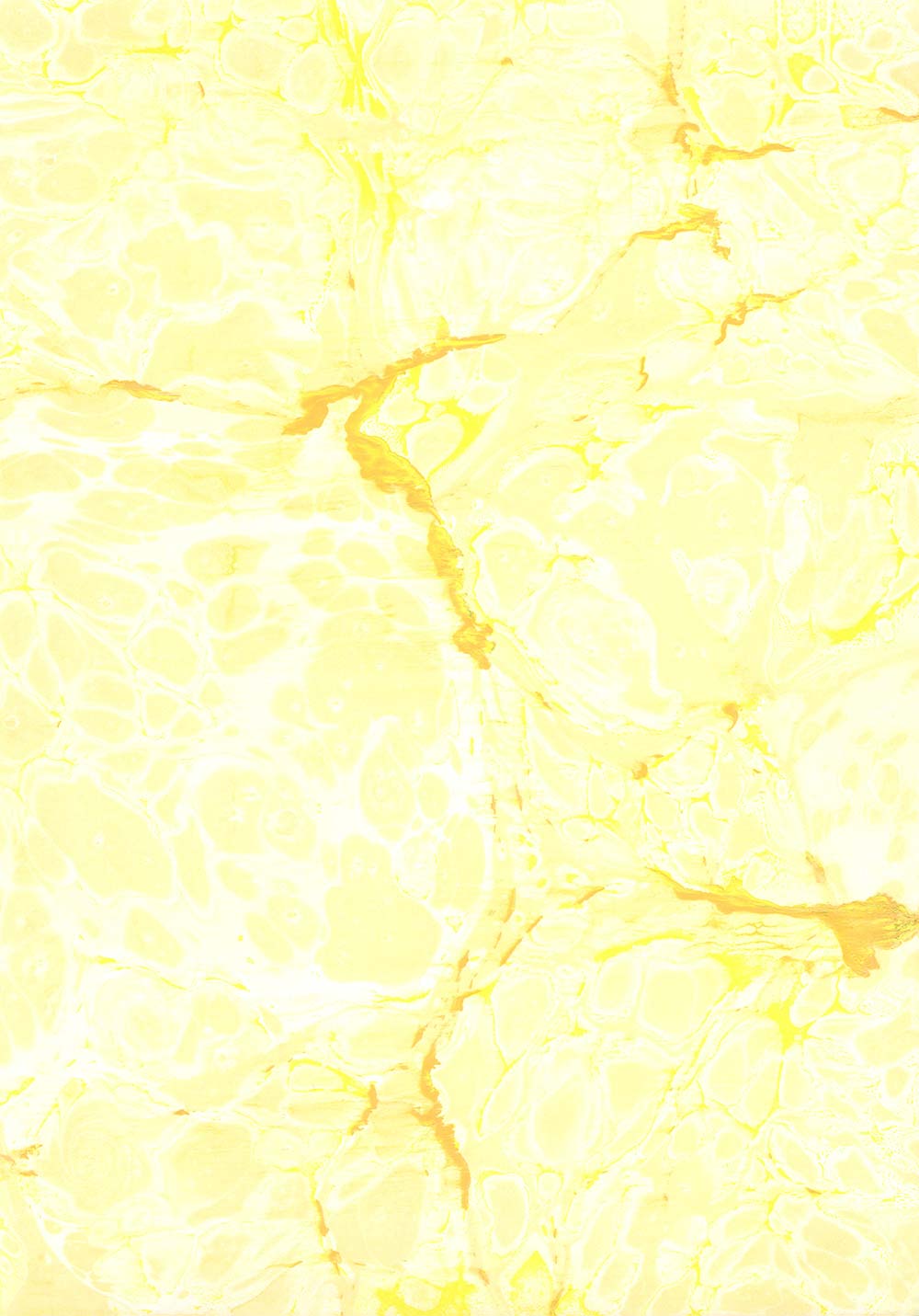
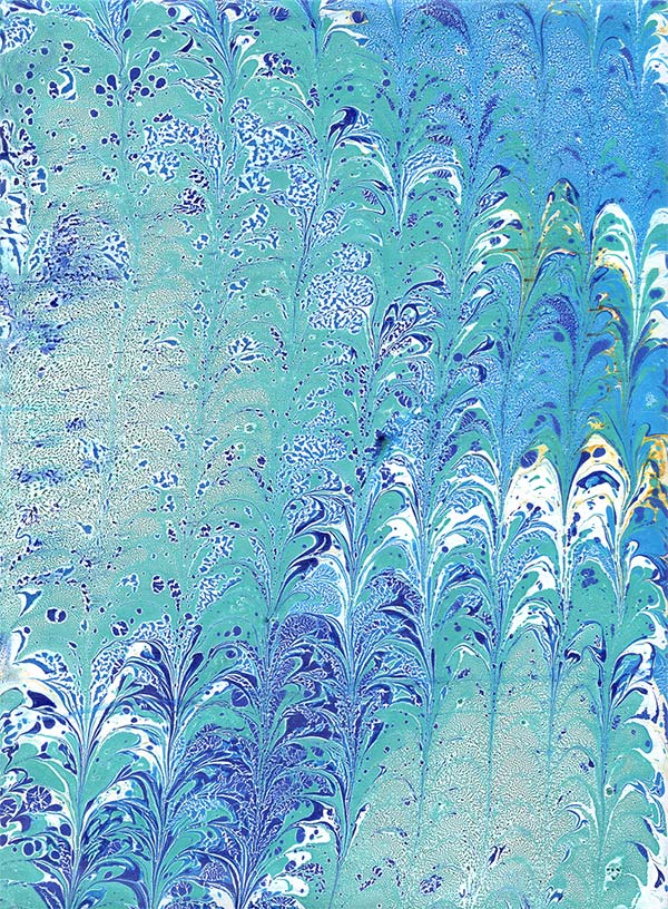
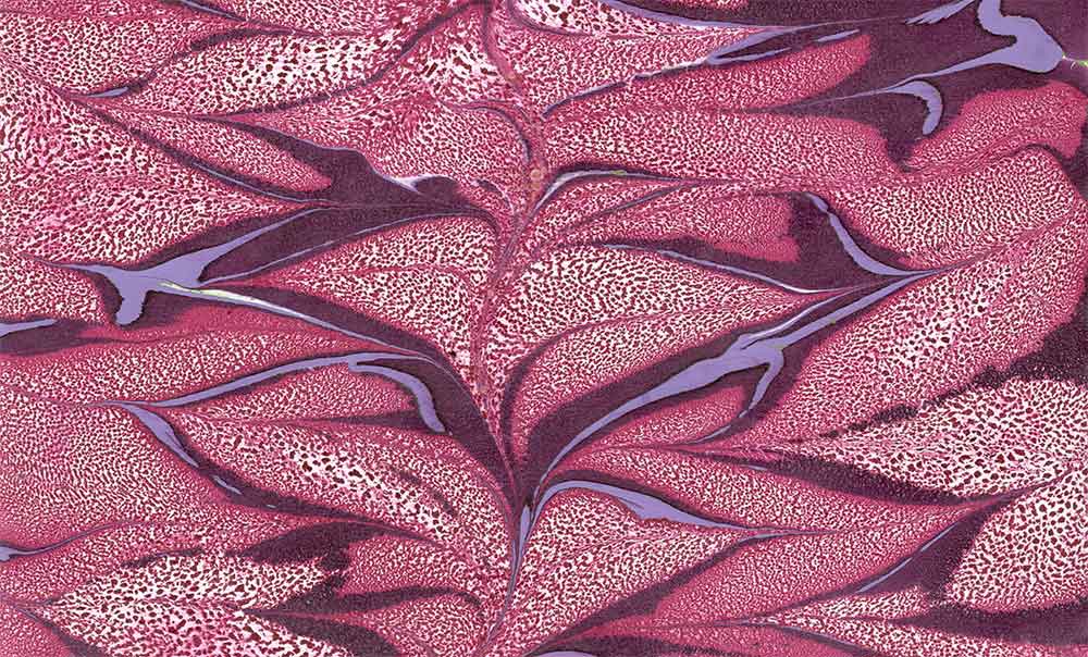
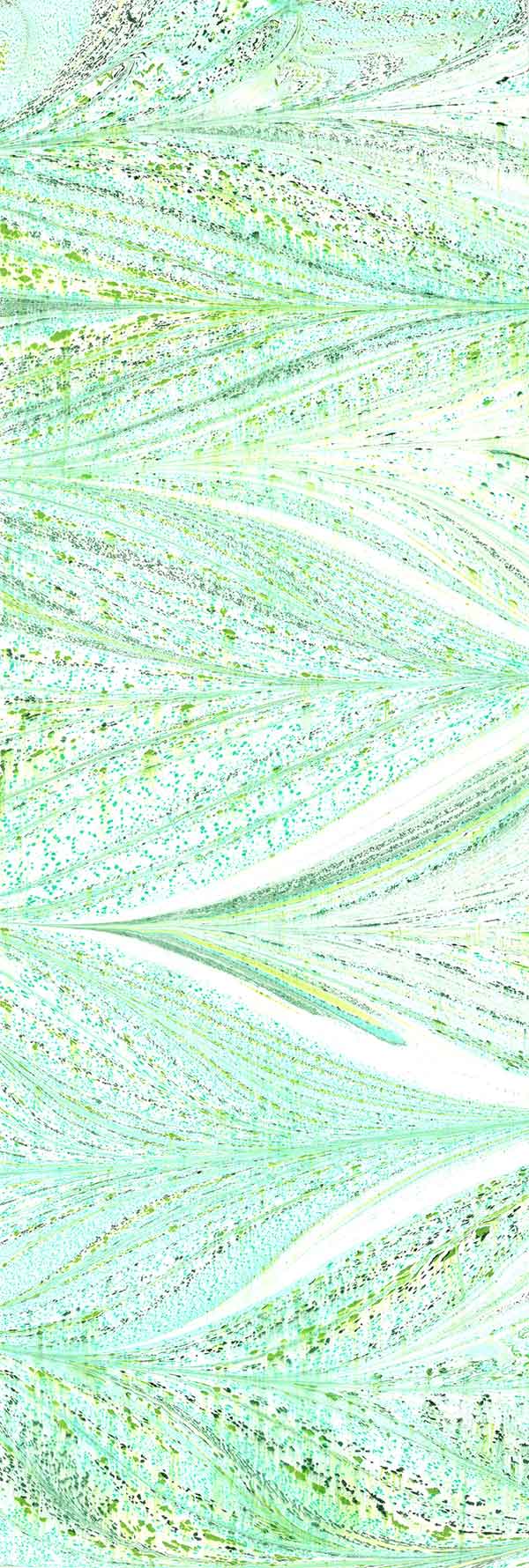
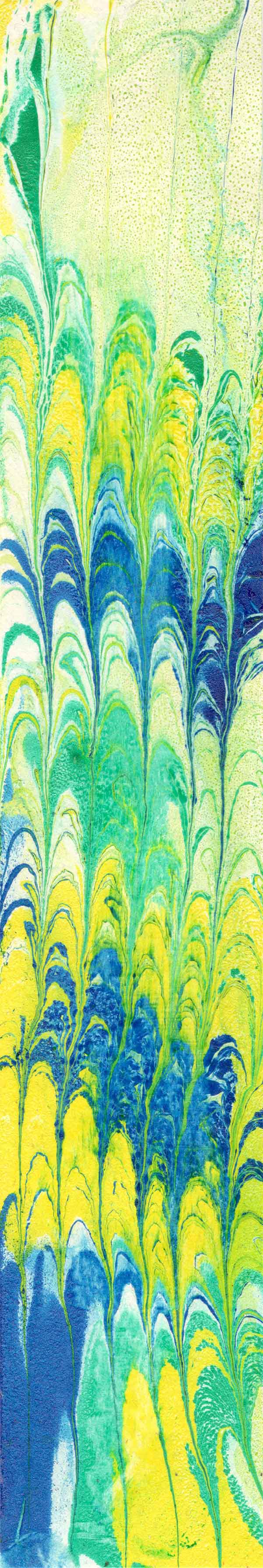
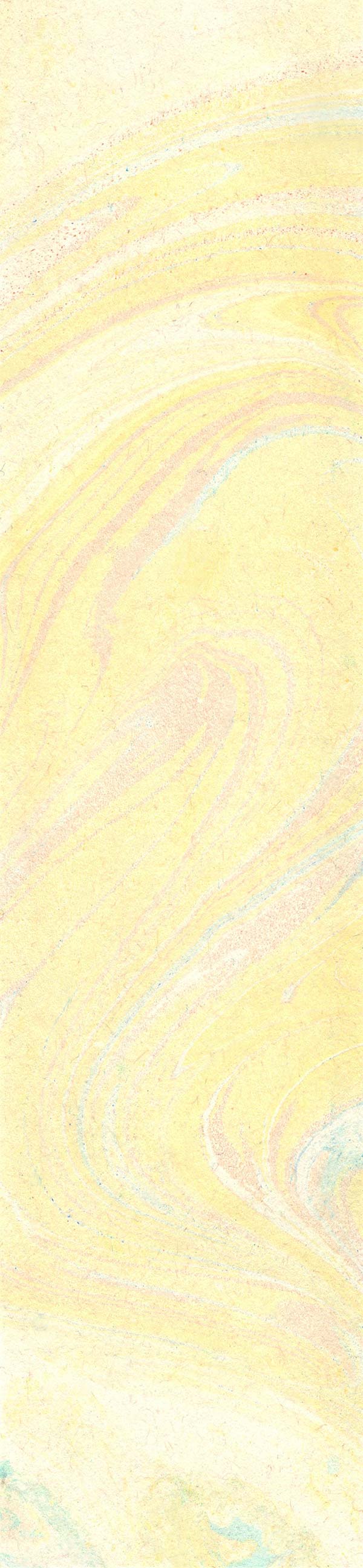
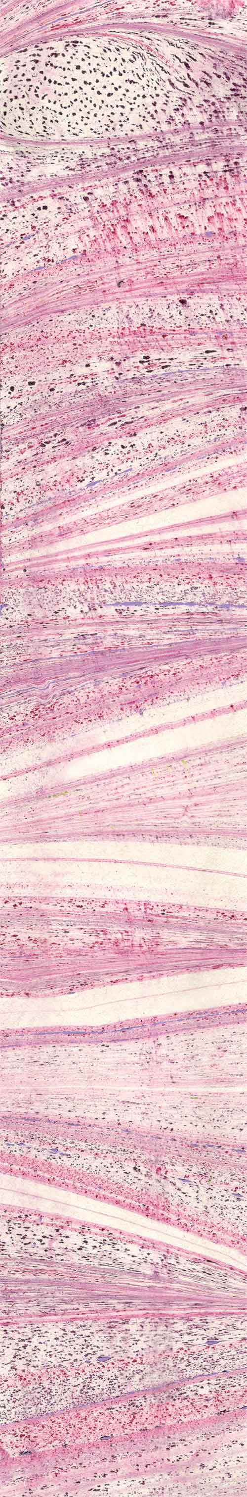
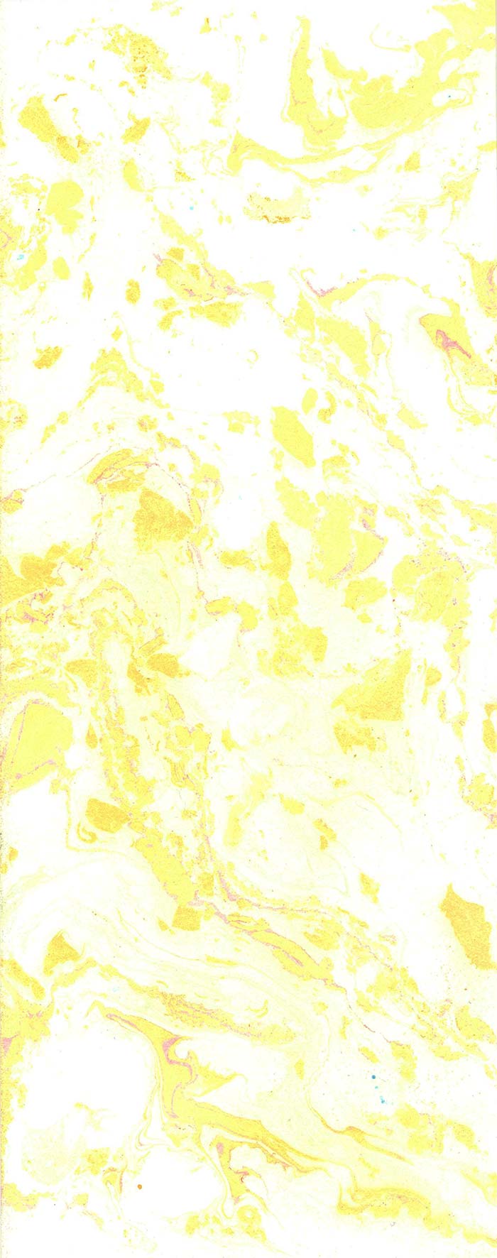
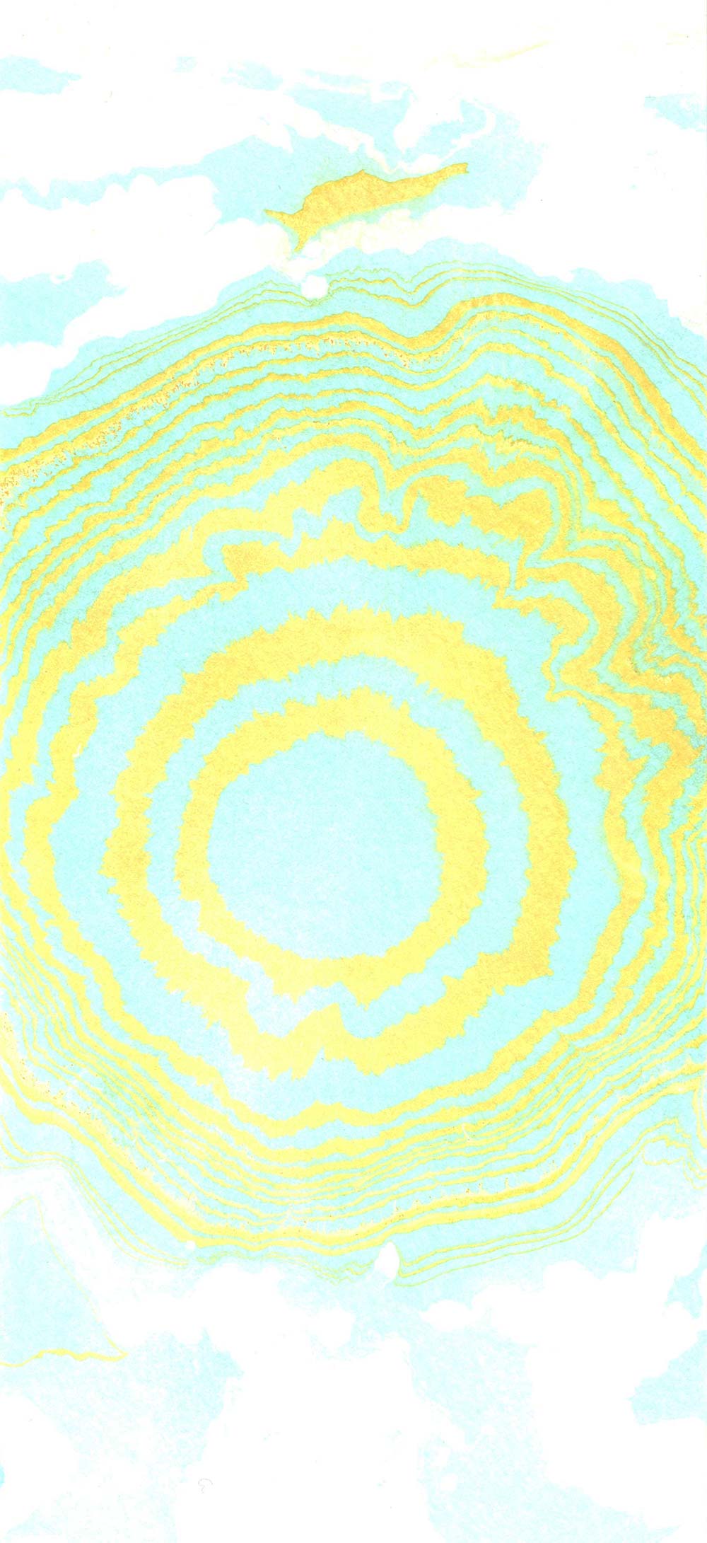
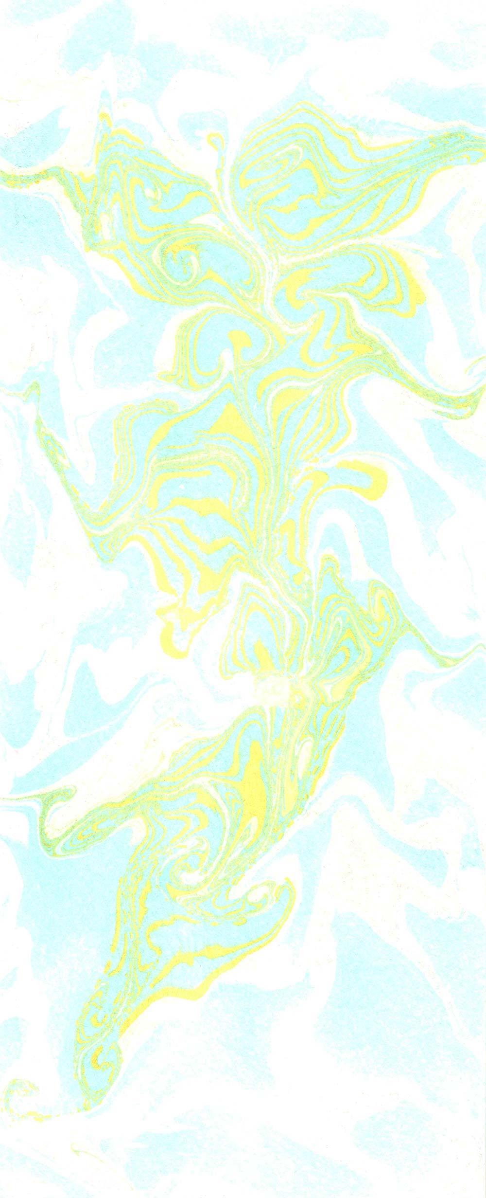
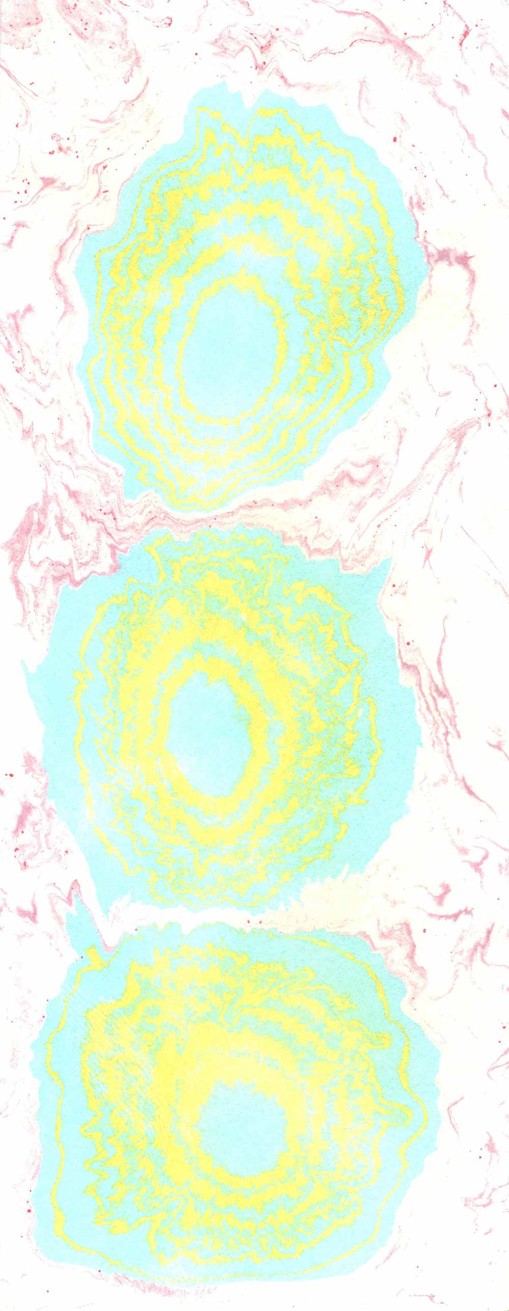
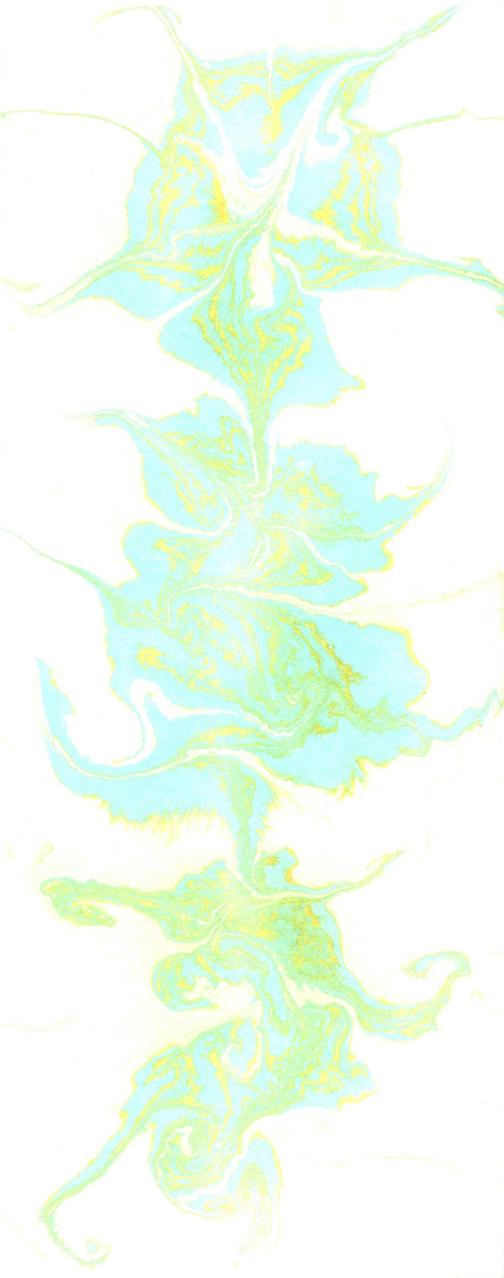
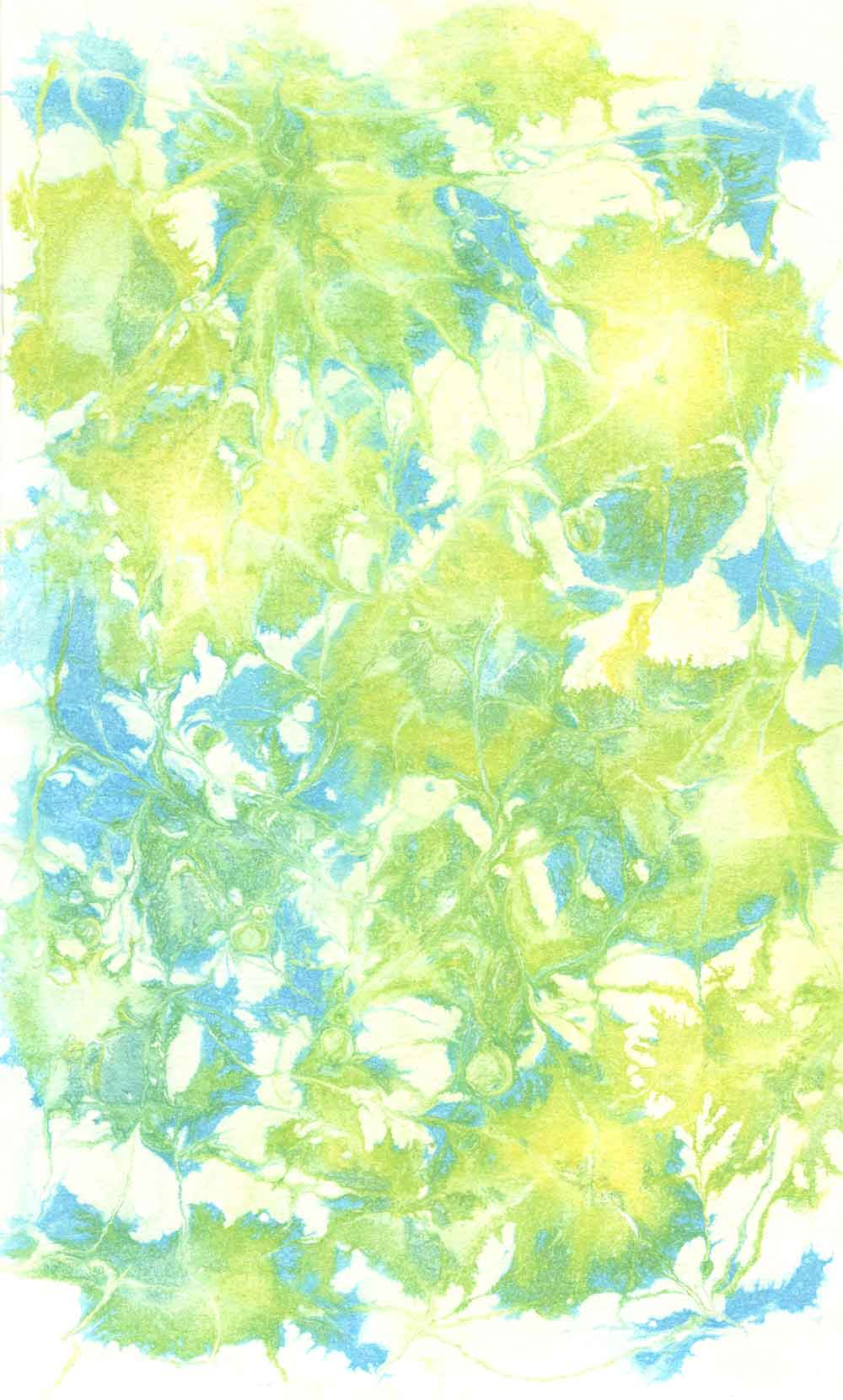
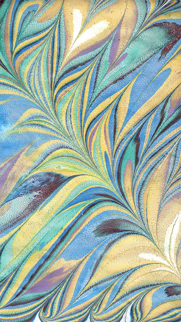
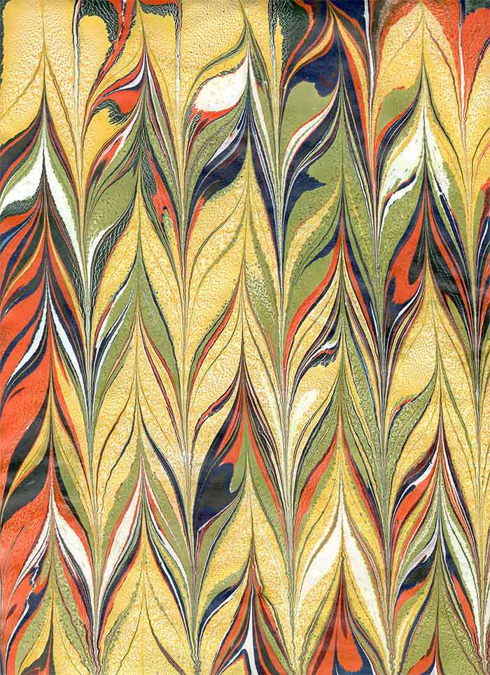
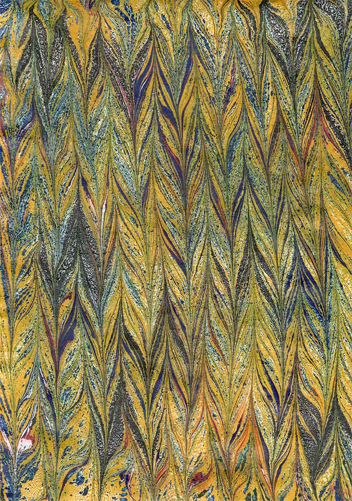
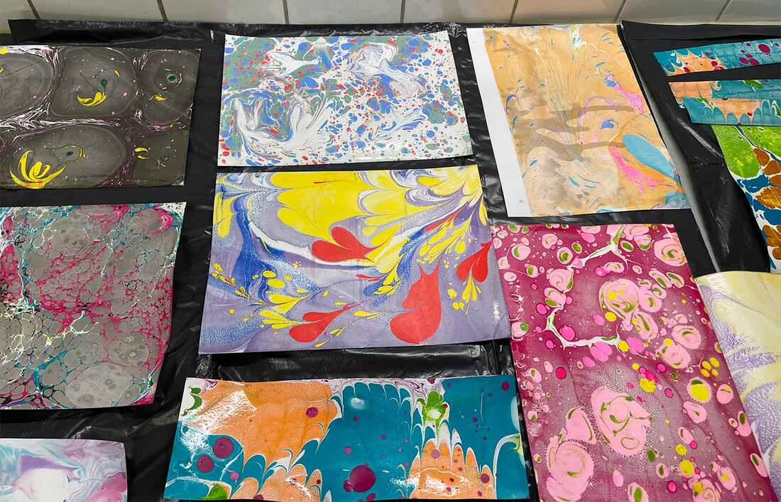
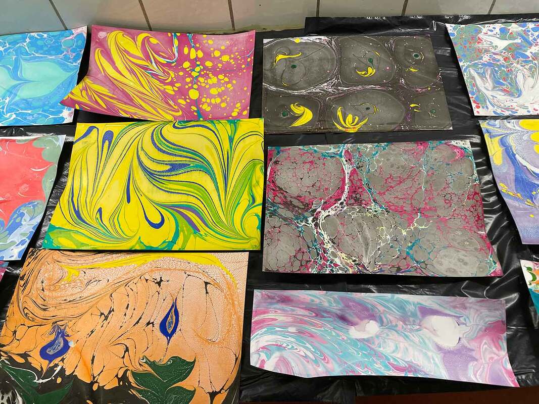
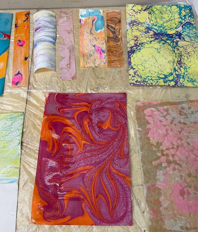
I finally had time to scan the papers of my marbling session in May (link to previous blogpost here). Some of these are lighter than most of my previous marbles, particularly the yellow ones, which I'm really happy about: light marbled papers are better as backgrounds. I'm looking forward to using these for cover designs and as backdrops to my illustrations. During the scanning process I rediscovered old marblings in an art folder, made back in 2016-2018. I've scanned those as well, which can be viewed below. Several of these would make great bookmarks. 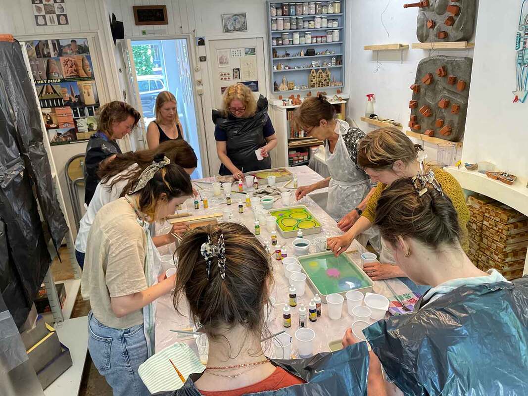
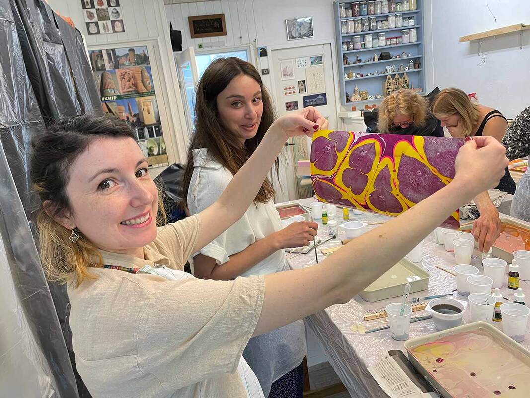
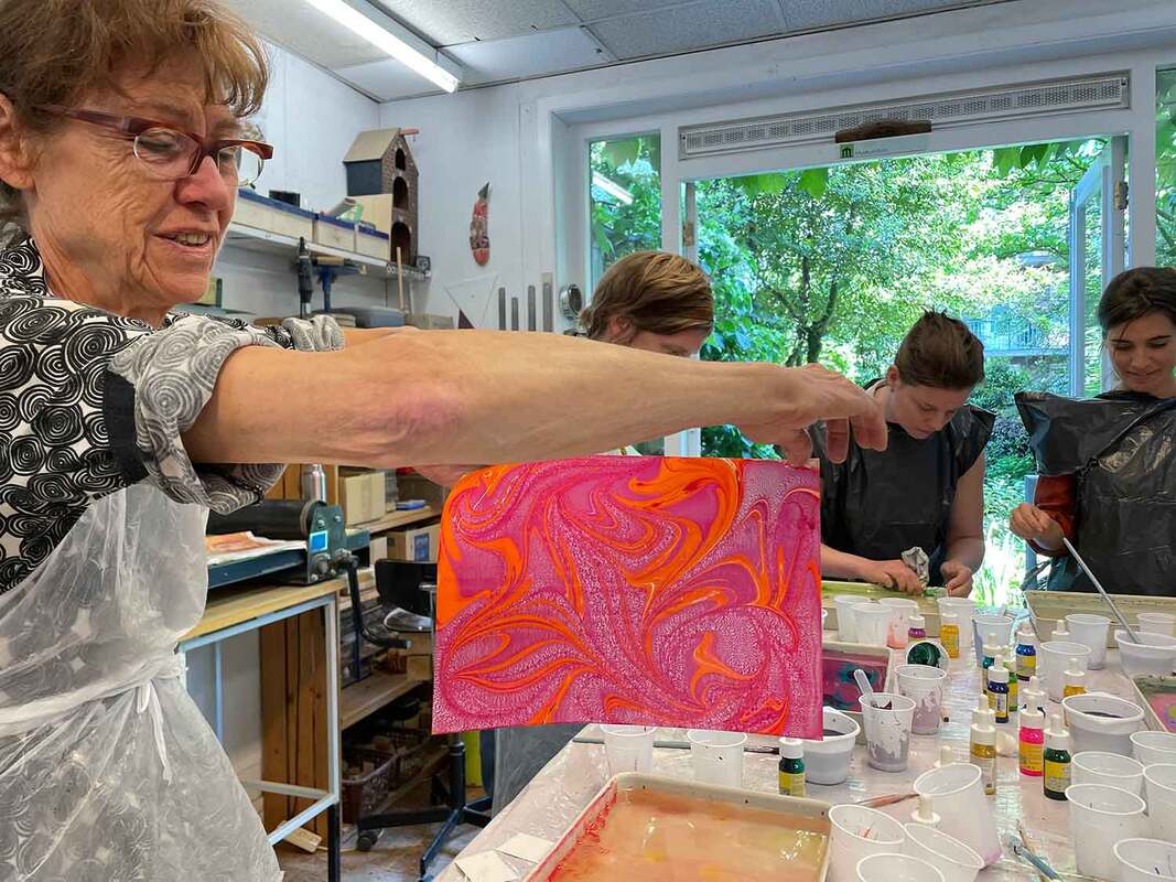
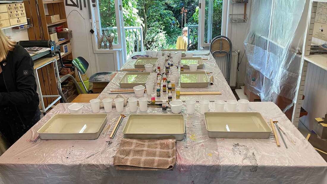
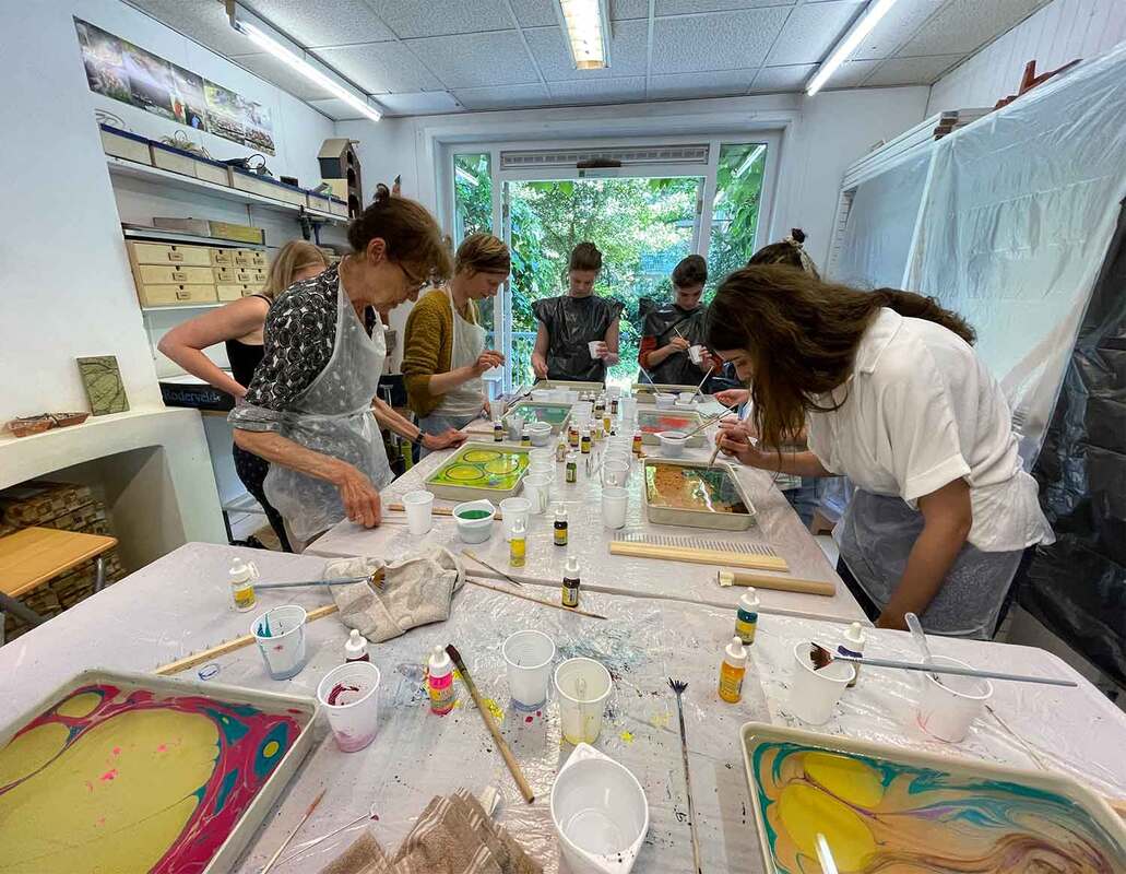
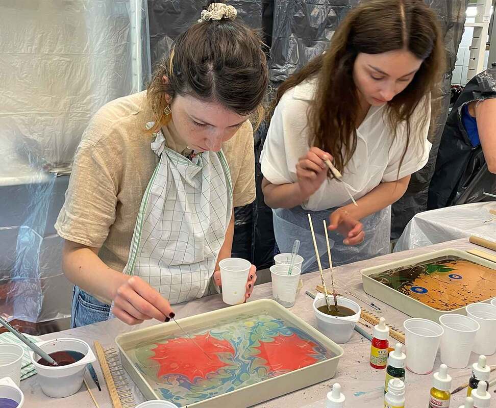
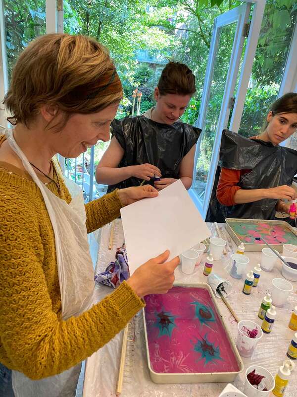
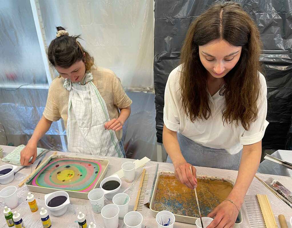
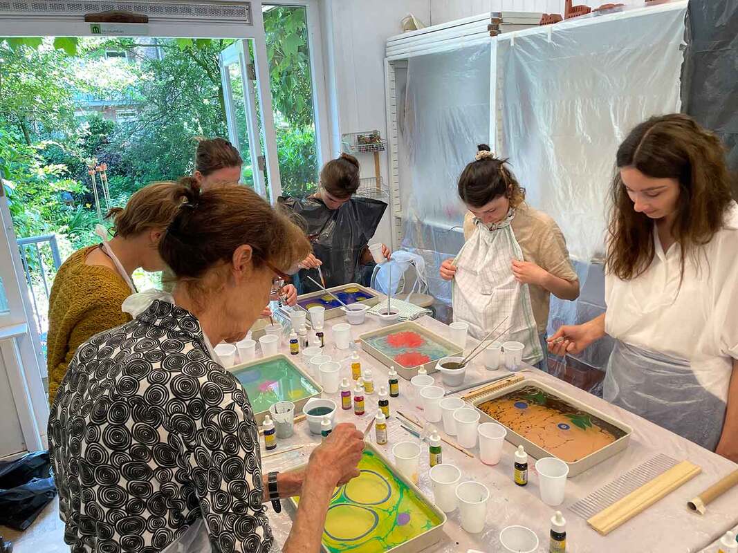
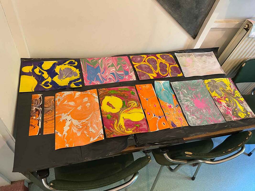
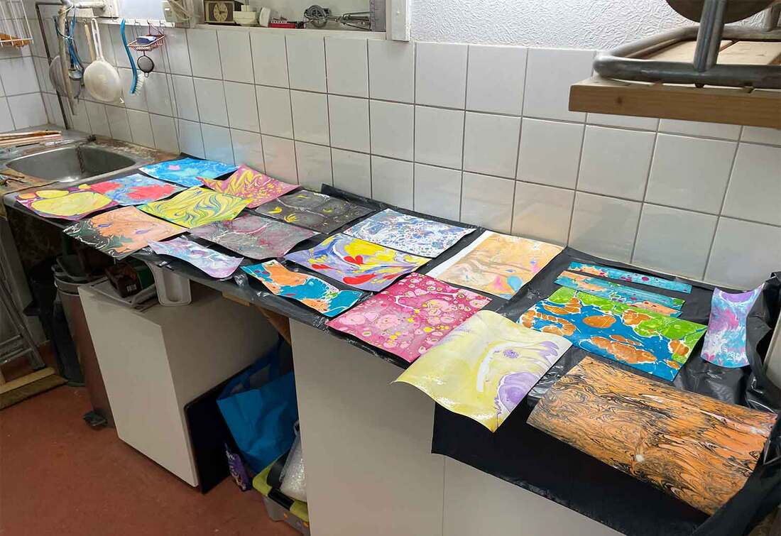
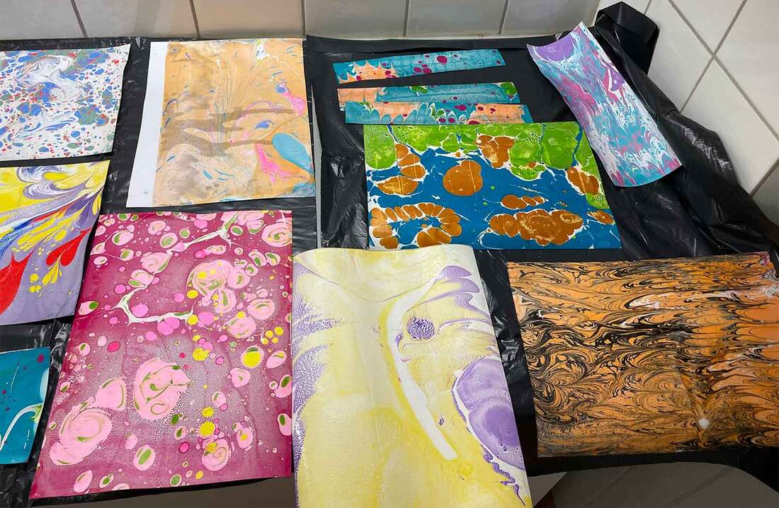
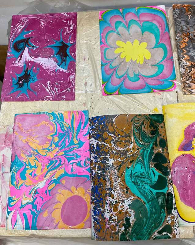
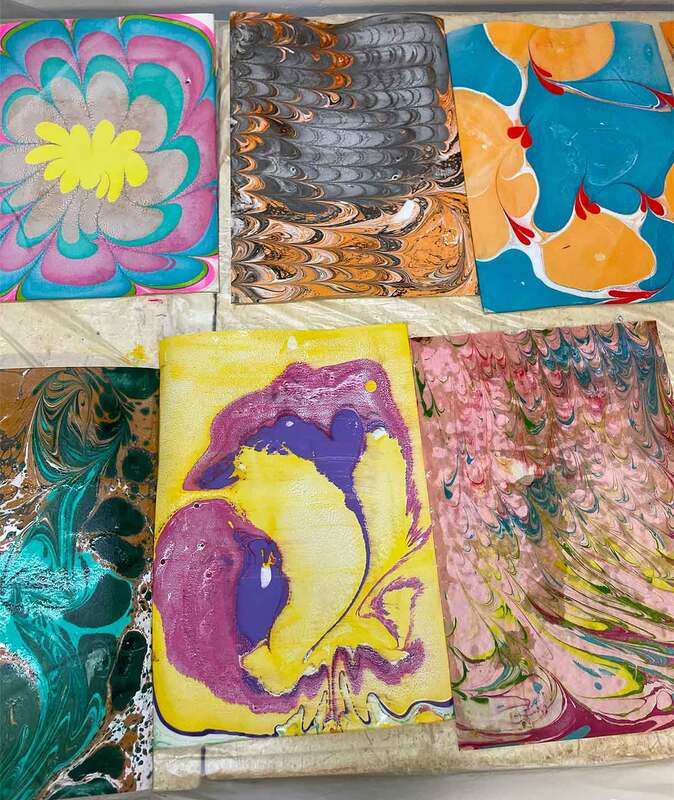
Yesterday, on 4th of June, Justyna and I gave our first workshop on paper marbling, also known as Turkish marbling (ebru) and suminagashi. It took place in Galerie de Stoker at Witte de Withstraat 124 in Amsterdam, as part of the art expo “Colourful Art on Paper” by Philo Ouweleen. It was a great success. We were fully booked with seven people that signed up. They all showed up, and an extra participant even walked in to ask if we still had another spot left. Since we brought eight trays to marble in, one extra tray to do a small demonstration in at the start of the workshop, we gladly let her take part. After a short introduction, all participants were eager to get their hands dirty and immersed themselves in the marbling arts. Justyna and I assisted where necessary and gave some tips on techniques and how to smoothly print the designs on paper. We saw so many smiles and excited faces. Everyone genuinely seemed to enjoy it and some people even said that they'd like to do it again. All our preparation paid off. It was a good day. We might have to do it again. Below some more photos of the workshop and the marbled papers of the participants: 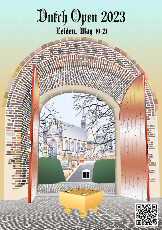 The organizers of the Dutch Open 2023 commissioned me to make a poster design. The Dutch Open is the largest go tournament of the Netherlands, the replacement of what used to be the Amsterdam International Go Tournament. It attracts go players from all over Europe. This year the tournament will be held in the city of Leiden, from May 19-21 in the Denksportcentrum (mind sport center) at Robijnstraat 4. My design features a view from the Burcht van Leiden to the Hooglandse kerk, two iconic buildings of the city. We see a traditional go board with 22 moves played out on it. This modern opening pattern is taken from a professional game between Mi Yuting and Ke Jie that was played on February 15th of this year (click here to view the game). The open doors invite us in. I largely based my artwork on a photograph by Harry van der Krogt, who is an active organizer in the Dutch go community, the former manager of the European Go Cultural Center and a board member of the European Go Federation. This design took me several weeks to make, and it probably topped my Go Peacock drawing in terms of hours spent on it. It most certainly is the design with the most layers in Photoshop I have ever created. The poster will be used to promote the tournament online and will be physically hung at the location of the tournament. More details about the tournament can be accessed by scanning the QR code or by clicking here. I plan to make a version without text for my Etsy shop, purchasable as posters and postcards. Below some zoomed-in details of the artwork. 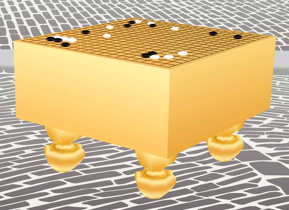 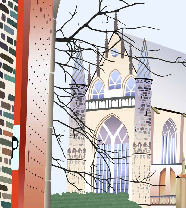 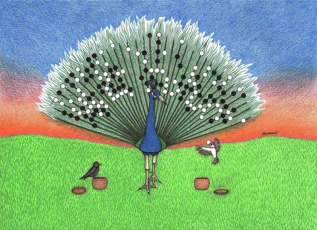 Today I finished a drawing that had been lying on the shelf for some time. Before covid, so more than two years ago, I received a private commission from John, who'd commissioned me to make art for him twice before ("Salsa Dancing Tigers" and "Ski Jumping Penguin"). John always comes up with fun and challenging ideas to draw. This time was no different. The task at hand was to draw a peacock with go stone feathers. Later an extra criterion was added: two little birds, black and white as metaphors for the colors of the stones, would have to place the stones on the peacock's plumage, effectively playing a game of go against each other. I'm a fan of Peng Liyao's complicated and tesuji-packed playing style (彭立尧, Chinese 8-dan professional go player) and so I decided to use his games for the go motif. I picked two of his game records and merged parts of their go positions, adding or omitting stones here and there. A black and white version of the drawing was created, and I placed it aside to think about the next stage: color. Putting a drawing aside is a dangerous thing for me. I tend to work on an artwork continuously until it's finished, making optimal use of the flowing creative juices, because I know I need to. If I stop, life takes over. That's what happened in this case, too: other things took priority and the drawing ended in one of my many art folders. Luckily, John was in no hurry, and covid took away any urgency that was left. I'm the kind of person that doesn't like to leave things unfinished, and the drawing was gnawing at my thoughts for months on end. It was one of those things you know you still have to do, but somehow cannot muster the willpower for. The longer you wait, the harder it becomes to commit to. One day in July I decided to finally get back to the drawing and ignore my fear of ruining it. After all that postponement, once you get going it's surprising how "easy" and pleasant the task often turns out to be. Not that I finished the drawing quickly though: I probably spent more hours on it than I did on any drawing, ever. Here is a little glimpse into the coloring process: For me drawing is an experience of ups and downs. There are those rare drawings where everything magically seems to go the way you want it to, but more often than not I ponder, fret and experience mood swings galore. Justyna has to live through my cries of desperation: "Arrghh! The drawing is ruined!". "It's fine, I can't even see it." "Are you sure? It's right there. It's a huge mistake!". "Nah, come on, it's barely visible." I'm lucky that she is as understanding as she is and genuinely likes my art. She always reassures me and puts me back on track. The key is to find peace in "mistakes" and learn to go with the flow. If I do that, the mistake often evolves into something else that becomes a part of the whole. During this particular drawing, the coloring process of the background was particularly stressful. I put so much time into the feathers and go stones of the peacock, and I was so content with the result, that the background had to be perfect. Because my expectations were high, anything I would have done would have probably disappointed me. I wasn't happy with the grass at first, and then the sunset seemed to make it better, but halfway through it felt like it was only making it worse. Sometimes you need some distance, and after it was finished I gained a different perspective. It also helped that everybody else seemed to love the drawing, so now I'm loving it too! 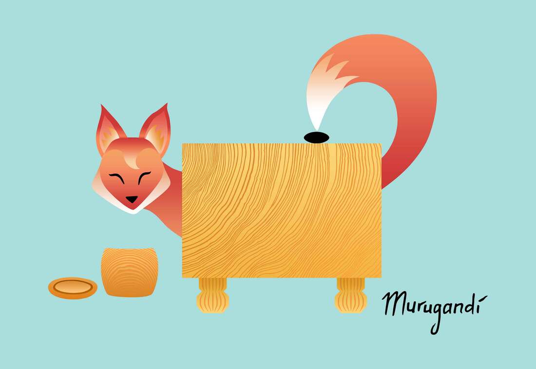 My entry for the Little Fox Weiqi art competition In winter 2021, the Chinese Weiqi Association organized an art competition on their social media platform Little Fox Weiqi. For the competition, artists were encouraged to create designs based around the fox in the logo of Little Fox Weiqi, incorporating references to the game of go. "Little Fox Weiqi" stems from China's nickname for go: 木野狐 (wooden wild fox). In the announcement of the competition, the fox was described as "very clever, cute, lively but also naughty." The organization further wrote: "We hope to use the image of 'little fox' to show the elegance, kindness and wisdom of Chinese weiqi, and its powerful vitality and infinite charm." Logo of Little Fox Weiqi, the social media platform of the Chinese Weiqi Association Inspired by the logo of Little Fox Weiqi (above), I made an illustration in the same cute and child-friendly style, using gradients for the red-orange-white fur similar to the original. I played into the classic qualities of naughtiness and shrewdness of the fox: my fox peeks at us from behind a beautiful wooden go board, smiling happily while simultaneously placing a go stone on the board with its tail. I titled my design "Cheeky Little Fox". 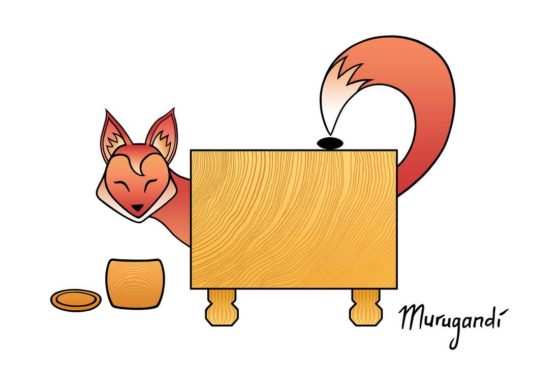 Version with black outlines I ended up making two versions of my design which I both entered into the competition: one with my usual black outlines (above) and one without (at the beginning of this blog post).
On social media, opinions were divided on which version was better. Personally, I probably prefer the version without the black outlines: it is more in line with the logo of Little Fox Weiqi, and this change from my usual drawing style positively surprised me. All participants of the competition will receive prizes or certificates of honour. The winners should be announced in the coming weeks. 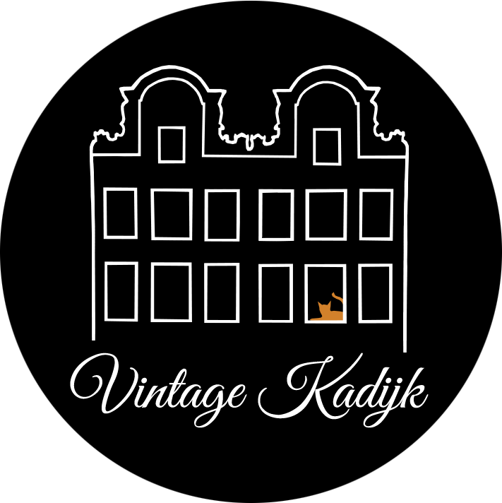 After many years of walking into any thrift store we stumbled upon and looking for treasures, Justyna and I have decided to take our passion to the next level: we've started a shop with vintage and antique items! The shop is called Vintage Kadijk, inspired on Hoogte Kadijk, the name of the street in Amsterdam where I grew up. I've created above logo for the occasion, featuring the typical shape of the houses on Hoogte Kadijk and a brown-red cat in loving memory of Chan, who lived there with my parents, my sister and myself. Currently there are 19 listings in our shop and plenty more to come. Have a look by clicking here. If you see an item that you like, but you have questions, feel free to send us a message. On the picture below you see some examples of the items you can find in our store: these are recent arrivals and we are working on slowly putting them in the shop one by one. Happy shopping! 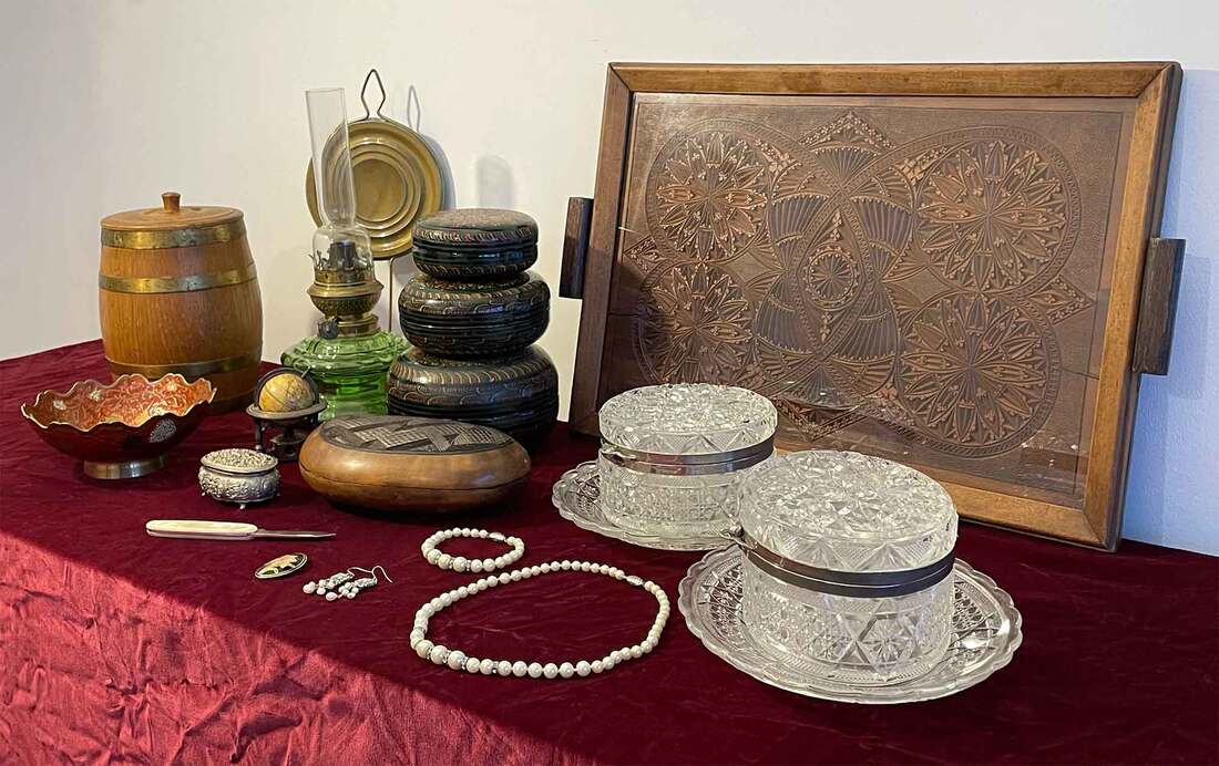 |
AuthorWelcome to my website! My name is Kim Ouweleen, my artist pseudonym is Murugandi. I am an illustrator, author, proofreader and go teacher from Amsterdam. Do you want to support my art? I take on private commissions.
On Etsy I sell prints, postcards and mugs.
On Spreadshirt I sell clothing, mouse pads, stickers & more.
Want to stay updated on my latest art? Click below to subscribe to my newsletter.
You can view my previous newsletters here.
Archives
June 2024
Categories
All
|