|
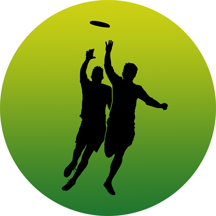
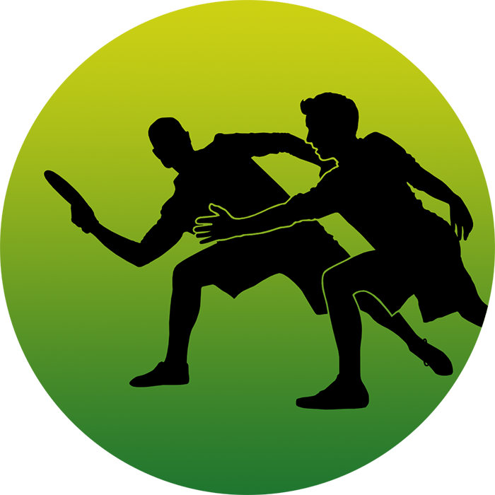
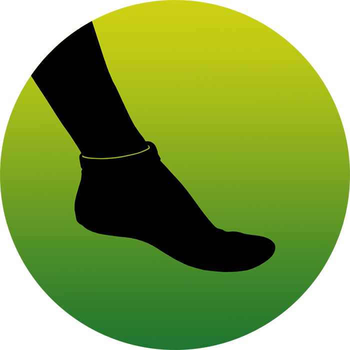
I made more thumbnail designs for Frisbeewinkel, the biggest frisbee store of the Netherlands. These are visible on the website when you hover with your mouse over the banner with product categories at the top of the screen.
This is the third category that I am making designs for: Ultimate Frisbee. Previously I made the thumbnail designs for the categories Disc Golf and Dog Frisbee. Those were easier to make because the titles of each category were self-explanatory and part of a consistent set: For "Putters" I drew a man throwing a putter into a basket, for "Midrange Discs" I designed a figure throwing an up-shot and "Distance Drivers" asked for a design of a person driving a disc, and so forth. The Ultimate Frisbee category was a bit different: the five titles of this category are "Logo, Star and Tribal Prints", "Junior Ultimate Discs", "Custom Frisbees", "Ultimate Accessories" and "Sand Socks". These titles are more varied and less in line with each other, and it did not make sense to try and directly translate these into a visual equivalent. Instead I decided to use ultimate frisbee players in action, in line with the 'action shots' I used for disc golf and dog frisbee, to form a consistent visual story throughout the website. The last two titles "Ultimate Accessories" and "Sand Socks" felt too out of sync if I used in-action-designs as well, so for those I used two characteristic products, a cap and a sock! #ultimate #ultimatefrisbee #frisbeeshop #frisbeewinkel
0 Comments
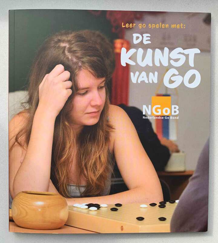
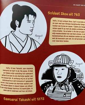
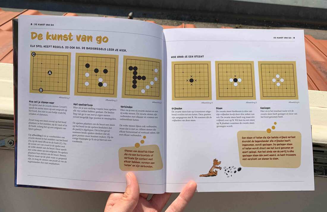
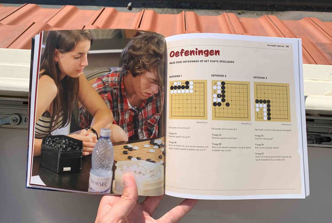
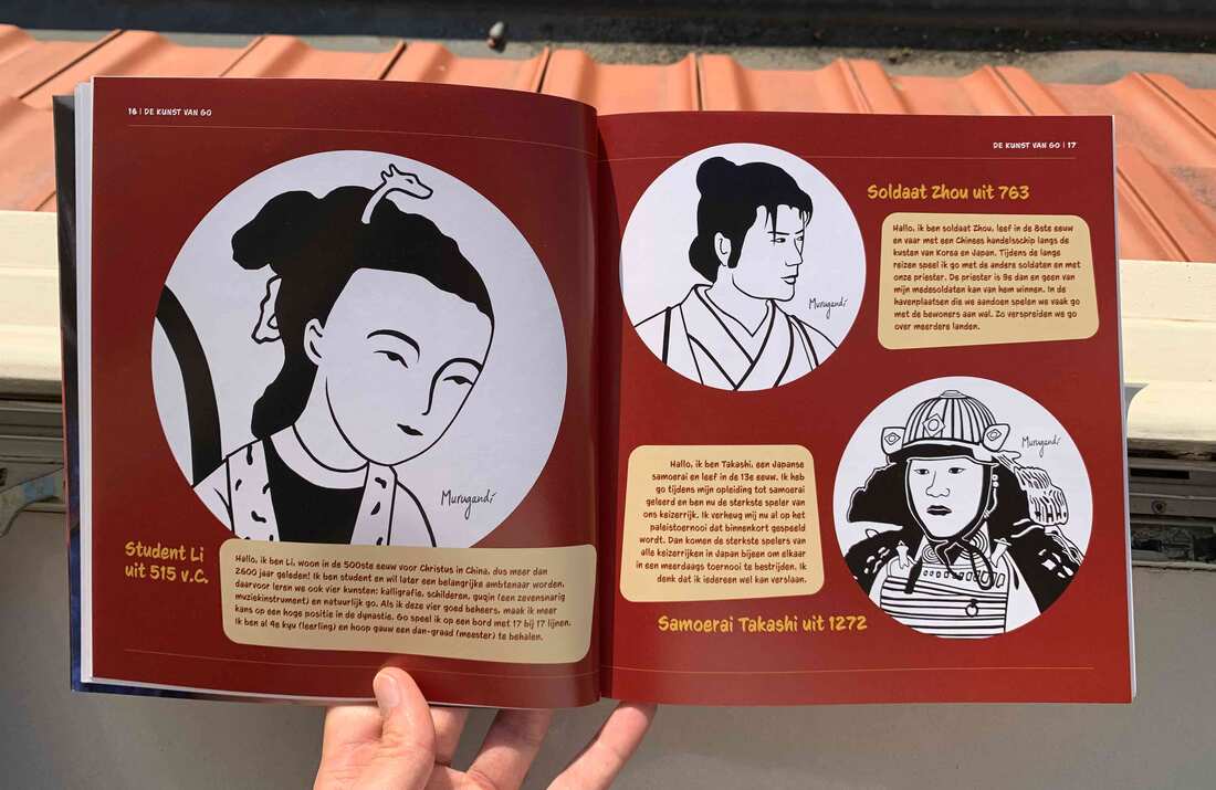
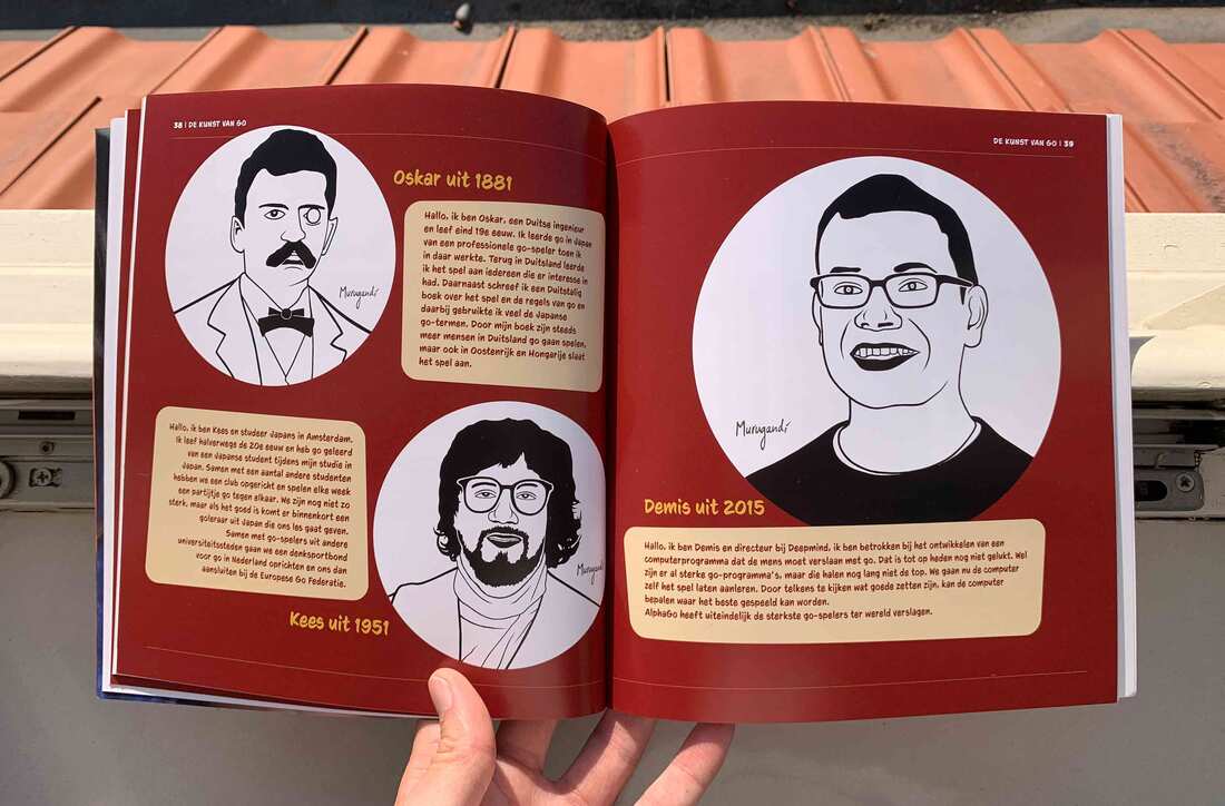
About a month ago I made six illustrations for a new beginners go book by the Dutch Go Association (Nederlandse Go Bond), depicting go players through the ages.
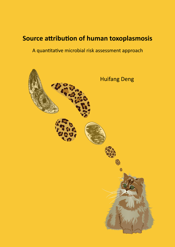
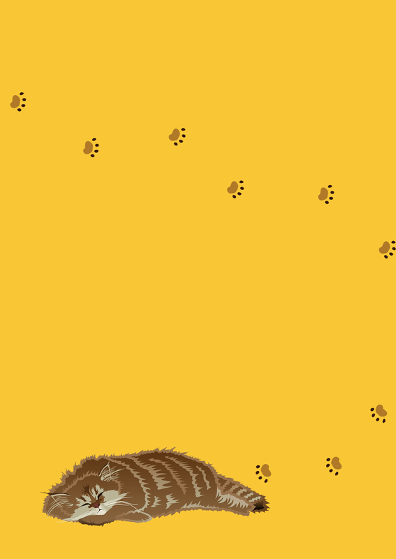
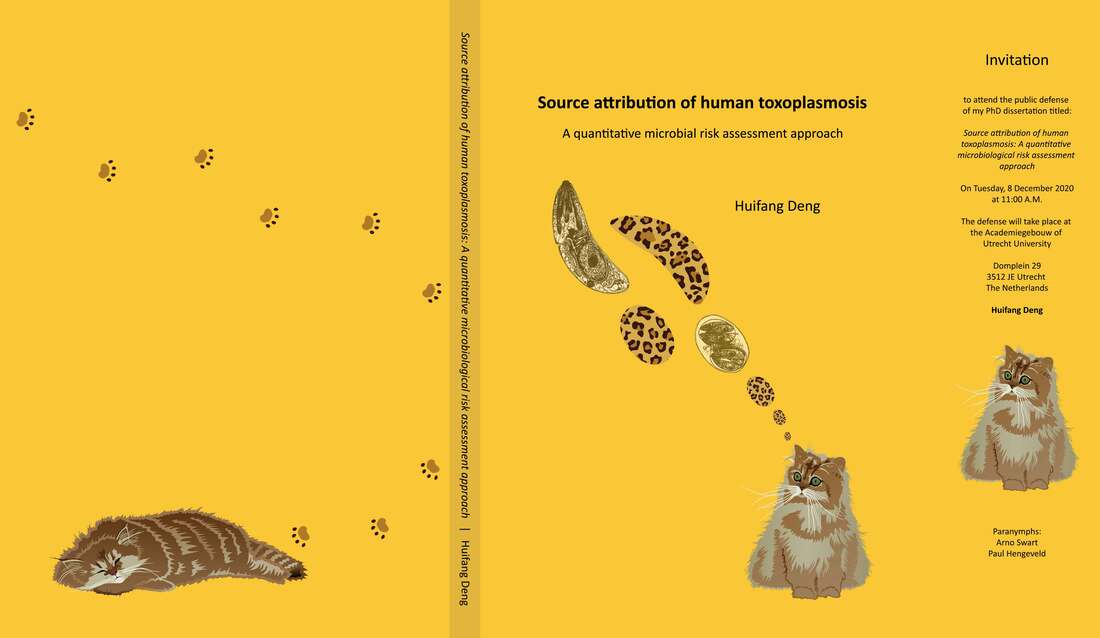
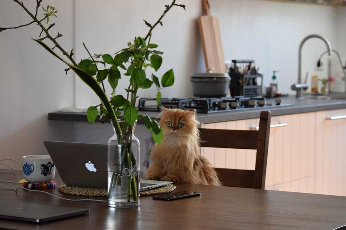
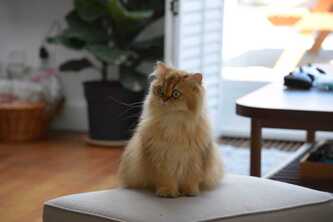
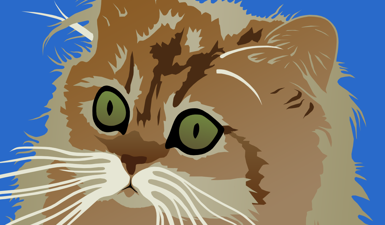
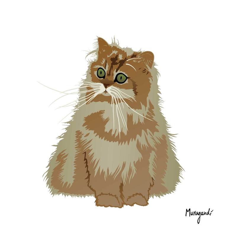
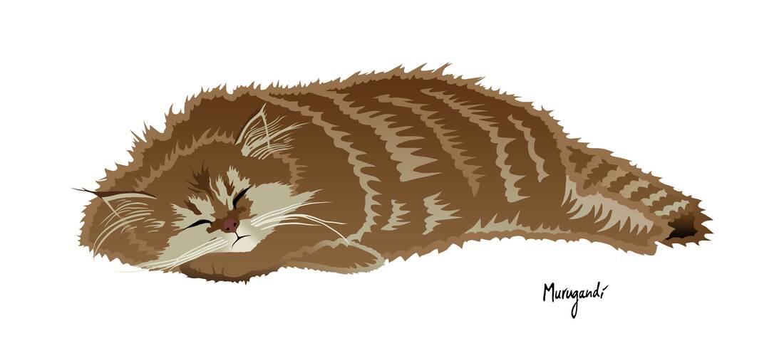
The book is now printed and landed in my mail box yesterday. It is called "De Kunst van Go" (The Art of Go) and has 72 pages full of pictures, rules and exercises for Dutch readers who want to learn the game. The photos in the book are really nice and show all sorts of different European go players, from pretty girls crunching their brains to kids playing pair-go with their grandparents. I am always grateful when friends and acquaintances reach out to me for art commissions. This time I was approached by my friend Tim van Vliet and his wife Huifang "Jenny" Deng (邓慧芳). Jenny asked me to design a cover for her PhD thesis, titled Source attribution of human toxoplasmosis - A quantative microbial risk assessment approach. Quoting the thesis: Toxoplasmosis, known by its Latin name Toxoplasma gondii, "is a single-celled zoonotic parasite, which has a worldwide distribution. It can infect virtually all warm-blooded animals, including humans, mammals and birds. It was first discovered in Tunisia and Brazil in 1908 and named a year after based on its crescent‐shaped morphology (Toxoplasma means ‘arc form’ in Greek) and the host species in which they were detected (a rodent, Ctenodactylus gundi) (Dubey, 2008). It belongs to the phylum of Apicomplexa together with other species, but is the only known member of the genus Toxoplasma." This parasite is also strongly linked to cats. Wikipedia reads: "Toxoplasmosis is usually spread by eating poorly cooked food that contains cysts, exposure to infected cat feces, and from an infected mother to her baby during pregnancy. Rarely, the disease may be spread by blood transfusion. It is not otherwise spread between people. The parasite is known to reproduce sexually only in the cat family." The main objectives of the thesis: "To identify and prioritize successful prevention strategies, it is important to attribute the burden of toxoplasmosis to specific sources. QMRA is a useful tool to collect all available data on different aspects so that the data can be used for source attribution. In this thesis, we focused on the assessment of relative attribution of different sources (namely different meat products and soil) to human T. gondii infection in the Netherlands by using a quantitative microbial risk assessment approach. In addition, we implemented the QMRA model of meat-borne T. gondii infection from the Netherlands for the mainland of China, where consumers have different consumption habits." Jenny had recently seen my drawing of a go playing cat and knew that I previously designed a PhD cover for another friend of mine. After our initial brainstorm session, the first concept was to have cellular shapes of the parasite on the cover and to incorporate a leopard skin pattern, based on a Chinese saying: 管中窥豹,可见一斑。Translating to: "Look at one spot on a leopard and visualize the whole animal - extrapolate; conjure up the whole through seeing a part of it." An interesting metaphor in relation to microscopic research and the prevention of parasitic infection spread, both zooming in on small areas in order to understand the bigger picture. Jenny also asked if I could draw a small cat for the back side of the cover. Soon we figured out that it should not be just any cat: why not her cat, Ruby? Ruby is a funky cat with an intense and crazy stare, so I looked forward to capturing her in a drawing. I started working on the cover and I used a scientific drawing of the parasite that Jenny sent me to create the outlines of basic shapes. I used the characteristic banana shape of the parasite, multiplied that and filled them purely with leopard skin patterns, but it looked too abstract. I realized that the link between the leopard skin and the parasite itself had to be explicitly visible to make the metaphor work, so I combined the leopard skin shapes with the scientific drawing of the parasite. The link became evident, but something was still missing, so I decided to take the idea of the cat on the back side of the thesis and put it on the front instead: the parasites + the host. I made a crude first sketch of the cat and started playing around with the positioning of the cat versus the parasite-shapes, until I came up with the idea of the "thought bubbles" that you see in cartoons: the balloon in which the thoughts of a comic's character are drawn. I aligned the parasite-shapes in such a way that they started from the top of Ruby's head and grew from small to big. Now it looked like the cat, with its intense eyes, was actually spacing out and thinking of parasites! Fitting also in a sense that parasites can change the mental behavior of their host, but that's more of an afterthought, something I realize now that I'm writing. Jenny liked this idea for the cover, so I started working on the drawing of Ruby, which I did fully in Photoshop. The main things I focused on were her fluffy hair and her big, green eyes. The cat for the cover of the PhD was done, but I liked the idea of a cat in the corner of the back side as well, so I decided to draw a second Ruby. This time a sleeping one, as a wink at taking a rest after you've read the entire thesis, but also because sleeping cats are just cute. I added some foot prints to create the illusion of a cat walking around, inspired by the title screen of the short anime film Cat Soup. The foot prints are also a wink at the way parasites spread: they travel along with their hosts. We ended up selecting Calibri as the font for the title of the thesis. Normally I would be against this, but Jenny requested it and it fits the design nicely. It was a lot of fun to draw cats and to design my second PhD thesis cover. Thank you, Jenny!
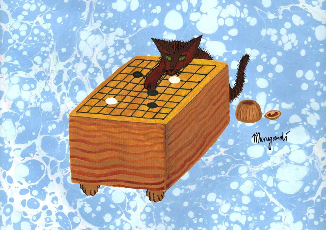
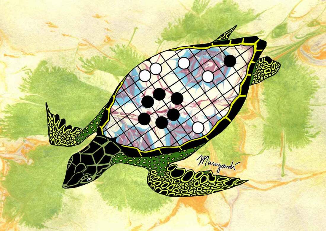
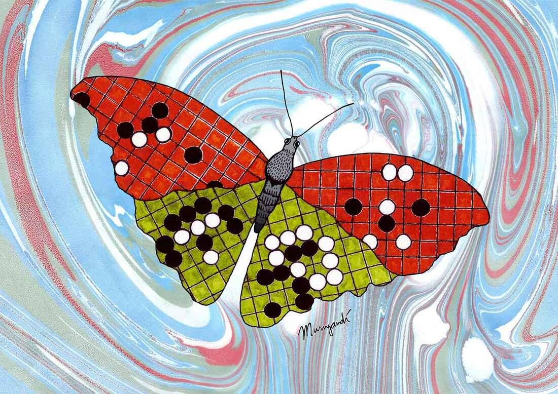
If you like my artwork of these cats: you can get them as posters and postcards in my Etsy shop. Gissella Gastin and Luciano Salerno asked me to participate in the Sala de Arte of the Congreso Virtual Latinoamericano de Go. The congress is organized by the Federación Iberoamericana de Go and the Asociación Argentina del Juego de Go and is taking place as I type, until 11 October. The Sala de Arte is an online gathering of go inspired art, some of which is especially made for the occasion. My entry is one of circa 30 and includes three of my "classic" go designs: The Tortoise Shell, the Go Butterfly and my most recent go artwork, Sniffing the Third Line (a cat playing go).
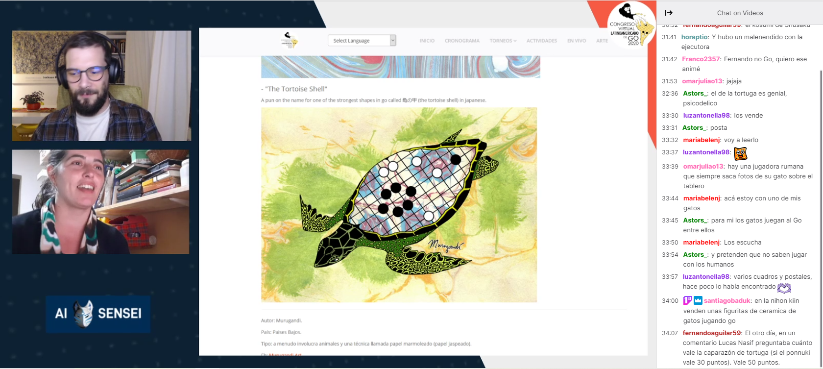
All entries for the Sala de Arte were also shown on the Twitch channel of AAdeGo: https://www.twitch.tv/videos/763714342 (my art starts around minute 31:30) https://www.twitch.tv/videos/763772347 Especially my turtle was popular amongst the viewers. Even Fernando Aguilar, famous in the South American go world, typed a few words about this go shape that is more powerful than a ponnuki and is said to be worth 50 points. It is nice to see that go related art is being appreciated and is getting attention in such a big event. Thank you Gissella and Luciano for the organization and let's make more go art in the future! |
AuthorWelcome to my website! My name is Kim Ouweleen, my artist pseudonym is Murugandi. I am an illustrator, author, proofreader and go teacher from Amsterdam. Do you want to support my art? I take on private commissions.
On Etsy I sell prints, postcards and mugs.
On Spreadshirt I sell clothing, mouse pads, stickers & more.
Want to stay updated on my latest art? Click below to subscribe to my newsletter.
You can view my previous newsletters here.
Archives
June 2024
Categories
All
|
