|
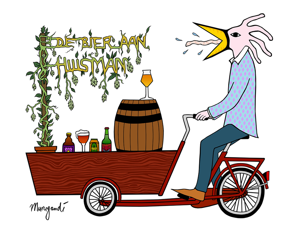
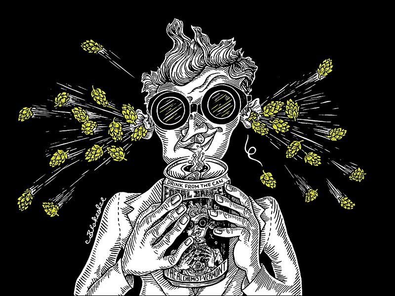
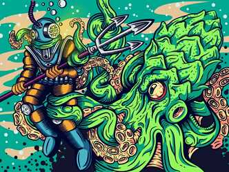
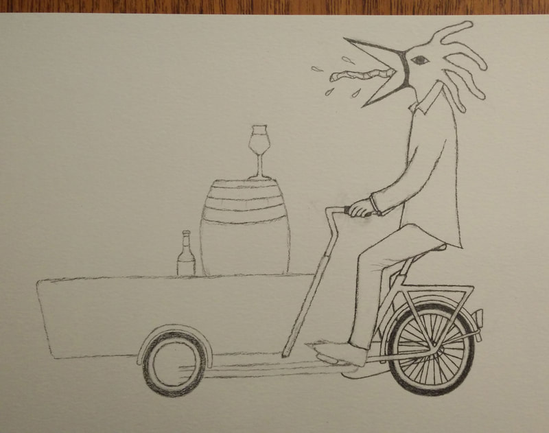
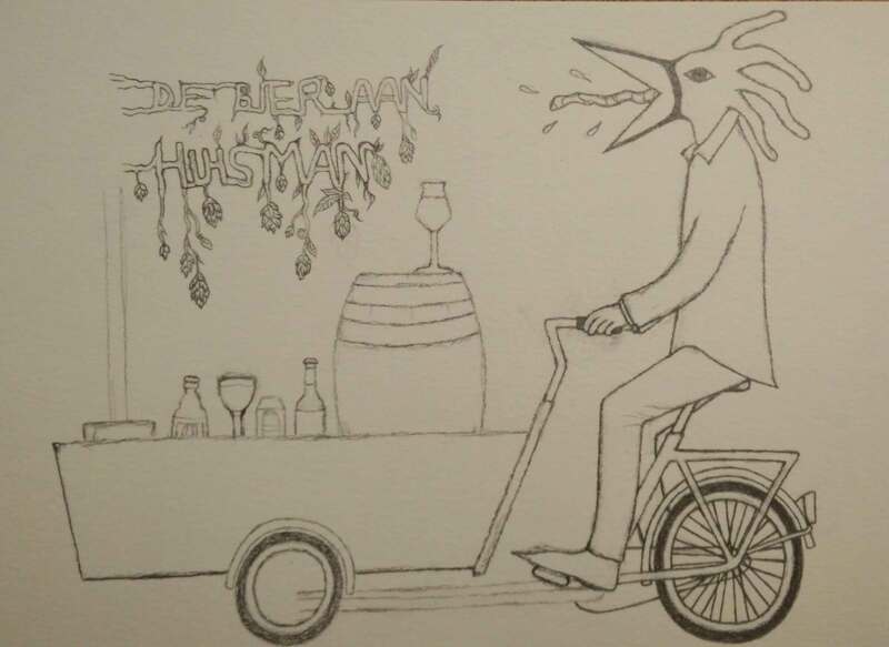
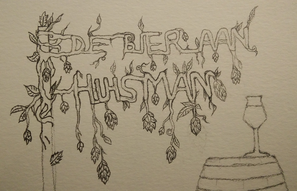
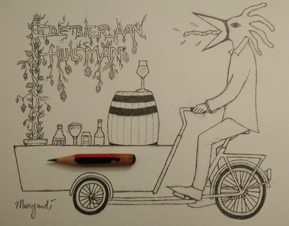
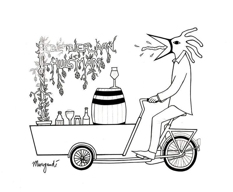
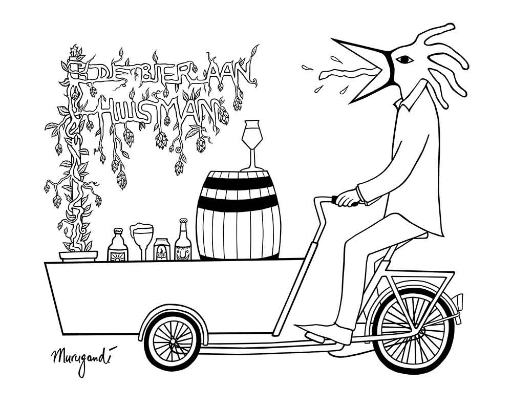
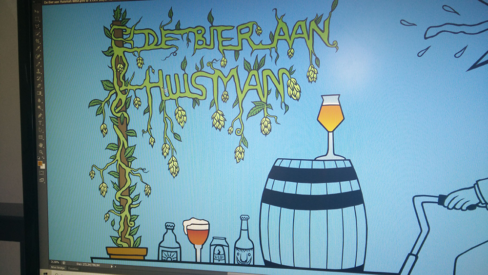
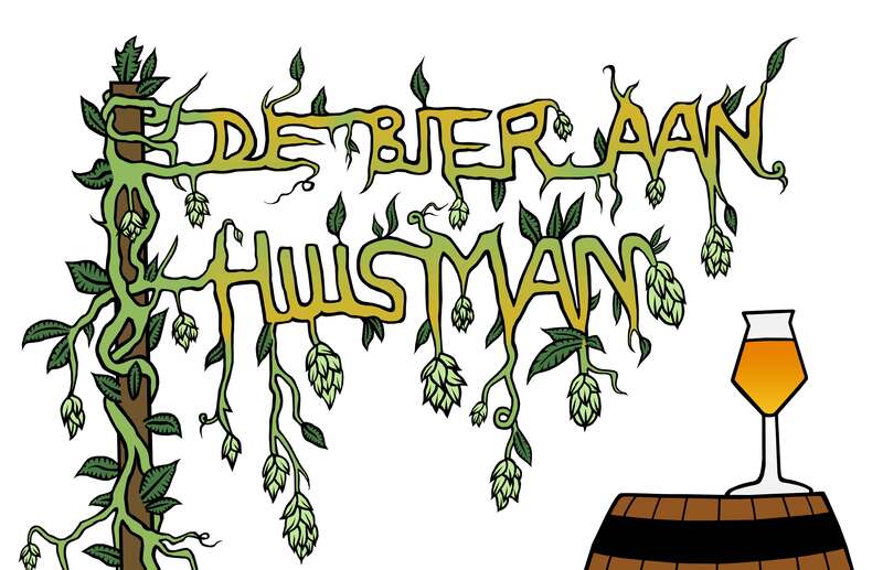
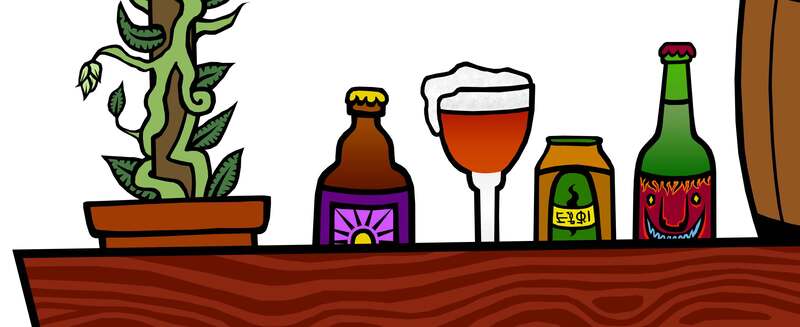
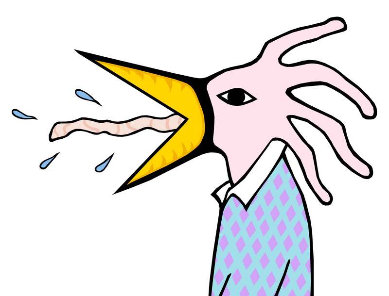
I recently finished my latest art commission, a logo for De Bier aan Huisman, a one man company from Amsterdam in the beer sector. De Bier aan Huisman (www.debieraanhuisman.nl) is run by beer sommelier Daniël Huisman, who provides beer tasting events for groups and companies. I have known Daniël for many years, we went to the same high school, and I always knew him as "the beer expert". Sometimes we organize board game evenings with a group of friends and on several occasions Daniël brought specialty beers for everyone to try. What I didn't know until I worked with him is that he studied 3 years to become a beer sommelier and even went on a trip to Austria to get his certified diploma. Personally, I love it when friends, family or acquaintances come to me for artwork. It means that my work is being picked up and appreciated. So it was a pleasant surprise to get a message from Daniël requesting a get together to discuss the making of a logo for his start-up! A few days later we met at Gollem aan het Water, a lovely café at Entrepotdok 64 that specializes in, of course, specialty beers. Probably the only location of the five Gollem bars in Amsterdam that Daniël hasn't actually worked at. There we talked about Daniël's business concept of providing beer workshops and tastings on location, his ideas for the logo and the message he wants to convey on his website: funky and fun, yet sophisticated. He showed me a few examples of beer artwork that he likes, amongst which a drawing by artist Dan Blakeslee for brewery Alchemist Beer and the "Hoptopuss" by graphic designer Luke Keil for a beer can of brewery 81 Artisan. We also talked about the shape of hops, Amsterdam and Daniël's plan to buy a bakfiets (cargo bike) for his business. And about my own surreal and graphic drawing style, which he wanted to shine through in the logo. I was free to draw whatever I deemed appropriate, and even though the concept remained vague, a few ideas already started taking form during our talk: a bird man riding a cargo bike, the bike overloaded with beer bottles, perhaps hops growing out of those bottles and forming intricate shapes. I also pictured the hops plant forming the letters of De Bier aan Huisman, but I was not sure how viable this idea would be.
I had a lot of fun with this commission and I'm proud of the final result. Are you a beer freak in Amsterdam or do you know nothing about beer but are you curious to experience a beer tasting with a professional? Send Daniël an e-mail! I highly recommend it.
7 Comments
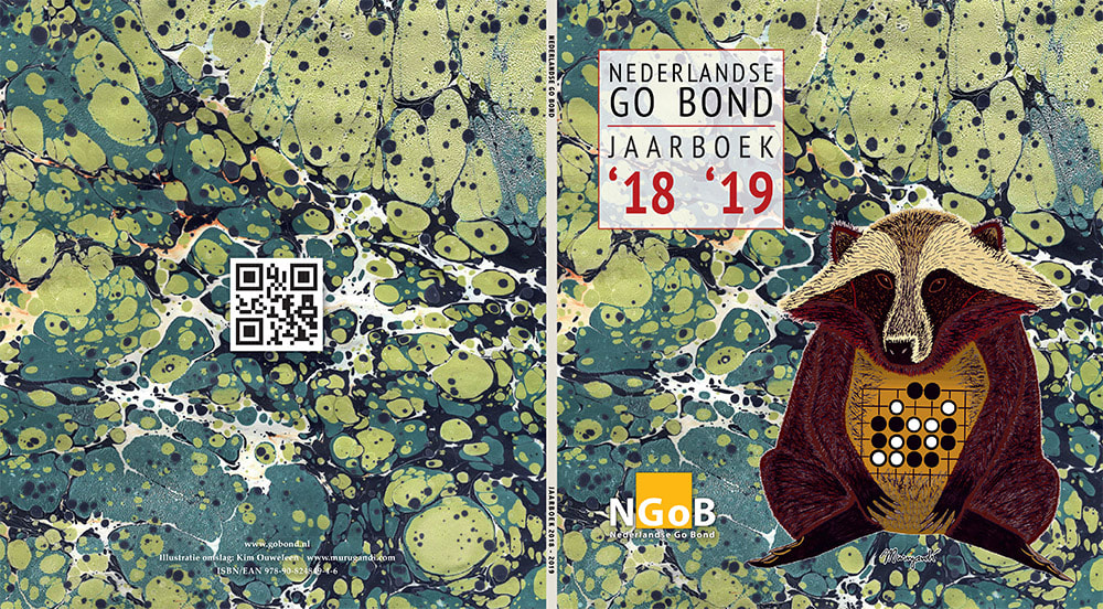
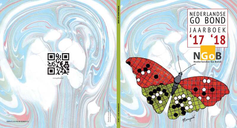
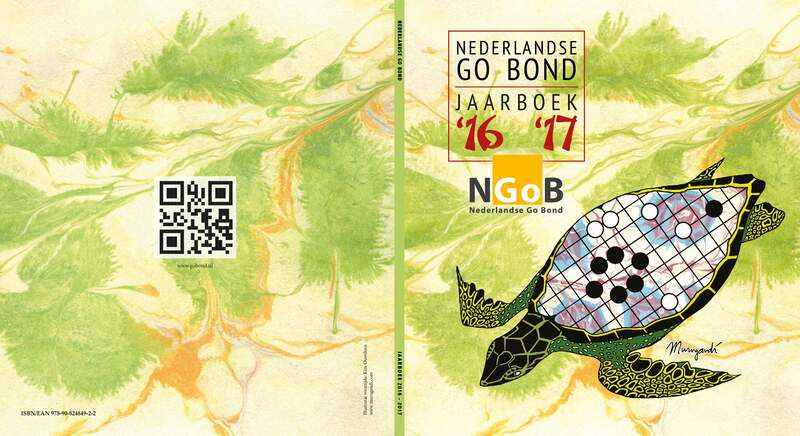
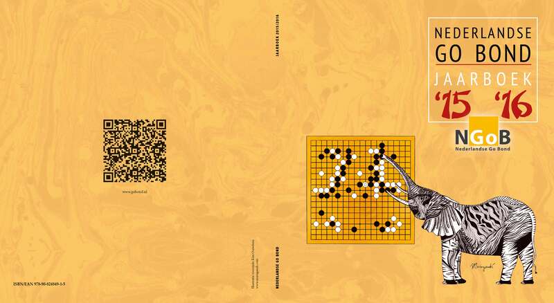
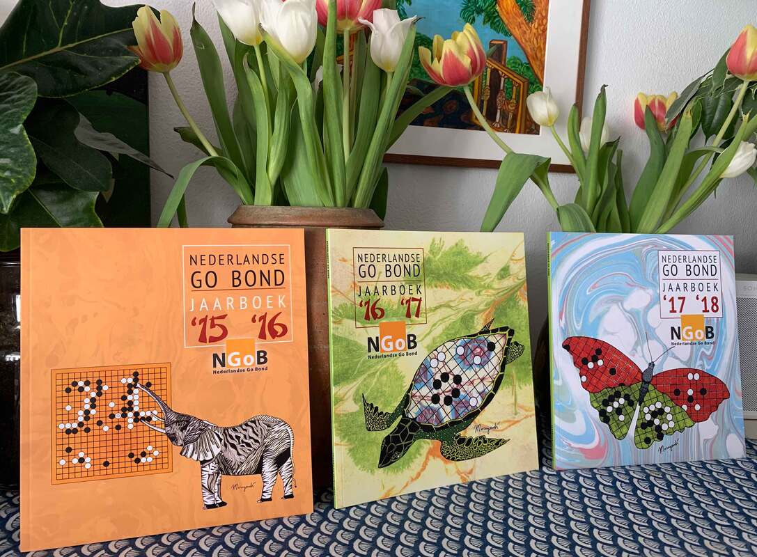
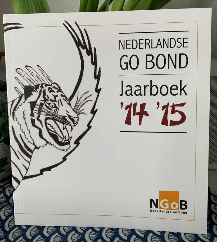
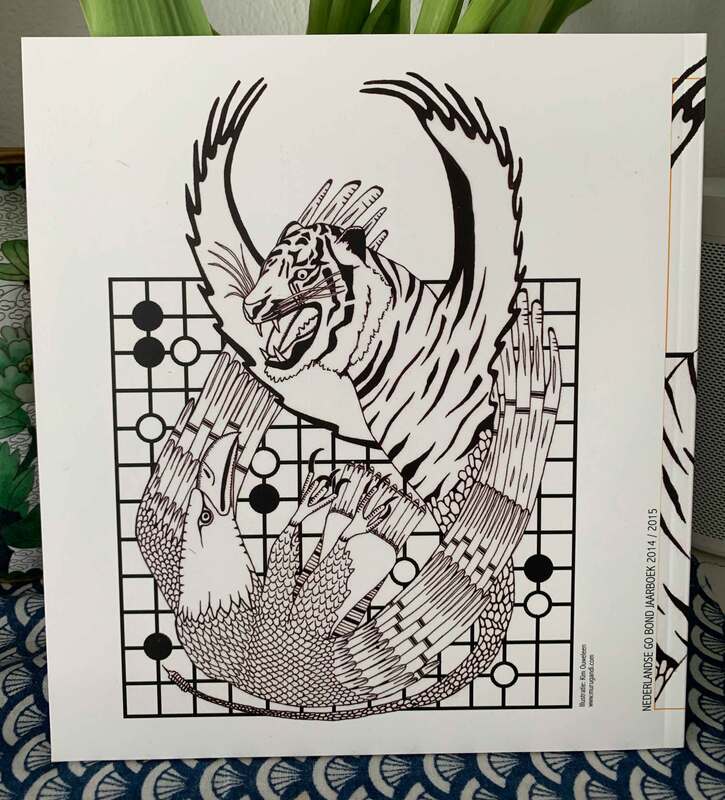
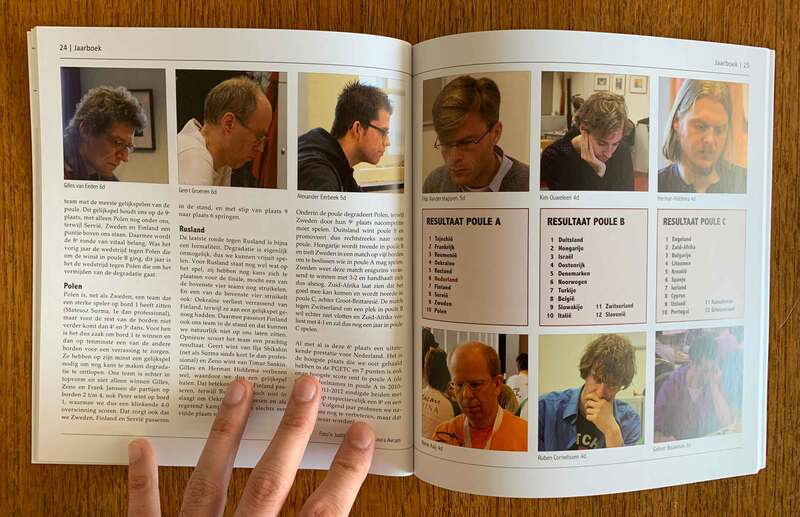
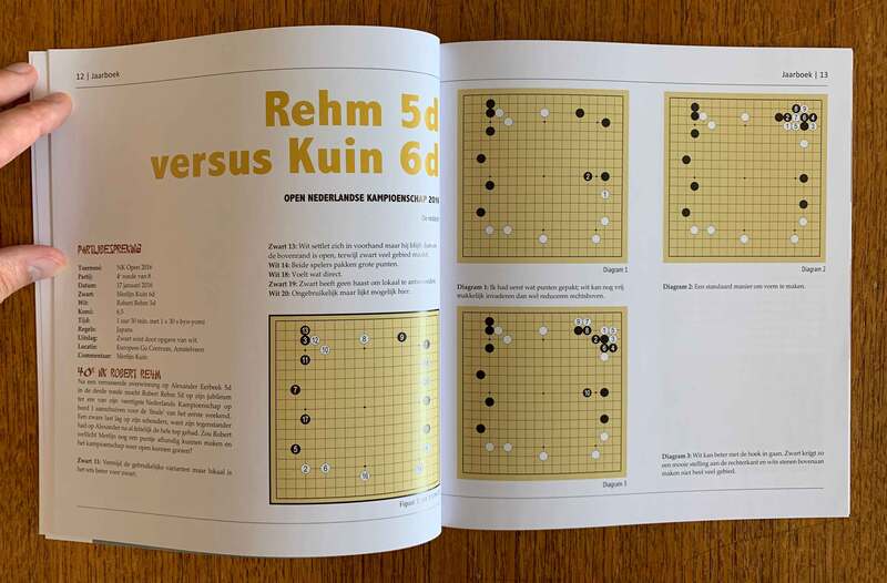
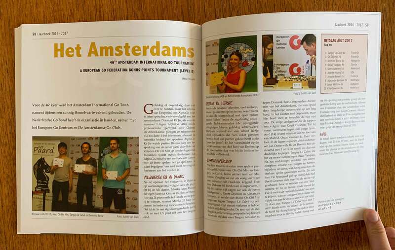
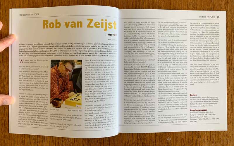
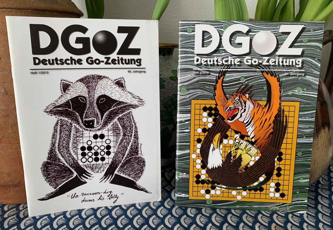
This blog post is the second edition of Looking Back, in which I look back on artwork I have made in the past. Soon the 2018-2019 edition of the Dutch Go Association Yearbook will be published. Each year the Nederlandse Go Bond (NGoB) publishes such a booklet in which the most important seasonal go happenings of the Netherlands are recorded, along some major international go news. As is becoming tradition, my go art is on the cover! This time it is my raccoon dog who drums his belly, a pun on the Japanese name of a famous tesuji combination of two stones played on the first line, capturing the opponent's group of stones in a spectacular way. The green marbling pattern was created by hand in 2019, then scanned and cleaned up digitally. The raccoon dog on the cover of the 2018-2019 Dutch Go Yearbook is the fourth in a series of covers I have made for the Nederlandse Go Bond that feature animals, go positions and paper marbling. Here are the previous three: And a picture of what the three booklets look like next to each other: The cover of the 2017-2018 NGoB Yearbook features my go butterfly, which originally was a logo that I created for the European Youth Go Championships (EYGC) of 2015 that took place in Zandvoort. The patterns on the wings of the butterfly show several tesuji shapes, such as the crane's nest and a snapback. The 2016-2017 edition, probably my personal favourite so far, incorporates my drawing The Tortoise Shell, a pun on the Japanese name for one of the strongest shapes in go called 亀の甲 (the tortoise shell): a tortoise rocking the tortoise shell on his tortoise shell. For the 2015-2016 yearbook I chose a design featuring Lee Sedol's famous move 78 that made AlphaGo go on tilt in game four of their best of five match in 2016. Lee Sedol lost the overall match to the computer program by 4 to 1 games, making AlphaGo the first computer to defeat a top level professional in the history of go. This wedging move by Sedol resulted in the only victory in the matchup for the Korean and became a symbolic victory of human capability. If you look closely, you might notice a difference in the look of the elephant cover with the following editions: the elephant is black and white, since most of my artwork was still black and white in those days, but also unlike the subsequent covers the marbled background is one shade of colour and blends together with the go board. The original was blue and white, but an editorial decision was made to change it to brown. The future editions were not altered, showing a small difference in style. Technically the NGoB Yearbook series with my artwork on the cover started with the 2014-2015 edition, for which my drawing called Fighting Spirit was used. I don't really consider this volume as part of the series, however, because it stands out from the rest. It is completely black and white and as I had not yet discovered paper marbling, there is no exciting background. On top of that, the actual go drawing ended on the back side of the booklet instead of the front. See pictures below. I also include some examples of what each yearbook I illustrated looks like on the inside. My go art has also been published on two magazines of the German Go Association, called the Deutsche Go-Zeitung. The Raccoon Dog Drums His Belly and Fighting Spirit make their first appearances on the first DGoZ volume of 2015 and the second DGoZ volume of 2019. Do you run or write a go editorial, magazine, bulletin, leaflet, website, book, you name it? And would you like to include my art? Please leave a comment!
|
AuthorWelcome to my website! My name is Kim Ouweleen, my artist pseudonym is Murugandi. I am an illustrator, author, proofreader and go teacher from Amsterdam. Do you want to support my art? I take on private commissions.
On Etsy I sell prints, postcards and mugs.
On Spreadshirt I sell clothing, mouse pads, stickers & more.
Want to stay updated on my latest art? Click below to subscribe to my newsletter.
You can view my previous newsletters here.
Archives
June 2024
Categories
All
|
