|
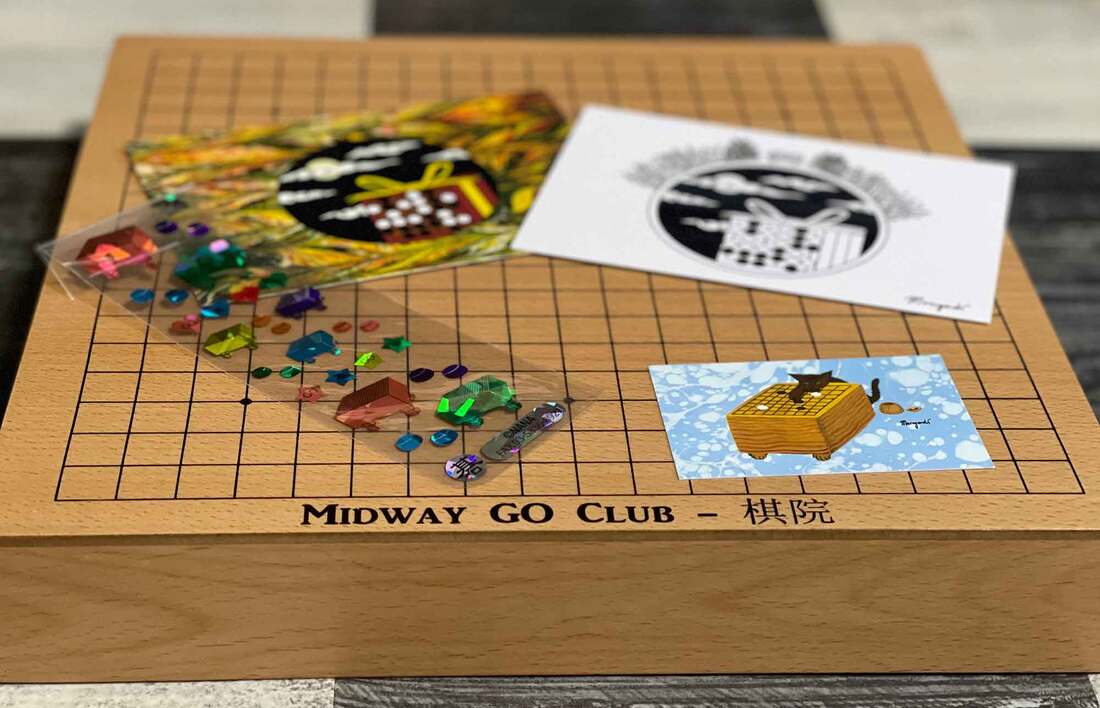
One of my customers on Etsy, William Sheehan, was happy with his order and asked me if I'd consider doing a private commission for him. William is 54 years old and has 20+ years of experience in chess under his belt. Only recently, about two months ago, he got into go and has already reached the level of 14-kyu. Previously William ran a chess club and as he is now fully submerged into go, and plans to start a go club. He showed me the logo of his chess club that he made himself (see picture below), in which he incorporated the blue and red colors of the flag of Chicago. The stars in the top left corner are taken from the same flag and the buildings in the background form the skyline of the city. We exchanged some ideas and soon I understood that the go logo was to be quite similar, but that I was free to give it my personal twist. William told me that he lives close to the Midway International Airport, and that's where the name of his club comes from. Soon after, I got the idea to include an airplane in the design and have it take off from the go board. William had also mentioned the tarmac of the airport and this gave me an idea for the go-position: the go stones shown in the logo form a ladder that resembles a tarmac and emphasizes the movement of the plane. The ladder is good for White: White is in atari, but can move out with the next move, connecting up to his corner stones and breaking free, just like the plane. Interestingly, although the blue of the plane looks darker than the blue of the sky, they are in fact the same color. It is an optical illusion caused by the black skyline. Another optical illusion is at play in the go stones: did you know that when go stones are produced, the white stones are made slightly smaller than the black ones? This is done because white objects seem larger to our eyes. I experienced that first hand during the design process: when using same-sized stones for black and white, the white stones appeared much larger, and I had to reduce them for a balanced composition. For the font of the letters we ended up chosing a mechanical-style font called 'Noise Machine'. If I'm ever in Chicago, I look forward to dropping by at the Midway Go Club.
1 Comment
Antonie Van den Berg
4/2/2021 08:03:15 am
Great logo and great story Leave a Reply. |

AuthorWelcome to my website! My name is Kim Ouweleen, my artist pseudonym is Murugandi. I am an illustrator, author, proofreader and go teacher from Amsterdam. Do you want to support my art? I take on private commissions.
On Etsy I sell prints, postcards and mugs.
On Spreadshirt I sell clothing, mouse pads, stickers & more.
Want to stay updated on my latest art? Click below to subscribe to my newsletter.
You can view my previous newsletters here.
Archives
June 2024
Categories
All
|